Pop the cork and pass the bubbly — your gorgeous new logo design is done … or is it? You’ve designed the perfect logo and exported all the necessary formats, what else do you need to do? The sharp, savvy designer creates a logo style guide so she has all the elements well-documented for herself, her client and any vendors who might need to use the logo.
Why is this important?
Do you ever look at a logo on a business card, then compare it to the web site logo, or the logo on the door of the business and notice they are not the same? Ha, maybe that’s just me!
Brand consistency is super important because it says to the world that what you stand for is the same day after day, your product or service is consistent day after day, your mission and customer service are consistent day after day. If you want your prospects and customers to have a positive view of your company, product and service and be able to rely on you, your brand needs to be consistent.
By the way, if you’re wondering how I launch every logo design project, download my free logo design questionnaire, a free printable PDF. Click the graphic below!
In this post I’m talking specifically about the visual cornerstone of your brand — your logo!
- How do you make sure it stays consistent?
- How do you make sure that when team members want to create a brochure with a colored background that matches the logo color, that it’s consistent?
- How do you make sure that when you need to create a sister logo to the original that the fonts are consistent?
You document everything about the logo design and you tell people — in a short, sweet and easy-to-use format called a logo style guide. I create mine in Adobe Illustrator since that’s where I create my logos.
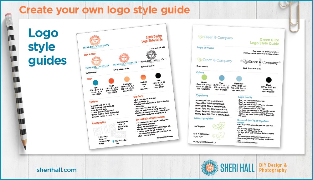
The logo style guide vs. brand board
I call this a logo style guide and I include it with all my logo design projects. Some people call it a brand style guide. I would use that term if I were documenting additional info like fonts to use in social media graphics, photos and patterns, additional colors for the brand that are not part of the logo, etc. Another common term is brand identity guidelines.
You might also see terms like brand board and style board thrown around. I consider the brand board to be something you do as research on the front end of a logo and brand design project; it’s like a Santa Claus list of visuals you like and could see as part of your brand; this includes fonts, colors, patterns, accent graphics, photos and illustrations. At the end of the process you would take the elements you actually used and create a brand style guide just for your brand.
Let’s add more confusion here! Some people use the term visual style guide which I have observed is pretty much a brand style guide since it documents all the things after the project is complete.
Board = brainstorming of cool ideas on the front end of the project
Guide = documenting actual assets at the end of the project
Now, let’s layout our logo style guide! Be sure to label each section.
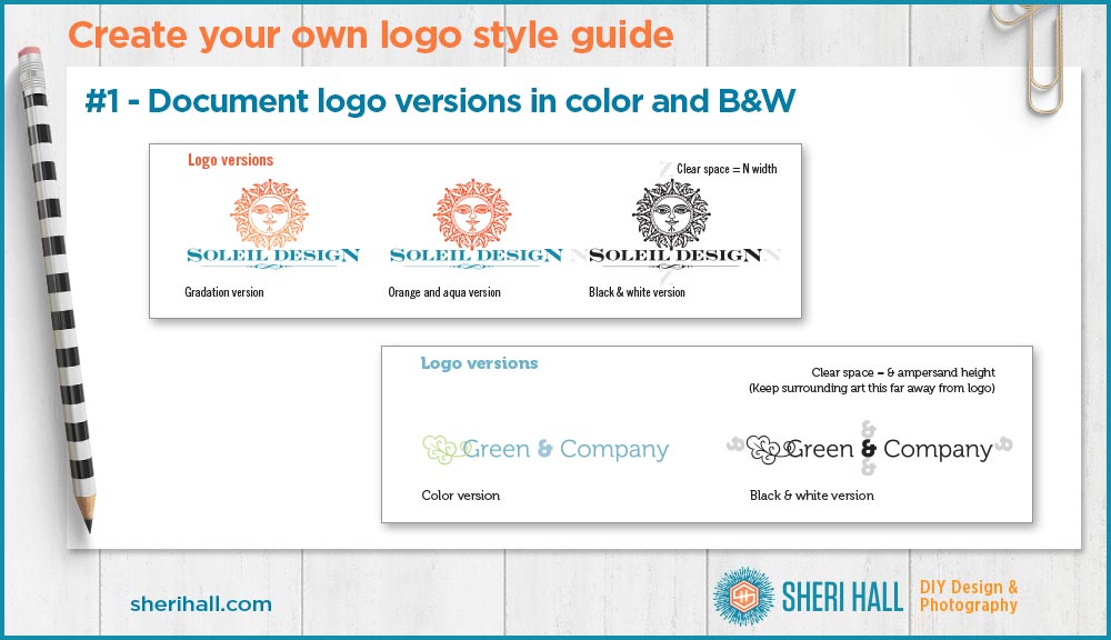
Element #1 on your logo style guide: logo versions
Minimally you’ll want to document the full color version and a black and white version of your logo.
If your logo has gradations or shadows, you may want to have a color version that does not include those; so you would have your regular color version and a simplified color version. Label each logo — color version, simplified color version, black & white version.
I also like to include a recommended margin or clear space for the logo. I base it on part of the logo so when the logo gets bigger, so does the margin. This means the clear space I would like to have around the logo so it’s not bunched up next to something else.
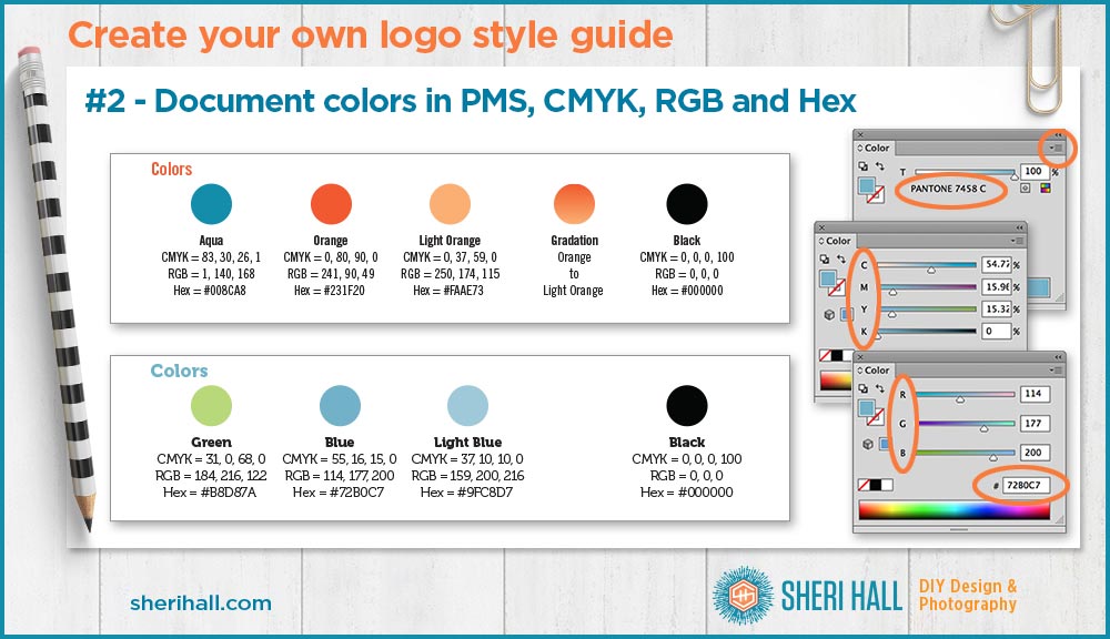
Element #2 on your logo style guide: logo colors
This step varies depending on how you specified the colors on your original logo.
First, make a color swatch on your guide for each color and tint used in your logo (this can be a square, rectangle, circle — just keep it simple and make it large enough).
Next, add a plain English description of the color (not necessary, but it helps when you’re referring to the colors in words, not color codes)
Now you need to document the colors in 3–4 color spaces.
PMS color
Check the Color palette to see what it says for each of your logo colors and document them one by one.
If you specified PMS (Pantone) colors, start with that since those are your true, original colors. If you specified your colors in coated (C), your number would be 321 C, for example.
Next you need to translate those colors into the closest versions of 3 other color spaces — CMYK, RGB and hex. Let’s look at each of those.
CMYK color
CMYK is the color space for printed materials like magazines and brochures. If you send your art to a printer (company, not machine) they will want the art in CMYK because that is the colors of ink they use on their presses. These colors are cyan, magenta, yellow and black (K is black).
With your logo open in Illustrator, click on the shape or text that is the color you want to document. Make sure you have the Color palette open and Show options is turned on (click arrow at upper right to check this).
Click the triangle at the top right of the color palette and choose CMYK.
Document these 4 CMYK colors in the order they appear on the Color palette separated by commas. Each number will be between 0 and 100 because they represent a percentage of each color that is in the mix. (Do not expect them to add up to 100 because each color is its own percent.)
For example, the aqua listed for Soleil Design is 83, 30, 26, 1.
RGB color
RGB is the color space for digital displays — computer, tablet, and phone screens. This is red-green-blue so it will give you 3 numbers between 0 and 255, one for each color.
Next, click the triangle at the top right of the Color palette and choose RGB.
Document these 3 numbers in the same order they appear and put commas between them.
For example, the aqua listed for Soleil Design is 1, 140, 168.
Hex color
Hex color is how colors are specified on websites. It’s a version of RGB.
Next, (with your colored shape still selected), click the triangle at the top right and choose RGB if you’re not still there from the previous step.
Look at the # box at the bottom right and copy that 6 character code. Each character will be 0-9 or A-F. Don’t use commas; just copy it exactly as it appears in the box.
For example, the aqua listed for Soleil Design is #008CA8. (include the #)
Do this for each color in your logo (see example graphic above).
If you have any gradients you use in your logo, document which colors make up the end points for that (see example graphic above).
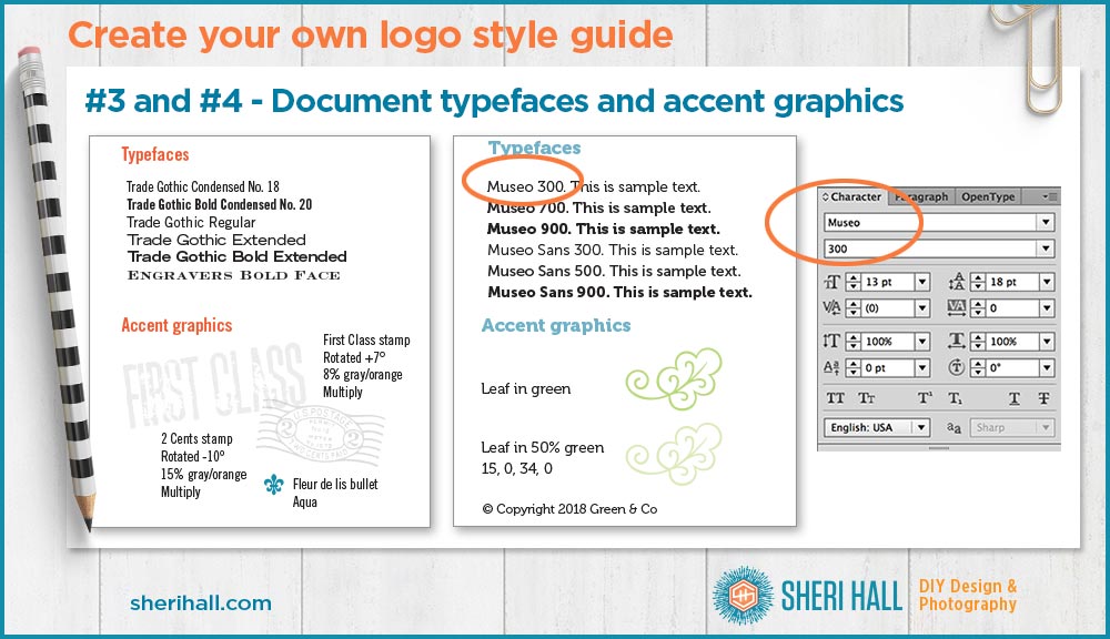
Element #3 on your logo style guide: fonts (aka typefaces)
Next, document the fonts used in your logo (assuming they have not been turned to shapes yet).
Select one of the fonts in your logo.
Look at the Character palette to see what it says and copy that down exactly. The top white box will show the type family and the second white box will show the face (bold, small caps, italic, etc). Make sure you document all that info and not just the family. If your logo is set in Garamond Premier Pro Italic, you don’t want to end it at Garamond Premier Pro (because there are about 34 of them!).
Do this for each typeface in your logo. If you have a regular and bold version of the same family, document them both separately.
If you want to document other weights and slants of the type family on your logo style guide, go for it. You might want to use them in supporting art later on, like social media graphics, text on a business card, etc.
Make sure you document which faces are the actual ones in the logo vs. other options in that type family.
Element #4 on your logo style guide: accent graphics
Document any accent graphics or icons you may use in your brand even if they are not part of your exact logo.
Also document any graphics in your logo that you plan to use as stand-alone graphic elements in other art, like as a dingbat centered at the top of a social media graphic, or blown up large and ghosted in the background, for example.
Document the colors for those.
Element #5 on your logo style guide: usage guidelines (aka dos & don’ts)
I include a short list of design guidelines on my logo guide because many of my clients are small businesses who will be using this logo in-house on various materials as well as sending it out for their vendors to use.
I prefer the logo to remain in the state I designed it with no “creative” additions or graphic effects.
This is my list of logo don’ts (yours may vary):
- Don’t put shapes around the logo
- Don’t animate the logo
- Don’t surround the logo with elements there than the accent graphics
- Don’t change the color of the logo
- Don’t add special effects to the logo (like bevels)
- Don’t use older versions of the logo, previous logos or any other marks that may be confused with the brand
This is my list of dos and don’ts for typeface usage:
- Do use a combination of uppercase and lowercase letters
- Do use only approved colors
- Do use only approved typefaces
- Do align text in body copy flush left and ragged right (for print work)
- Don’t use special effects to emphasize type (like bevels)
- Don’t change kerning or letter spacing when setting headlines or copy
- Don’t distort the typefaces (stretch, squeeze or skew)
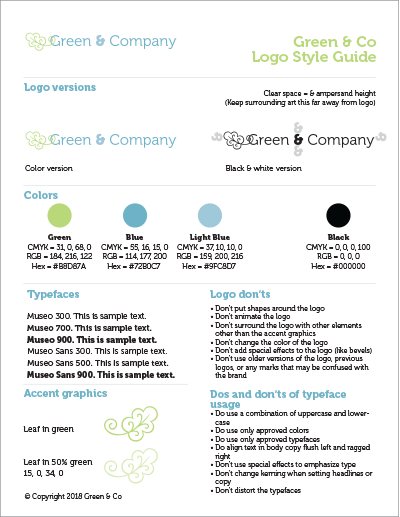
I find this list of basics fills up one page and is plenty for most clients. If it gets too much longer than that, I’m not sure they would read or follow it. Mostly what they want to know is fonts and colors, and they are well documented here.
Do you have any other sections you like to add to your logo style guide?
Sheri Hall
Entrepreneur, graphic designer, photographer, cookie-baker

👀 Facebook – DIY Graphic Design + Photography
📷 Instagram – boxy fun with graphic design + margaritas + costumes + life adventures
📌 Pinterest – pinning logos, typography and cats!
Email sheri @ sherihall dot com
“Those who say it can’t be done should get out of the way of those doing it …”P.S.
If you enjoyed this post on creating a logo style guide, share and comment please =)


I’d like to thank you on this detailed guide to create logo styes. I’m new to graphic design industry and learning things to accelerate my skills. Keep coming up with such posts 🙂