
I was cleaning out some old papers last weekend and ran across some of my old business cards, as in business cards I designed for myself shortly before and after I got out of design school in 1991. Holy cats, what was I thinking?!?
Well, it was 27 years ago, so how hard can I be on past Sheri?
OK, it wasn’t all bad; in fact, I was pretty proud of past me for some of my design decisions. A couple of major choices were regrettable. Let’s get into what I did right and what I could have improved.
Well the good news is I had a little better, more conservative design sense when I was 22 (before I got married) than when I was 23 (after I got married). I don’t think getting married had anything to do with my venture into the trendy novelty stuff :0
On a side note, if you’re looking for more info on the logo design process, download this questionnaire. It’s how I start every logo design project. I’ve been developing this for 20 years. Don’t reinvent the wheel; just grab mine.

For me, learning graphic design basics means learning about design that will stand the test of time from layout, to logos, to typography. The less you know about design the more you should keep it simple. When you start playing fast and loose with stuff is when it becomes apparent you don’t really know what you’re doing.
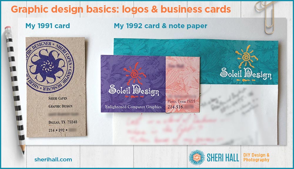
Graphic design basics: my 1991 business card
What I did right:
- I had a simple but interesting logo. I like the S rotated around the center point. I ran my name and title along a circular baseline around the S mark. I used Bodoni Bold Condensed, an excellent choice.
- I used a non-trendy but fashionable typeface from the 1700s: Bodoni (it looks like bold condensed). I used it for the logo and the rest of the text underneath.
- I used small caps rather than all caps. I assume I looked at the text in upper case and lower case, but it was so long ago I don’t remember.
- I laid out the text so the left margin lined up with the center of the S logo. Considering I used a rubber stamp to free-hand print the logo on the cards, that’s pretty impressive!
- I ran the logo off the left side of the card for balance and interest.
- I kept the layout fairly simple and clean; that wasn’t hard to do when the only contact info I had was an address and phone number. No email, website, Twitter, Instagram, etc. because it was the good ol’ days.
- I laid out a vertical card (I’ve always liked vertical cards, and they were very unusual in the early ’90s)
What I could have done better:
- If I were to redesign this today, I would look at a condensed sans serif typeface for my name running around the circular logo. I think it might be a little more readable, especially on a rubber stamp.
- I would enlarge my name and title a tiny bit and separate them from the address with more vertical space to better organize the info. I’d have to reduce the vertical space on the rest of the text to compensate.
- I’d look at upper case and lower case for the info text.
The card:
- For the shoestring budget I was on, this was a pretty sweet design solution: buy some kraft recycled cover stock from OK-Paper; I think it was French Paper Co. brand. I laid out the cards in Illustrator, printed them on a black and white laser printer which was a really nice printer in the ’90s.
- I trimmed out the cards with an X-acto knife on the crops that I printed on my card art.
- I had a custom stamp made from my logo art. I stamped my logo onto the cards using a purple ink pad. It was a bit labor-intensive, but I was young and had plenty of time on my hands (no cell phones or social media distractions 😉 ).
- I spent time, not dollars on this business card solution.
- Some info has been digitally blurred on purpose.
Graphic design basics: my 1992 Business card and note paper
What I did right:
- I like the layout and the strong background color. In the ’90s when business cards were a lot less interesting than today, this card really stood out.
- I think the choice of Goudy for the non-logo text is fine. Goudy was created in 1915, so it has stood the test of time and it’s based on the Italian Renaissance which is a good bit older. If I were redoing this today, I would use a different face.
- I made the phone number larger than the other text because that was the info most people were looking for.
- I included a tagline, since it really doesn’t otherwise say what Soleil Design does. Haha, yes, “Enlightened Computer Graphics” was what we came up with. I don’t think the general public had a good idea of what graphic design meant (do they today?) so we went with computer graphics because that seemed to get the point across better. And computers used for art were new and cool!
- I have always loved engravings for artwork, so I still like that in the background.
- I like the color choices for both pieces together, but I would do it differently today; the purple and orange is not a good contrast.
- I much prefer the aqua and yellow color scheme to the purple and orange today.
What I could have done better:
- Oy, that logo typeface!! WTH!! No, I wouldn’t do that again. I think I found it in a book and traced it by hand, then scanned that in to Illustrator and traced it again, digitally! Whew!
- Past Sheri was super resourceful but should have gone with a more traditional typeface. Remember there were far fewer digital typefaces available back then and the ones you could find cost serious money, so if I wanted something novel, I had to do it myself.
- Clearly this typeface was not a good choice! It’s too rough and fussy, looks a little like Halloween.
- I don’t mind the sun too much because it’s what soleil means in French. I knew the logo had to include a sun. I prefer the suns I used in later Soleil Design logos, but this was fine for my early days.
- The only other thing I should have improved was the orange on purple. There’s not enough contrast. At lease the text is white making it easier to read.
- I should have put the yellow sun on the purple card or made the card yellow and aqua. There’s plenty of contrast on the notepaper. I would guess the card looked better on screen, but didn’t quite translate to paper.
Graphic design basics: The takeaway
It’s unusual to be able to look back 27 years and critique your work; that is a gift you might be given if you stay in the same field long enough and you’re a packrat!
What would I advise a young designer based on my recent experience?
- Don’t be too hard on yourself.
- Keep it simple until you have a solid grasp of what you’re doing with regard to typography, layout and logo design.
- Look at design around you. I used to read Print and HOW magazines religiously. I learned a lot about running a design business and fine design.
- Stay away from trendy typefaces. Go for traditional faces from the 1800s–1900s until you understand what makes a good typeface and then look for newer faces that fall into that category. No one-hit wonders!
- If you’re printing a job, get a paper proof from your printer so you can be certain you’ll be happy to pay for whatever comes off the press. A screen proof won’t cut it until you have years of experience.
- Keep in mind that everyone is not under 35. Older people need reading glasses, so make it a little easier on everyone and bump that font size up a bit. For business cards, I wouldn’t go smaller than 10, 9 minimum.
- Don’t let budget or other limitations limit your creativity. This is the perfect opportunity to come up with a great idea to work around your limitations.
- Quality paper matters. Go to the paper stores (not Office Depot/office supply) and look at paper swatch books to expand your horizons with regard to paper.