Have you seen any good horror movies lately? I recently saw an instructional video by someone demonstrating how to design a logo in Canva. Holy cats, you guys — it was scary! But I kept watching making a mental list of why this is not at all what one should do if they are aiming for a professionally-designed logo.
After I picked up my jaw off the floor I knew I had to warn others why this is a terrible, horrible, no good, very bad idea.
- We all want a good-looking logo
- We all want to save it in the correct formats so we can resize it without a loss in quality
- We want to be able to layer it on top of other art without the white box behind it
- We all want to be able to use high-quality typefaces (I hope)
How does Canva deliver on these wants/needs? Ummm, not so well.
Incidentally, if you’re about to embark on a logo design project for yourself or a client, check out my Logo Design Questionnaire, a free printable PDF:
Here are my 5 reasons why you should not do a Canva logo design IF you’re aiming for a professional logo.
Reason #1 to not do a Canva logo design – Canva does not create a vector file
If you’re aiming for a professional logo, or really any useful logo art, it has to be vector. Canva produces raster art. If you pay for the premium version you can have it create a really large file (whaat some might call high res), but it will never be a vector file.
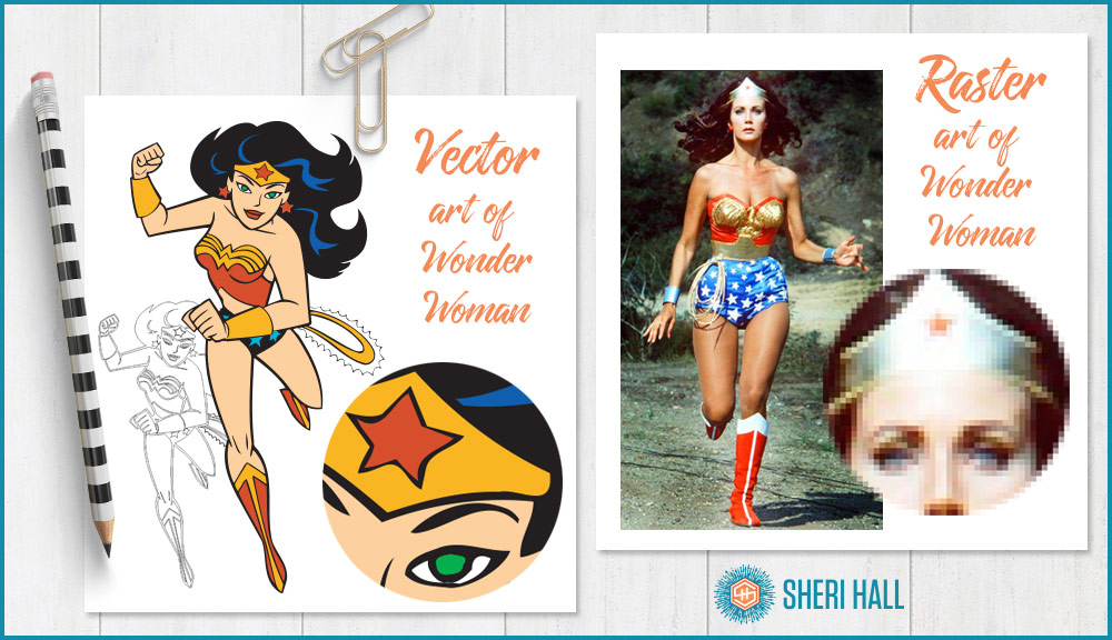
Vector files provide code for the outlined shapes of your artwork rather than a list of the colors in a grid of dots (raster). If you want a refresher on the vector vs. raster differences, check out my post Vector and raster art — what’s the difference? where I used Wonder Woman and Buffy the Vampire Slayer to demonstrate the difference.
As far as professional logo design is concerned: vector good, raster bad. In my opinion, this alone is enough reason to not use Canva for logo design. Yep, I said it!
Here’s a graphic from that post demonstrating the difference between vector and rester art:

Reason #2 to not do a Canva logo design – The typeface selection and type controls are fairly limited
This one is a 2-fer!
One of the most important aspects of logo design is choosing a great typeface. The free version of Canva has limited typeface selection. The paid version, Canva for Work, allows you to upload your custom typefaces. You can only upload one face at a time, so it would take a long time to upload a large family.
Canva for Work is a monthly subscription so you have to keep paying to keep using it.

As for type controls, see the illustration above.
- Illustrator has several precise controls for your type. It has the usual type size (does not have to be a whole number!) and letter spacing (tracking), as you might expect. (Canva has this.)
- Illustrator also has leading (the vertical space between baselines) which can be set in any increment you want — how about 14.05 points? Yes! (Canva has this; it calls it line height.)
- Illustrator gives you excellent control over kerning (the space between one certain pair of letters). Canva does not have this.
- It lets you change the vertical and horizontal scale of your letters. I don’t recommend this unless you really know what you’re doing, but hey, it’s in there. Canva does not have this.
- It allows you to baseline shift a character or series of characters so they fall above or below your baseline. This is great for the TM symbol. Canva does not have this.
- Illustrator allows you to rotate characters individually rather than rotate a whole block of text (will, it allows that too, but not in the character palette. I’ve never used this, but it’s in there. Canva does not have this.
- Illustrator also has a separate tab for paragraph controls — indents, space before, space after, etc.
Reason #3 to not do a Canva logo design – Canva can’t turn text to outlines for further editing
One of the coolest things you can do with your logo design is pull out one main letter or letters and create a unique mark with them. This is done by setting the type in the face that you want it and having Illustrator create outlines from it. This means it becomes an editable shape and it is no longer text, according to the computer.
This technique is also useful for editing letter shapes for a more custom logo design. For example:
- Remove the cross bar on a capital A
- Remove the middle crossbar on a capital E and put a leaf in there instead
- Extend the descender on a j so it goes lower
- Extend the ascender on a d so it goes higher
Reason #4 to not do a Canva logo design – You’ll end up with a white box around your logo
Because Canva is generating raster files instead of vector files, it retains the white background of your art board.
The png format that Canva uses is capable of transparency, but you can only save your art that way if you have the pay version.
When you design a logo in a vector drawing program like Adobe Illustrator or Affinity Designer, the art does not include the pasteboard. The .ai, .pdf, and .eps formats allow transparency so you can easily place your logo on whatever background you want.
Reason #5 to not do a Canva logo design – It’s just clunky
Remember that horror movie I told you about at the beginning?!? I watched this poor woman struggle to get some box outlines that she had running around the text to be perfectly even and symmetrical. She needed to get the line weight consistent and the position consistent. In Illustrator it would have been a breeze, but Canva made it look painful.
Bonus reasons to not do a Canva logo design — straight from the Canva site!
In researching this article I wanted to confirm that Canva still doesn’t export vector files and I found this super useful page full of warnings about doing logo design in Canva: https://support.canva.com/legal/licensing/using-canva-design-logo/
Here are some highlights:
“Canva’s pre-made logo layouts and elements are used by many people, so your logo will not be exclusive to you if you don’t heavily modify the design and elements.”
Logos cannot contain elements from Canva’s image library, either free or paid, as per section 4i of our license agreements.”
“Also be aware that logos are most useful when in a vector format so that they can be scaled to any size without losing resolution. Canva doesn’t yet support exporting in any vector formats…”
“so we recommend making your logo as large as possible and exporting in print quality PDF format (300 dpi).”
So where does that leave us? If you have to use Canva for logo design, use the free version to come up with your logo idea, export it and send it to a professional designer. He or she should be able to recreate something very close to it but substitute some higher quality typefaces, fix the kerning if you have some misbehaving letter pairs and polish it up.
By creating your logo in Illustrator, you’ll easily be able to generate both vector and raster files in color, all black and all white to suit all your needs. Boom! Illustrator to the rescue! Canva problem solved. If you don’t want to pay Adobe’s monthly subscription fee for Creative Cloud, consider the one-month free trial or purchasing Affinity Designer which is a flat fee of $50 (no monthly subscription).


