If you’ve been stressing out about your logo design because you think you need a killer icon and the perfect casual script, you can chill out now! None of that is necessary for a good logo or a successful business. Folks, I have some welcome news for you: you don’t need that killer icon. You can design an awesome text logo using classic typography and maybe add some simple shapes!
One key to designing a text logo is consistency of use. Another is to vary something so you’re not just setting your words in one typeface and calling it done. This post covers 5 simple tweaks to make to your logo so it’s not just a plain typeset logo (not that there’s anything wrong with that). Don’t do them all! One is enough!
Everyone wants a logo that is unique, readable, memorable and fits their brand.
If you think you don’t have a brand because you haven’t had your logo “designed,” let me assure you that your brand is whatever you’re showing to the world, even if it’s something super basic that you typed in Word or WordPress. For consistency’s sake, it’s best to go ahead and create your text logo as a cohesive logo mark so it looks the same across all media and uses.
Text logo design
In a previous post I used real-world examples to illustrate how easy it is to create a text-only logo, if you use the right font and use some simple techniques to make it more of a visual brand. Check that out if you haven’t already. It’s a good pre-req for these 5 tweaks.
Even if you’re only using letters, there’s still a lot of variations to play with. Consider playing with:
- The weight of your letters — light and airy, medium weight or bold and heavy?
- The case of your letters — all caps, all lower case or some combinations. What about small caps?
- The slant of your letters — italic or oblique
- Color — are all the letters the same color, or varied by word?
- Can you add a simple shape to customize your logo? (See below for examples)
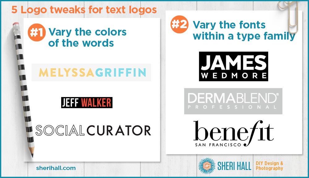
Text logo tweak #1: Vary the color of one or more words in your logo
The first tweak is to make the words different colors and use the color change to visually separate the two (or three) words. In this case you can eliminate the space between words for a more custom look.
- This technique can work on a light or dark background
- Outline one of the words to separate them (be careful with outlining; set the stroke to outside the letter shape in Illustrator rather than inside or you will alter the shape of the letter)
- These 3 examples are all caps which gives the overall logo a blocky look
- These 3 examples are all sans serif typefaces which gives them a stronger, sturdier feel
Text logo tweak #2: Vary the font of one of the words or letters in your logo
The second tweak is to vary the font from word to word; to keep it simple I recommend keeping the type family the same and just vary the weight or slant (italic).
- The simplest thing to do is separate the words by making one of them bolder than the other. When you use a type family with a bunch of different weights, you get a lot more options here: thin, light, book, medium, bold, black, ultra, etc.
- As with tweak #1, changing the font helps visually separate the words so you don’t need to add a space between words
- Alter the size of one of the words (this looks better if you’re stacking the words, as on James Wedmore)
- Try altering one letter instead of a whole word
- Alter the font or letter to an italic or oblique version of your chosen font (notice the ball on the top of the f becomes the dot on the i of benefit)
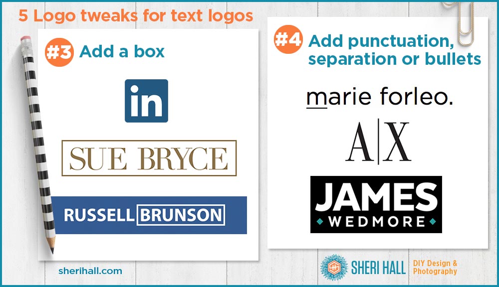
Text logo tweak #3: Add a box around your logo
OK, we’re taking it up a notch here! We’re adding another element to the logo, but still keeping things simple, with no icons.
- Set the name in the font that you want and add a box around the whole unit.
- This technique works best with all capital letters since they create a visual box shape anyway with no height variation in the letters
- Russell has a different take here and puts the box around his last name only
- When you add the box, be sure to give enough room around the letters so they have breathing space, but not so much that the text is swimming
- Another option is to make the box a different color from the text
- Another option is to make the box a double rule outline, possibly varying the width of the rules
- Experiment with rounded corners
- Another option is to make the box a solid color behind the text; be sure to create enough contrast so that it’s easy to read. Also, and this is super important: if you’re using a light-colored serif font with tiny details and reversing it out of a dark box, go one step thicker on the text so the details don’t fall apart.
Text logo tweak #4: Add a punctuation mark or separator mark to the logo
For trend #4, we’re getting a little (very little) more complicated by adding punctuation or other simple shape to the text logo.
- For this tweak, I would keep the shape super simple — no flowers or printers’ ornaments that get too fancy
- Think simple geometric shapes, like squares, circles, lines. What happens when you rotate a square 45 degrees? A diamond!
- You can put a separator between your words or letters
- You can add shapes at the beginning and end of your text
- You can add shapes above or below your text
- You can add shapes inside your letters if it doesn’t get too tight. Think capital O, D
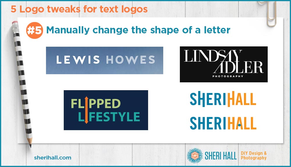
Text logo tweak #5: Manually change the shape of a letter in your logo
For trend #5, we’re getting a little more complicated. We’re going to look at manually changing the shape of a letter so you’ll want to have some basic Illustrator skills for this. Start by selecting the block of text and going to the Type menu >> Create Outlines to change your text into shapes.
- Choose one letter and move the handles or corner points to change the shape
- Choose one letter and make the vertical stroke(s) taller or shorter
- Choose one letter like the capital A and remove the crossbar; you can replace it with a diamond or round bullet if you’re feeling daring!
- Choose one letter and remove the counter (the hole in the donut) so the letter fills in; then you can add a simple shape (from tweak #4) in the center
(If you want a refresher on what a counter is, see my post on The Anatomy of Type) - This technique can be subtle or dramatic depending on how much you alter the letter shape
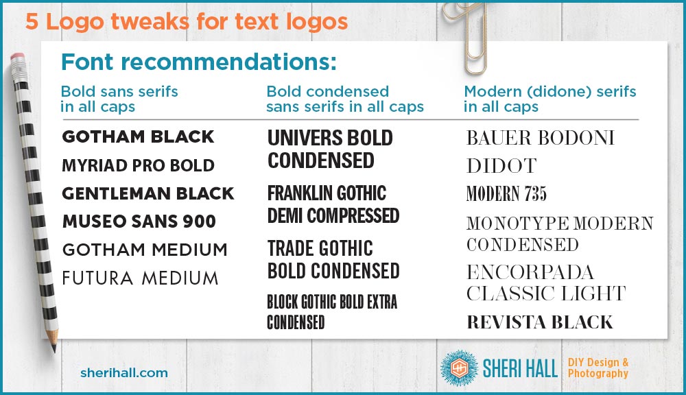
Text logo font recommendations
Although this post does not focus on which fonts to use for your logo design, I’ll leave you with this short list of readable and classic and fonts to consider. You can’t go wrong with these. If you want to see them in use in the real world, read my post 3 Logo trends for text-based logos.

