Howdy folks! This is Big Tex. Welcome to the State Fair of Texas! … Ah the familiar words of the iconic statue at the State Fair of Texas.
Today we’re taking a look at a very successful brand and learning what we can from its brilliance!
- We all want a strong logo and brand that identifies us immediately to people
- We all want a consistent brand so all the art we present online and in print looks like it came from the same place
- We all want a solid, predictable set of graphic assets so when it comes time to generate new art, it will be quick and easy to generate without the hassle of picking new fonts and colors
Before we look at the particulars of this brand, here are a few interesting facts about the State Fair of Texas, just to give you some background.
https://en.wikipedia.org/wiki/State_Fair_of_Texas
The State Fair of Texas is an annual state fair held in Dallas at historic Fair Park. The fair has taken place every year since 1886 except for varying periods during World War I and World War II. It usually begins the last Friday in September and ends 24 days later. While an annual attendence of over 2 million, it is consistently recognized as one of the most highly attended and best state fairs in America as well as Dallas’s signature event.
- On November 7, 1886, the fair closes and attracted over 100,000 people for the very first year.
- Big Tex makes his first appearance in 1952.
- In 1985 the Texas Star opens as the largest ferris wheel in North America.
- On October 19, 2012, Big Tex caught on fire, burning it down to the skeletal frame, with only the right arm remaining.
- In 2017 the State Fair of Texas attracted a total of 2,250,433 attendees with roughly 93,000 daily guests
Branding case study: State Fair of Texas
What is the brand for the State Fair of Texas? What does the fair want to be known for? What do they want people to think when someone mentions Big Tex or State Fair of Texas? All of this is considered the brand of the State Fair. For me, these things come to mind:
- Southern hospitality (Howdy folks! I’m Big Tex)
- Family-friendly (games, rides, petting zoo, baby animals, starlight parade)
- Fun for all ages (car show, creative arts, music concerts, ballet folklorico, pig races)
- Adventures in food (corn dogs, all matter of fried foods, cotton candy taco, deep fried elotes, bacon wrapped Twinkie dipped in funnel cake batter!)
- Good old-fashioned fun for most people
- Larger than life because everything is bigger in Texas!
How does the State Fair translate this brand into their graphic image, as in how do their graphics reflect, southern hospitality and fun and attractive to a wide variety of people?
- Creating and using the Big Tex icon in the logo and all over Fair Park and merchandise
- Using primary colors for the logo and bright, bold secondary colors (it is assumed that children respond best to primary colors)
- Using a variety of bold, retro typefaces (2 condensed serifs, 2 bold sans serifs and one script, detailed in a graphic below)
- Several of the typefaces have a speckled look to give the image a retro/vintage feel
- Using the Big Tex icon on the signage at the info centers (Y’all need help?)
- Using bright colors and fun display typography on banners throughout the park (howdy folks!)
- Having state fair employees wearing bright colored, casual tee shirts and jackets with Big Tex prominently displayed
- Using colorful, fun photography that shows happy families easting corn dogs, riding rides, etc.
- Using oversized type and graphics that bleed off of the edge (larger than life)
- Using southern language for Big Tex and on signage (Y’all need help and Howdy folks!)
Incidentally, if you’re about to embark on creating your own logo and branding, download my free, printable PDF logo design questionnaire that I start off every logo design project with:

OK, now let’s identify these assets and take a look at them in action!
Branding case study: State Fair of Texas logo
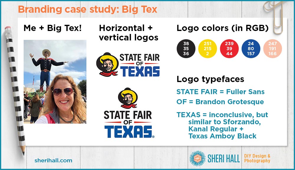
The logo comes in a few different versions. These are the 2 multi-color versions; one is horizontal with Big Tex icon on the left and the other is vertical (squarish) with Big Tex on top.
The colors are very close to primary colors: red, yellow and blue plus black and flesh. The example above shows the RGB (red-green-blue) color codes for each color.
The logo uses 3 typefaces and all text is in all capital letters (as is more state fair branding). I used a couple different online service to try to identify these faces. One is Font Matcherator from Font Spring – https://www.fontspring.com/matcherator
And the other is What the Font from My Fonts – https://www.myfonts.com/WhatTheFont/
They are not exact, but I think it did a pretty good job on the top line here.
The top line State Fair is Fuller Sans. – https://www.fontspring.com/fonts/dtp-types/fullersansdtcond
The OF is small but I think is is Brandon Grotesque which will come into play later on with the other branding typefaces. – https://www.myfonts.com/search/brandon+grotesque/#item_3
The TEXAS was inconclusive as the X shape was not quite round enough on any of these to match the logo, so I listed all of them.
Sforzando – https://www.myfonts.com/fonts/pintassilgo/sforzando/regular/glyphs.html
Kanal Regular – https://www.myfonts.com/fonts/t26/kanal/regular/glyphs.html
Texas Amboy Black – https://www.myfonts.com/fonts/parkinson/amboy/black/glyphs.html
Branding case study: State Fair of Texas brand assets
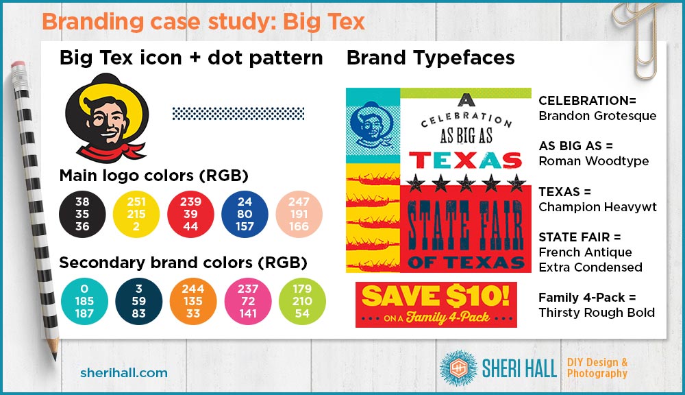
The main icon in the State Fair of Texas brand package is the Big Tex head icon. It appears everywhere around the fair in a one-color version and the 4-color version you see above (black, yellow, red and flesh). There are 2 other icons that are commonly used: the 5-pointed star and the corn dog on a stick with a squiggle of mustard on it.
The secondary colors in the brand are aqua, dark blue, orange, pink and chartreuse green. I’ve ordered these colors by how common they are in the brand, with aqua being most common and green being least common.
OK, now my favorite part! Let’s talk type! The State Fair typefaces blend together really well, but it would be tough for a rookie designer to pull this off. They’re breaking the main rule of combining typefaces which is to use contrasting faces. Instead, they use 2 condensed serif display faces and 2 bold, speckled sans serifs, all in capital letters! There is one script typeface, so at least that provides some contrast to the others.
Refer to the graphic above to see what each face looks like. Here’s the rundown:
CELEBRATION is Brandon Grotesque Printed. The default Brandon Grotesque is not speckled, but the printed version is. State fair branding uses both versions, but the Printed version is shown above.
Brandon Grotesque – https://www.myfonts.com/search/brandon+grotesque/#item_3
Brandon Printed – https://www.myfonts.com/fonts/hvdfonts/brandon-printed/
AS BIG AS is Roman Woodtype JNL. It’s a bit western looking, condensed serif that only comes in caps.
https://www.myfonts.com/fonts/jnlevine/roman-wood-type/
TEXAS is set in Champion Heavyweight (extra bold extended sans serif); it is a bold sans serif with a retro look. Here it is shown in all caps though it comes in upper and lower case. https://www.fontsmarket.com/font-details/champion-htf-heavyweight
https://www.typography.com/fonts/champion-gothic/styles/
STATE FAIR is French Antique Extra Condensed; this face contrasts enough with the Roman Woodtype that you shouldn’t confuse the two, but it is unusual to use two condensed serifs in the same brand. French Antique is more novel and unique so it is used sparingly. Hey, at least they followed this rule — use more uncommon faces with restraint. https://www.myfonts.com/fonts/woodentypefonts/french-antique/
FAMILY 4-PACK is Thirsty Rough Bold. This is the lone script in the brand package. It is used sparingly and contrasts well with all of the other faces.
https://www.myfonts.com/fonts/yellow-design/thirsty-rough/
This is a brilliant example of how to combine typefaces, type sizes and colors to support a brand. Learn from it!
If you want to know how I identified the brand typefaces, shoot me an email at sheri @ sherihall.com. I like to keep my best ninja secrets private and only share them with those who are super geeky about this stuff like me 🙂
Branding case study: State Fair of Texas in print + online
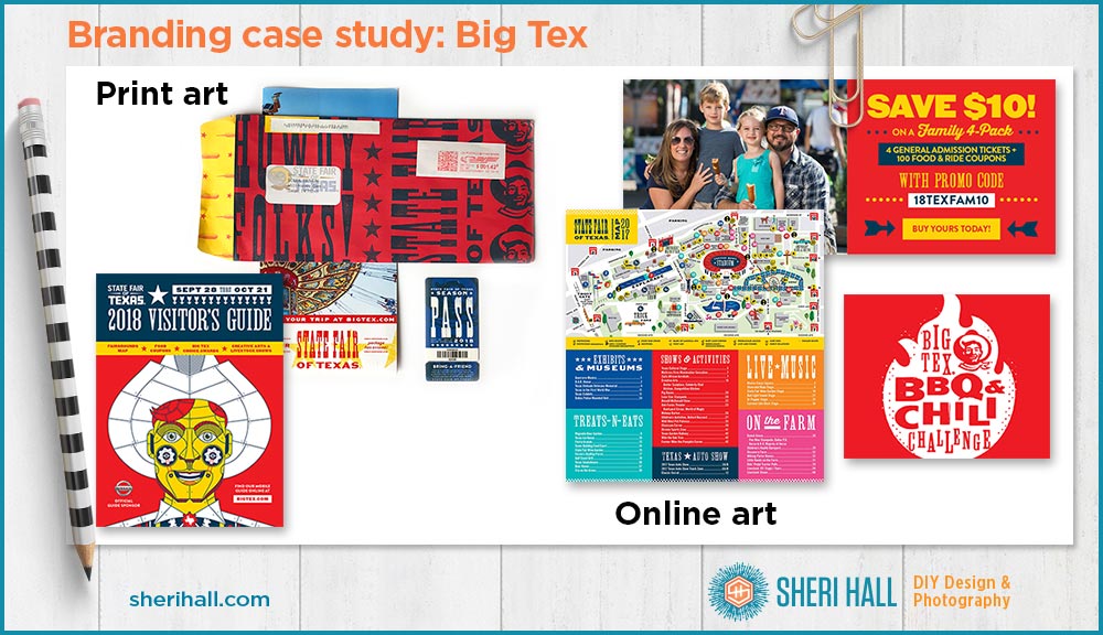
I bought a season pass for the fair this year. I’ve included a photo of the oversized envelope. The front of the envelope keeps a low contrast of red and blue so it doesn’t interfere with the mailing info for the post office.
Notice how the Big Tex icons run off the side of the envelope as do the words Howdy Folks! And State Fair of Texas. This is a great technique to make people associate BIG with your brand — so big it doesn’t fit on the envelope! Even with the art being covered up by mailing stickers, it’s obvious that this mail is from the State Fair of Texas because it’s consistent with their brand.
Every year the fair has a different theme. 2018 is innovation so the illustration of Big Tex on the visitor’s guide has some mechanical drawing aspects to it.
The art online art reflects the brand well. There is a photo of a happy family eating corn dogs and consistent colors and typefaces to create the rest of the graphics. I like how the actual graphics are kept to a minimum because the brand uses typography and color in such a graphic way. There are also dotted lines, dot patterns and arrows that help with this, though they are minimal as graphics go.
Also notice how effective the Big Tex icon is in one color — red.
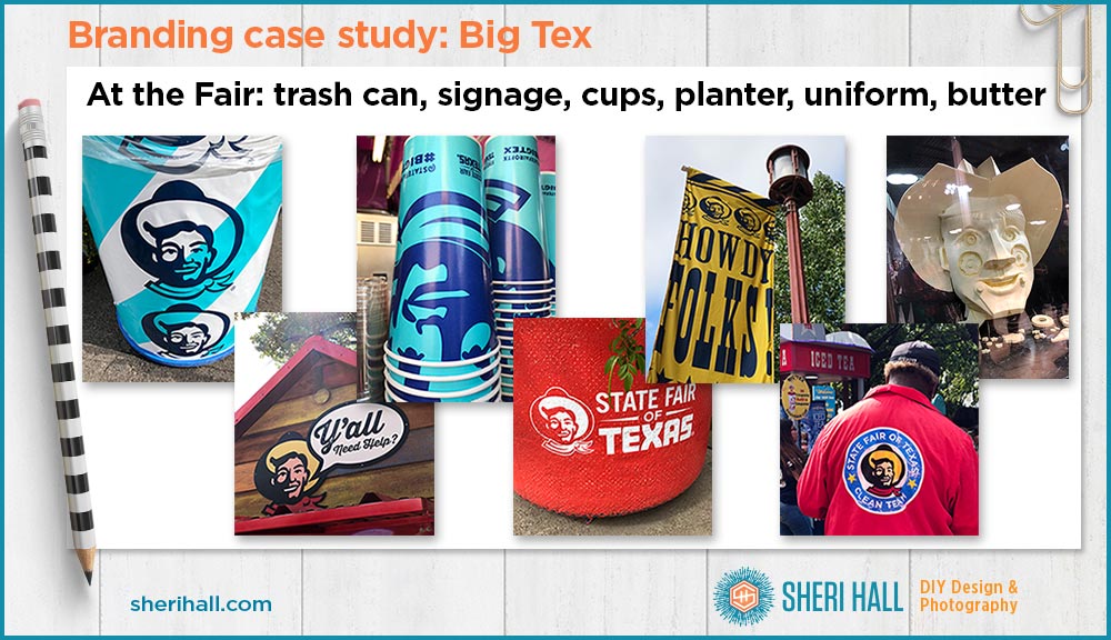
Branding case study: Around the fair
This is where the branding really shines! If you don’t know you’re at the State Fair of Texas and there’s some character named Big Tex that is associated, with it — what is wrong with you!?!
Big Tex is everywhere! He is prominent on the cups, the trash cans, the planters, the banners and the uniforms of fair employees.
In keeping with the brand, all the colors and typefaces used in the branded art around the park are consistent with what I identified earlier. Notice the stack of cups — the Big Tex icon is so big, his hat is not on the cup. As I pointed out earlier, Big Tex is big and everything is bigger in Texas!
The photo on the right end is technically a piece of art and not part of the fair branding, but it was too cool not to show it. This is the butter sculpture; every year there is a different butter sculpture inside a refrigerated display room in the creative arts building. This is the innovation illustration of Big Tex from the cover of the visitor’s guide translated into butter. Yes, the state fair has something for everyone!
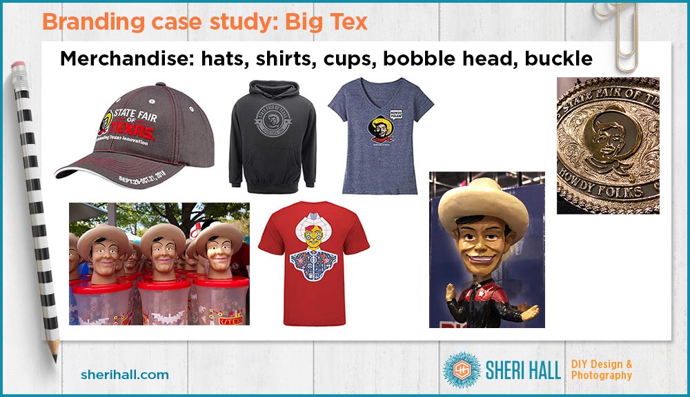
Branding case study: Merchandise
When you have a successful iconic brand like Big Tex, you might as well put him on some fun merchandise to sell and make more money off of it!
The photos above show the usual suspects for merchandising — hats, hoodies and tees. There are some other fun items too: the Big Tex cup lids, a bobble head and a big metal belt buckle. How Texan is that!?! There are also keychains, shot glasses and a cookbook. If you want to see more goodies, here’s the Big Tex store: https://bigtexstore.com
Branding case study: How to create a successful brand
And there you have it! Big Tex is one very successful brand. If you are wondering how to extend your brand across a family of print pieces, web design, signage, packaging, real world elements and merchandise, study the State Fair of Texas and how they manage to keep a consistent look without letting it get stale. They have a nice, bold color palette and a flexible set of typefaces to create attention-grabbing and attractive art that represents the brand.
2 main points about a successful brand: keep it consistent and put it on everything!