Learning to pair or combine fonts is one of the most fun, tricky and rewarding pursuits in graphic design.
If you learn font pairing well, it will take your design skills to another level. It takes practice and style sense to know when a pair is just not working, and when one is golden. This post will share some tips for how to pair fonts and show a bunch of examples for you to use until you get the hang of it. I’ve been pairing fonts for 25 years and I still find it fun to play around with. Not everything I try works on the first take, but I’m happy to keep at it and try different combos until I nail it.
Note: Before we get started I’d like to set down some old-school definitions when it comes to type. The word font probably doesn’t mean what you think it means. In the early years of desktop publishing the word font became a catchall term for font, typefaceface and family, but they are actually three distinct terms.
- A font is a set of text characters in a specific style and size: Helvetica Bold 24 point
- A typeface is a set of fonts (size is not part of this): Helvetica Bold
- A type family is the set of all the design variations of the typefaces, like bold, italic, bold italic, black, black italic, etc.: Helvetica
Today the terms are used interchangeably, unfortunately. I assume that is because most people don’t know the distinctions. In my own research trying to name blog posts to work best with SEO (search engine optimization) concerns, I end up using the word font when it is not the correct term(!) This annoys me, but I can play the SEO game and have my posts come up relevant to people who are looking for typography advice, or I can go hide my head in the sand and be “right.” So I choose to do a little of both.
I use the word font in my posts, but about 99% of the time I really mean and would prefer to use “typeface” or “face.” And I use the word typeface because it’s what I really mean.
Now, where were we …
Advice for font pairing
1. Use high quality fonts
This might seem obvious, but based on what I see in the real world, it isn’t. You can’t successfully combine typefaces if you’re using poor-quality faces to begin with. The examples and advice in this article are geared toward “print” design, where the designer has ultimate control over type decisions, although the end product could be a PDF for download, or a JPEG for a social media graphic.
If you want a short list of Sheri-approved serif faces and sans serif faces, check out these blog posts:
The Wonderful World of Sans Serifs
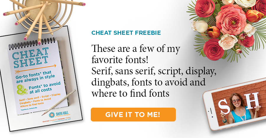
Do you get overwhelmed or underwhelmed when trying to pick the perfect font from your font menu? Put an end to that by downloading my designer-recommended list of go-to fonts that are always in style. Click that big orange button below to download it.👇 👇 👇
2. The less experience you have pairing fonts, the fewer fonts you should pair
If you have no to little experience combining fonts, choose only two type families to combine. If you have more experience try three, but the fewer you choose the easier it is.
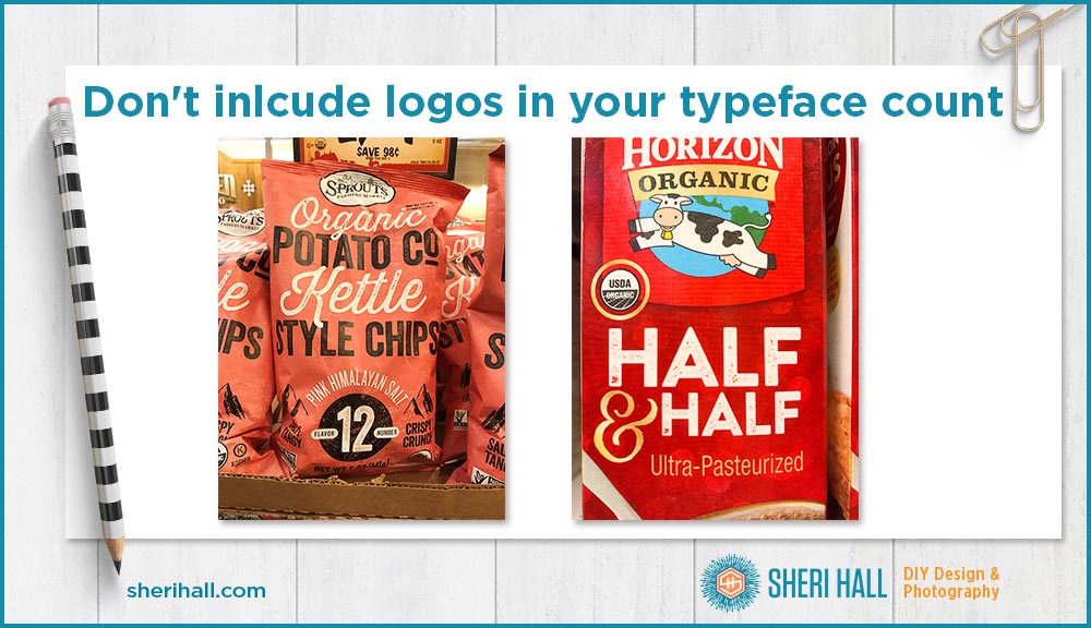
A note about logos: if you’re combining fonts on a package design, I don’t consider the logo typeface of the company to count as one of your faces. It’s a separate piece of art so don’t design around it or include it in your font count.
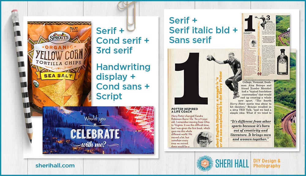
In the following examples, the Sprouts and Horizon Organic logos are different typefaces than the product name and that’s OK because logos are a separate element.
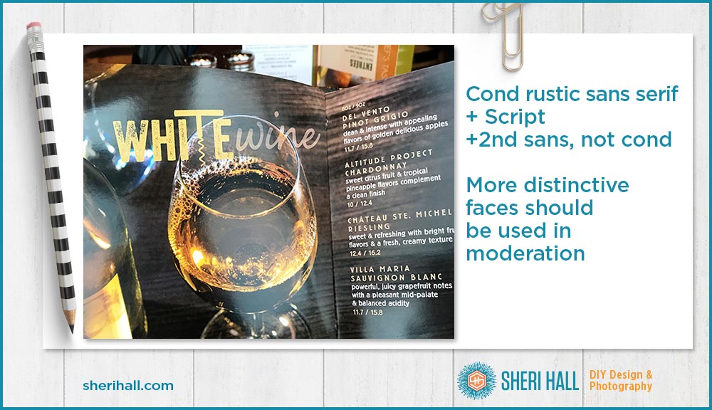
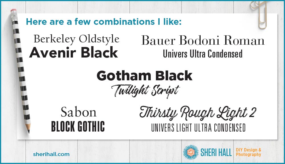
3. Choose contrasting type families — this is the key tip — contrast!
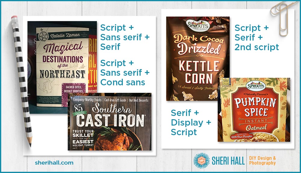
- One script + one serif
- One script + one sans serif
- One serif + one sans serif
- One condensed sans serif + one regular width bold sans serif
- One condensed sans serif + one regular width sans serif + one character of a script (ampersand)
- One display typeface + one script + one serif
The worst thing you can do when pairing fonts is to choose two similar type families like Helvetica and Futura, or Garamond and Times New Roman. It’s redundant and looks awkward. Pick one or the other and then choose a contrasting typeface.
If we look deeper into the subcategories of serif and sans serif, a good rule of thumb is that modern serifs (those with dramatic contrast between thick and thin strokes like Bodoni) pair well with geometric sans serifs (those with circular shapes and even strokes like Futura).
Old style serifs (with less contrast between thick and thin strokes, non-blocky serifs like Garamond) pair well with humanist sans serifs (those with variations in stroke width and a little more curve to them like Gill Sans).
For a quick guide to the serif and sans serif subcategories look at the examples from these posts:
The Wonderful World of Sans Serifs
4. Use display or novelty fonts sparingly
Unusual or hard-to-read typefaces should be used the least. Use them as accents only. If you’re wondering what qualifies as a novelty font, consider if the font in question could be used in a 5-sentence paragraph of body copy, be easily readable and taken seriously, all at the same time. If not, you may have a novelty font on your hands. Be cautious!
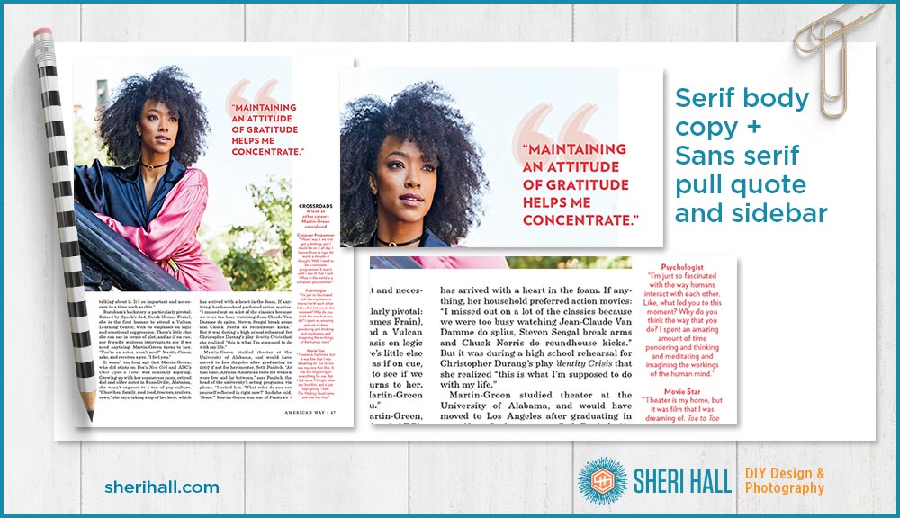
5. Font pairing for projects with body copy
If your piece is mostly body copy, choose one type family for the body copy (probably a serif) and one typeface for the headers or subheads (probably a sans serif). Within the body copy you can use bold and italics to add a little spice, but keep that to one family. You can also use your subhead typeface for sidebars, pull quotes and notes/credits at the end.
If you want to throw in a third family, try the page numbers if you have them. That’s a fun spot to add a little kick to your design.
You can also add interest by using different colors for different blocks of copy rather than using more typefaces. It’s a safer choice but still adds zing to your design. In addition to the example below, refer to the Harry Potter piece from tip 3 to see this in action.
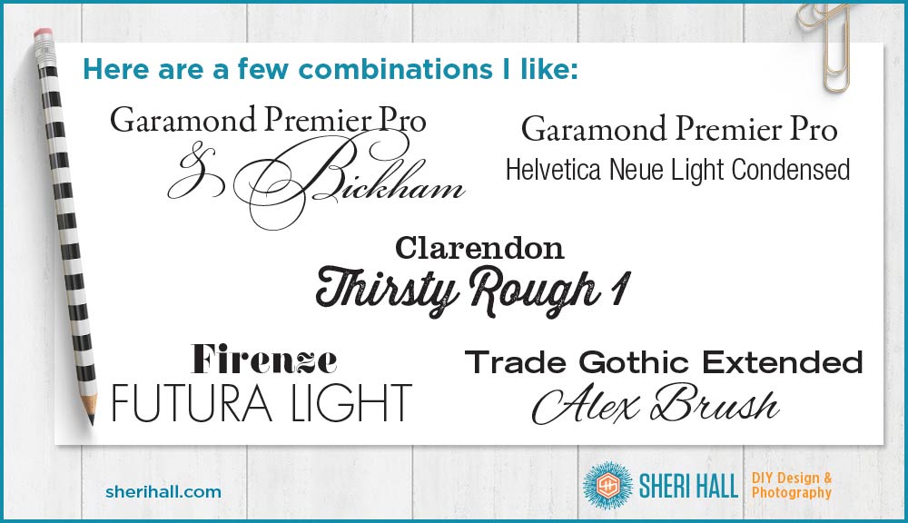
Font pairing examples
Do you get overwhelmed or underwhelmed when trying to pick the perfect font from your font menu? Put an end to that by downloading my designer-recommended list of go-to fonts that are always in style. Click that big orange button below to download it.👇 👇 👇
Observe the world around you for good combos and practice, practice, practice. As you feel more comfortable, experiment more. Many of my photo examples came from packaging at Sprouts. The Harry Potter examples came form American Way magazine. Magazines are great places to look for font combo ideas. The next time you’re near a book store (or in line at the grocery store), check out the magazine rack and pick up some fashion, entertainment and cooking magazines to see what gems you find.
Do you like pairing a script with serif or sans serif, or do you prefer pairing serifs with sans serifs? If you combined one of each, what would they be? Comment below. The possibilities are endless so there are a lot of right answers.