Logo design is serious stuff. It’s often the first design project for a new organization, and it sets the stage for everything that comes after it. It is the cornerstone of one’s visual brand. This post will take a step-by-step look at the process for how to design a logo, and end with a 3-minute time-lapse video.
Logo design is a lot of work and requires planning and research ahead of time so the design process goes smoothly and efficiently. Not surprisingly, a high-end, custom logo design does not come cheap. Once you see the process described below and the 3-minute time lapse video of a logo design project, you’ll see why! If you want to fast forward to the video, scroll all the way down.
1. Questionnaire
Before starting the design process I ask myself or my client a series of questions. Here are a few of them:
- What is the name of your organization, what does it do and who is your ideal target market?
- What should the logo convey to your target market?
- If you have an existing logo, what do you like and not like about it?
- Do you envision some sort of icon as part of the logo or should it be a text treatment? What imagery comes to mind?
- What 3-5 adjectives describe the look and feel of the new logo?
If you’d like to see my whole questionnaire, click on the big orange button below. It’s a free PDF to help you get this ball rolling.

2. Online research
I keep paper-based swipe files of well-designed brochures and direct mail I’ve received over the years so I have some printed material to help me brainstorm new projects. I also have a large library of design books featuring logos, business cards, brochures, tee shirts, package design and more. Flipping through a good logo design book helps get the creativity and “what ifs” flowing. If you haven’t built up a print library, you can search Google images and logolounge.com for some inspiration. I covered a bunch of graphic design resources in a previous post.
3. Pencil sketches
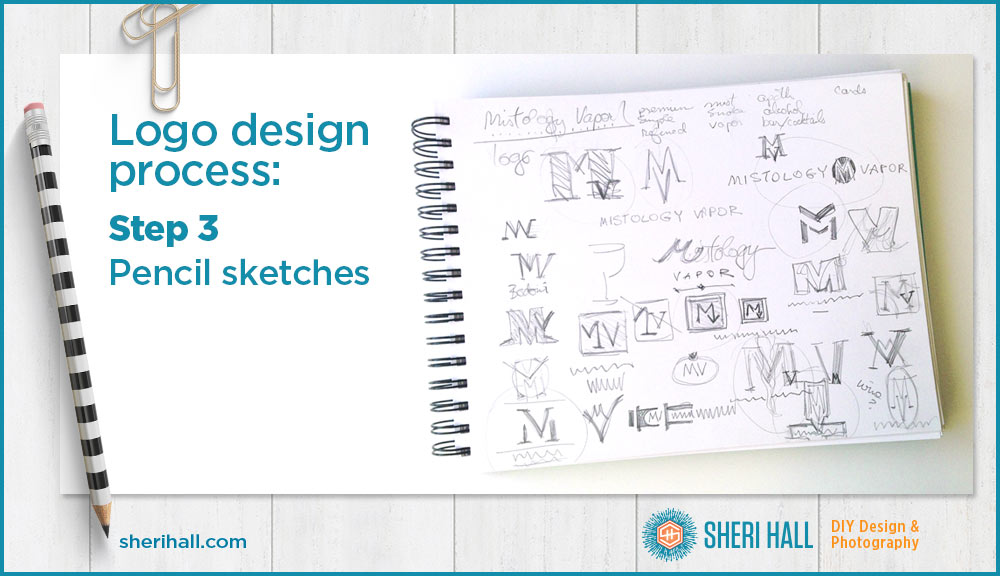
The real work begins with pencil and paper. I spend 1–2 hours sketching thumbnails (little logo diagrams). My thumbnails are not very detailed; they are meant to explore a bunch of ideas in a short amount of time. They don’t get as detailed as showing typefaces, just arrangement of elements and whether the type is in capital or lower case letters, condensed, serif, script, etc. Sometimes I don’t even write out the company name — I just scribble.
4. Digital comps
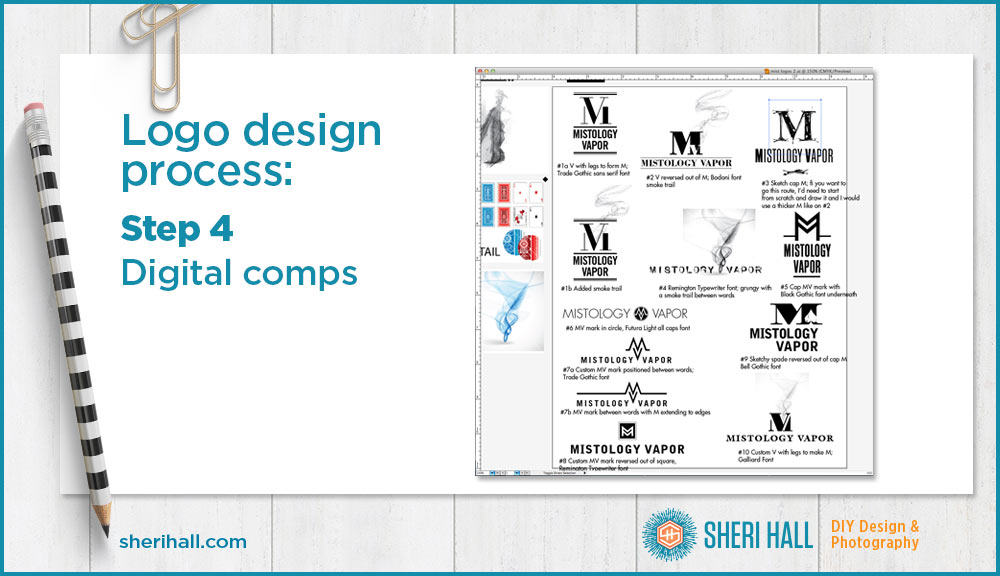
This is the most time-consuming part of the process, and where it starts looking like a real logo. I use Adobe Illustrator to recreate my favorite sketches in digital form and play with different typefaces on each one. When I have 3–5 serious contenders, I send just those options to the client for feedback. At this point the job is 75-80% done. It’s also the first time the client sees any design work. This is why it is super important to nail down the questionnaire answers and make sure designer and client are on the same page about the end goal before the actual design process begins.
5. Refining the logo
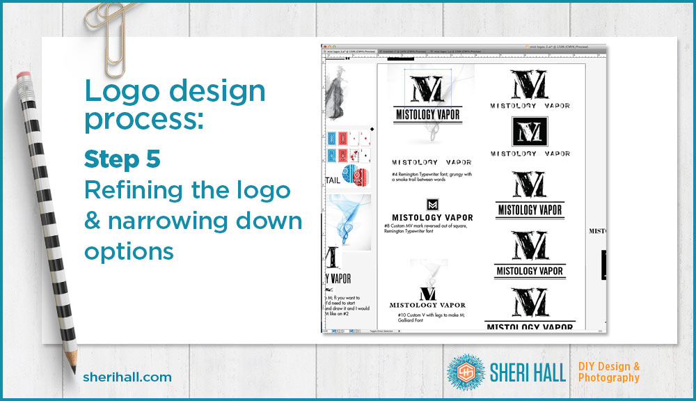
The client and I go back and forth a couple times via phone or email with revisions and feedback until we have a winner. I do all my design work in black and white because color is a distraction/variable we don’t need to deal with yet. It colors (stupid pun) people’s judgment against a logo when it’s really just the color they don’t like. Creating everything in black, white and gray solves that issue.
6. Color
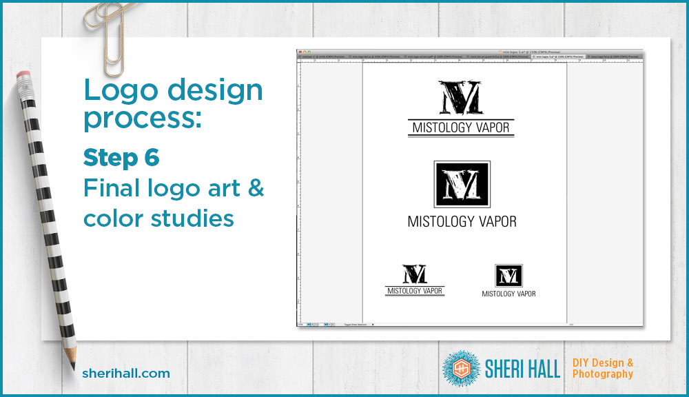
After a black and white logo is settled on, I do several color studies and send those off to the client to choose one or request revisions. For this project, black ended up being the color of choice so we did not explore beyond that. However, I did create the reversed out version (white on black) as an additional logo for certain uses.
7. File formats and style guide
When all design work is complete, I export the logo in various file formats (including ai, eps, pdf, jpeg, png) for print and screen use and I create a 1-page style guide documenting the typefaces and colors used in the logo for the client’s and their vendors’ reference.
And there you have it: the reason you should be suspicious of spending $5 for a logo design! If a skilled and experienced designer is going through all this work, you should expect it to cost real money. If you get a logo design bid that is suspiciously cheap, ask what their process is. If it doesn’t have these main components — questionnaire, sketches, several different digital comps, revisions, final files — run, fast!
Time lapse video of the Mistology Vapor logo design
Before you start any logo design project for yourself or your client, download and fill out my Logo Design Questionnaire:
Did you like the video condensing a long process down to 3 minutes? Did you like seeing an actual project come together from start to finish? What other aspects would you like to learn about logo design? Have you ever designed a logo? How does your process differ from this? Please let me know in the comments below.

