Your initials! Everyone has initials, whether it’s your personal name or your business name. If you’re not sure how to start a logo design project, this is a perfect place to start because we all have initials. This post covers 5 simple ways to create a text logo mark with your initials.
Another bonus: if you design your logo out of your initials it will be a more custom and unique mark, thus harder to steal!
If you’ve been procrastinating on your logo design project because you think it will be complicated, time-consuming and painful, let me help you get past that! It doesn’t have to be.
Folks, I have some welcome news for you: you don’t need that killer icon or trendy script. You can design an awesome logo using nothing but typography!
If you decide to design a text logo, you still want it to be unique, readable, memorable and fit your brand.
One key to designing a text logo is consistency of use. Another is to vary something so you’re not just setting your words a typeface and calling it done.
Read this post, say, “Aha,” and then try some of these ideas in Illustrator, see what you like best, save as .ai and call it a day. Sleep on it and if you want to tweak something tomorrow, you can do that. Just do it!
Btw, if you think you don’t have a brand because you haven’t had your logo “designed,” let me assure you that your brand is whatever you’re showing to the world, even if it’s something super basic that you typed in Word or WordPress. For consistency’s sake, it’s best to go ahead and create your plain text logo as a cohesive logo mark so it looks the same across all media and uses.
Even if you’re only using letters, there’s still a lot of variations to play with. Consider playing with:
- The weight of your letters —light and airy, medium weight or bold and heavy?
- The case of your letters — all caps, all lower case or some combinations. What about small caps?
- The letterspacing or tracking of your letters — are they far apart for an airy look or close together for a strong, sturdy look?
- Are color — are all the letters the same color, or varied by word?

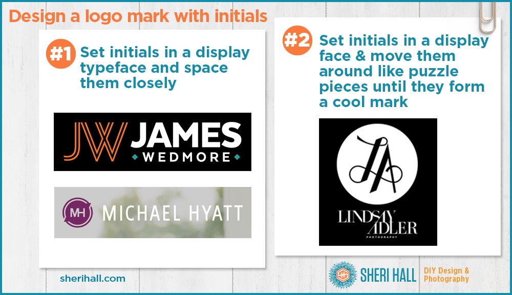
How to create a text logo mark with your initials #1 – Set the initials in a display typeface and space them closely to barely overlapping
For this example we’re looking at James Wedmore, podcaster and online course creator and author/speaker/coach Michael Hyatt.
- This inline typeface for JW (with a white line running through it) is a nice display typeface choice. (Display faces are used sparingly; if you’re wondering if a typeface is display or not, ask yourself if you would set a book in it; if not, then it’s probably a display face.)
- Notice the JW is very close at the top so the letters form one unit together.
- The JW mark is in a different color from the rest of the logo helping set it apart as its own mark.
- The JW mark lines up with the top and bottom of the rest of the logo so it all makes one nice contented logo mark.
- The MH fits together nicely because the right side of the M and the left side of the H are both vertical strokes; you need the right initials and typeface to make this work.
- The MH is reversed out of a simple shape (discussed in idea #4).
- The MH is smaller than the text of his name, but the MH circle mark is taller. When you have a round shape next to a chunk of text, it’s a good idea to make the top of the curve higher and the bottom of the curve lower than the accompanying text.
How to create a text logo with your initials #2 – Set the initials in a display typeface and move them around like puzzle pieces until they form a cool mark
This example is from fashion photographer and teacher Lindsay Adler. There are some interesting things going on here. There’s some tweaking of the letter outlines to get this shape to be one unit.
- Notice the crossbar on the A is the bottom stroke of the L. If the original A were turned to outlines it would be easy to cut out the crossbar, thus freeing up that space for the L to overlap.
- The baseline of the L is higher than the A (adds more customization and interest).
- The letters are spaced so that the swash on the L ends inside the vertex of the A — nice touch! This is what I mean by puzzle pieces. Look at the shapes of your initials as puzzle pieces and see how they fit together. Some typefaces will work better than others. Try several.
- The mark is centered in a circle to help it stay one cohesive unit.
- Even though the mark is not symmetrical it is well balanced in the circle.

How to create a text logo mark with your initials #3 – Use a monogram typeface to create your own monogram
This example is the logo for Melanie Duncan, lifestyle and social media blogger and online course creator.
- For a two-letter monogram, be sure to use a monogram appropriate for two letters. Some monogram typefaces are for 3 letters.
- The monogram is larger than the surrounding type and centered between her first and last name to give the mark a stately, balanced look.
- The monogram is white and outlined in a gold gradation.
- The first and last name are set in Futura Medium, all caps for a simple elegant look (also in gold!).
- The other examples are some quick ones I created with inexpensive monogram fonts.
- To see how simple it is to make your own monogram, check out my post 15 Minute guide to monogram design — beginner’s guide
How to create a text logo mark with your initials #4 – Set the initials in a basic or display typeface and put them in a simple shape
For this example let’s look at author and speaker Michael Hyatt again, and yours truly.
- The MH initials are set in a super simple sans serif typeface .
- The MH fits together nicely because the right side of the M and the left side of the H are both vertical strokes; you need the right initials and typeface to make this work.
- The MH is centered in a couple concentric circles, but the inner one has some triangle pointers coming off of it on a 180° angle. This reminds me of a compass shape.
- I created my SH mark to fit inside a hexagon and added a secondary sun shape behind it.

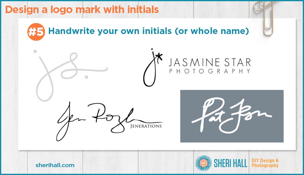
How to create a text logo mark with your initials #5 – Handwrite your own initials (or whole name)
For this example we’re looking at a few variations: author/blogger Julie Stoian with 2 initials, photographer Jasmine Star with an initial and icon; podcaster and blogger Pat Flynn and photographer Jen Rosenbaum with traditional signatures.
For this technique, I would get a Sharpie that’s still sharp and write my initials over and over again on a sheet of paper until I get one I really like, then photograph it straight on and trace it in Illustrator to create a vector format.
- The js. mark is lower case; the dot on the j and period add a nice balance of 2 dots; the letters are connected as they would be in handwriting making this more of a cohesive unit. It’s casual and easily readable.
- The j* mark is a fun one; if your name is a word, it’s cool to work that in to your logo, as long as it doesn’t get cliché; the logo looks nice to the left of the stacked logo text set in all caps sans serif face
- For Jen Rosenbaum, the Jen is much easier to read than her last name. It also has her company name Jenerations set in all caps Trajan nested under the signature. Does she care that her last name is illegible? I suspect not.
- Pat Flynn uses his signature on a gateway site for his books, blog and podcast. All the other entities have their own logos, but since this is strictly about Pat, it makes sense to use a signature to brand it, super simple in the header of his website.
- What’s up with all the J j J j initials for lady entrepreneurs?!?

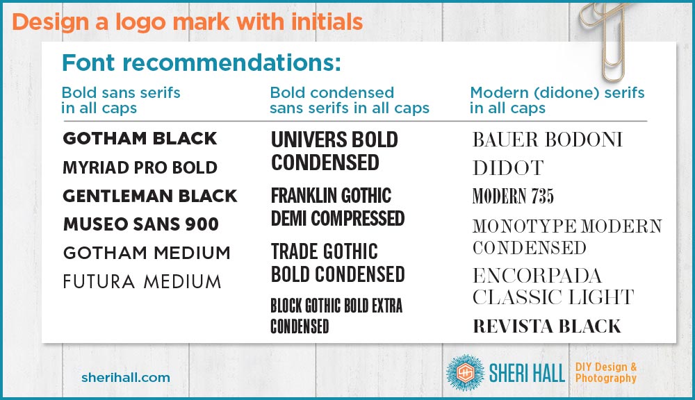
Text logo font recommendations
Although this post does not focus on which fonts to use for your logo design, I’ll leave you with this short list of readable and classic and fonts to consider. You can’t go wrong with these. If you want to see them in use in the real world, read my post 3 Logo trends for text-based logos.
If you’re seriously done procrastinating on your logo design project, you should also check out my post 5 Simple tweaks to customize your text logo. This series of 3 posts will give you lots of solid, actionable ideas for text-only logos, from simple to not-so-simple.
Go forth and design!
Have you seen any clever logo marks made from the initials of a person or company initials?
Let me know in the comments below.
I love to talk logo design!


