If you have a logo or are the designated protector of your company’s logo, it’s your mission to prevent people from doing stupid things to it! Uh oh. You thought that once the logo was designed that it was a magically protected piece of digital branding? No, sadly no. Here are my top 5 logo mistakes to avoid.
Have you ever been put in charge of sending your company’s logo off for design projects, web site redesigns, sign printing or the like? Did it come back like you expected?
You want your brand to look professional and consistent across all media because it helps maintain a strong image.
- When you hand off your logo for a brochure design, you want that version of the logo to match your business card and the rest of your printed materials.
- When a vendor prints a sign for an event you’re participating in, you don’t want a sad surprise when it gets delivered and your logo has a case of the jaggies.
- When you refresh your logo, you don’t want to have any straggler printed materials out there with the old logo.
Don’t think these mistakes are limited to tiny companies who can’t afford a graphic designer to protect the brand. I have seen the logos of major million-dollar operations reproduced in less-than-professional ways. Ouch! But with a little attention and care, you can make sure your logo always gets reproduced in its proper glory!
Every time I see an example of this, I wince and then pull out my iPhone and take a photo to document the travesty. Follow me and learn from my incessant documentation…
Here are 5 common logo mistakes to avoid.
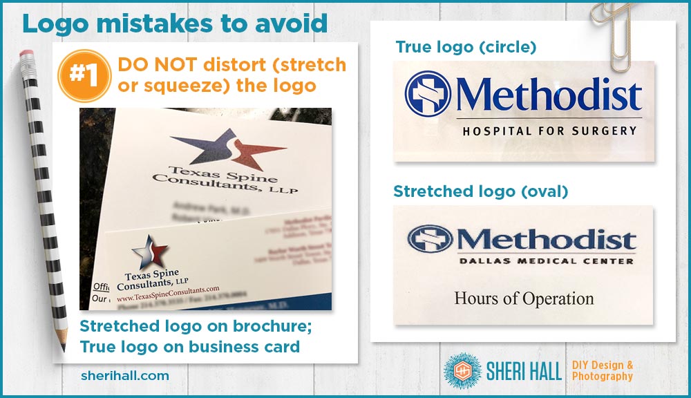
#1 Do not distort (stretch or squeeze) your logo
I am amazed how many people do this to a logo. So amazed, it’s at the top of my list!
I understand that when you’re laying out a brochure or an ad and you need to put your logo in a certain area, that there’s a temptation to “fit” the logo to the space. Heck, there are even commands in design apps that will automatically do this for you! BVC (be very careful)!
When you do this, do it proportionally. DO NOT stretch the logo to be more horizontal just because the space it’s going into is horizontal. DO NOT stretch it to fit on an event wristband. And do not squeeze it because the space is narrow. The logo is the logo, period.
If you don’t like the space it needs to fit in, change your layout to accommodate it better. Rearrange elements, cut copy, whatever you need to do, do it. But do not distort your logo.
If you imagine a great piece of art being stretched to fit a wall, it should be obvious what a bad idea this is. Do I need to go on?!? I really like that paining The Scream, but I need to hang it over the couch; can you make it horizontal???
You should have heard my jaw hit the floor when I saw these 2 pieces of collateral sitting next to each other at the check-out desk of a doctor’s office (example #1). And in my head … “What were they thinking?!?!”
Be consistent!
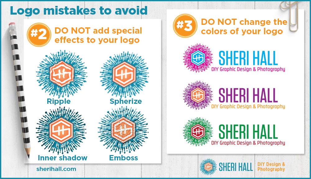
#2 Don’t randomly add special effects to your logo
This is similar to #1 in that it involves altering your logo — do not alter the logo, other than the basics of creating an all black version and an all white version for use in special, limited cases.
Bevels, heavy drop shadows, glitter, all the crazy filters you can add to your art in Photoshop — just don’t. The logo is the logo, period.
Be consistent!
#3 Don’t change colors randomly
If you’re trying to build brand consistency (like you should be), aim to stick with your chosen brand colors.
Yes, colors vary a bit on their own from printed page to digital representation; that’s normal so don’t sweat it too much. But don’t consciously change your logo colors on a whim, or for a holiday season.
Be consistent!
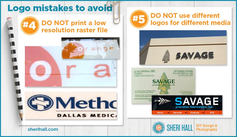
#4 Don’t print a logo from a raster file (or it will look jagged)
When dealing with logo files, it’s super mandatory to understand the difference between raster and vector art. (If you don’t know these terms like the back of your hand, go read my post where Wonder Woman and Buffy illustrate the difference.)
Your true logo file should be a vector file (ai, eps, pdf) and if you ever need to print it on a business card, ad, banner, etc. give the printer the correct file format. If you give them a supposedly hi-res file raster file to a banner printer, it might not turn out like you want.
Raster files don’t scale up very well before they get the jaggies. Vector files scale great—as smooth as butter!
#5 Don’t use multiple versions of your logo across media
This one gets a little tricky when you update your logo. Depending on your company size it might take a while to update your logo across all media, but you need to get it done. Digital updates should be quick because it’s relatively quick and easy to change digital art. Print takes longer because it requires a reprint of all your materials.
If you’re FedEx, it requires updating trucks and airplanes! Understandably, that took a while. But you’re probably not FedEx, so get that stuff updated ASAP.
When you design a new website, do not let your web designer create a new logo that is only used for your website, while you keep using your logo version on printed materials.
Be consistent!
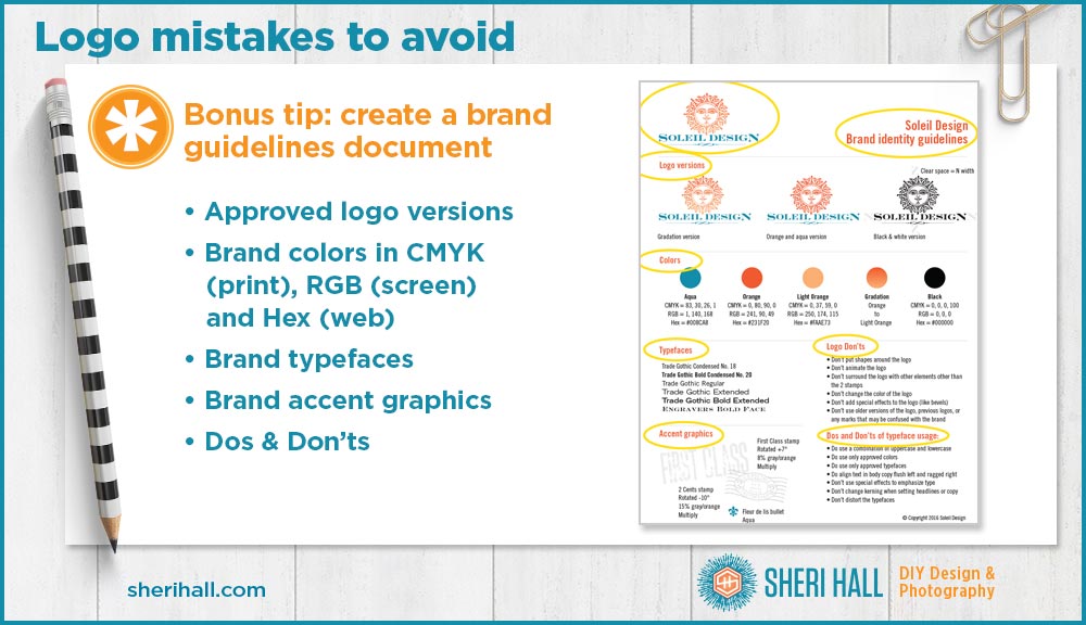
Bonus tip: create a brand guidelines document
How do you protect your logo when you send it out into the world with no protection, i.e. when you’re not carrying out the design yourself? You send it with brand guidelines so the recipient will know what’s allowed and what’s not.
Brand guidelines also document what typefaces you use, what colors you use, and any accent graphics you use.
I think most of the above rules are pretty obvious, but hey, after seeing so many poorly-reproduced logos in the real world, I think these rules are only obvious to graphic designers. And that is why I’m putting this out there!
If you want to download the 1-page brand guidelines shown above, click on the link below to grab the logo questionnaire, then follow the next link to download a zip of files. Or you can email me and ask for it — sheri at sherihall dot com. This is not an auto-send thing. If I’m not at my desk when you email me, I will see your note when I return and send it as soon as I can.
P.S. Bonus: Here’s a fun brand guide — Apple, from many years ago.

