If you’ve dabbled in graphics for your web site and social media accounts, you’ve probably become comfortable dealing with color, typography and graphics for your web design needs.
But if you thought all that knowledge would easily carry over into print design — yikes! You might wonder what strange new world you’ve fallen into.
Donut panic! This post will explain the top 5 difference between print and web design as I see them. I started my professional life as a print designer when there was no web design (in the early ’90s). I got into web design in the early days — 1996, to be exact. It was a whole different world back then! I’ve enjoyed bouncing back and forth between the two disciplines and I rather like the considerations of each. If I have to pick a favorite, it’s print design, shhhhh.
>I’ll cover raster vs. vector art, resolution and quality of graphics, color spaces, typography and when to be a control freak and when to let go. Off we go …
Difference between print and web design #1: The settings for resolution and quality for raster art
If you’re creating graphics for web sites or social media, you’ll probably be working at 72 dpi at close to actual size. For example I make my website header graphics 1000 pixels wide which is 13.89” wide at 72dpi. (1000 divided by 72 = 13.89) The WordPress engine which lays out my pages will fit or stretch that graphic into the header space it has allotted so it may not be that size, but that’s the general math.
Print concerns
If you’re laying out a “print” document, let’s say 8.5″X11″ you plan to PDF for people to read on their screens and possibly print out on ink-jet printers, you have several considerations.
The text will come out sharp because it’s text and that’s what a PDF does for you (yay!).
Any raster art (photos, irregular background patterns, complex illustrations) will need to be created at an adequate size to view and print nicely. Plan to have 150-200dpi of resolution at actual size to cover viewing and printing. What does that mean? If you have a header all the way across the top of your page and you go with 150dpi, the art needs to be 1,275 pixels wide (8.5″ X 150 pixels per inch = 1,275 pixels across).
The lower end of this scale is OK for screen use; if your viewer prints the document, the printer will take advantage of the higher resolution art. Don’t get too wound up about this if it’s only destined for an inkjet printer. You can work with 200dpi art and export a PDF to 100-150dpi if you want to reduce file size. But don’t expect to export to a higher resolution than your original art.
Keep in mind, the higher the resolution, the larger the file size; if you’re emailing or downloading long documents, you might sacrifice some resolution to get a smaller file size. Play that by ear.
If you’re designing a piece that’s going to print on a printing press, you should work at 300dpi at actual size at a minimum.
Web concerns
Web designers usually save raster art as jpeg or png files. Print designers save them as jpeg or psd (tiff if you’re old-school), but all jpegs are not created equal!
If you’re saving for web you go through the Save for Web dialog box and choose a preset at the top (let’s say JPEG medium) which will give you a lower resolution AND lower quality file than if you go through the regular Save As dialog box and choose jpeg, then choose 9-10 on the quality scale.
So that’s raster art considerations. What about vector?
That brings me to #2 …
Difference between print and web design #2: Vector art is much more common in print design than web design
Any vector art (logos, charts, graphics, cartoony-looking stuff) destined for a printed piece or PDF should be saved from Illustrator to .ai or .eps and imported into your page layout application. It will maintain its vectorness and keep a small file size, so it will print sharp at any size (yay!) and not bulk up the size of your PDF (yay again!).
If you’d like a vector vs. raster refresher starring Wonder Woman, check out this post: Vector vs. raster art, what’s the difference?
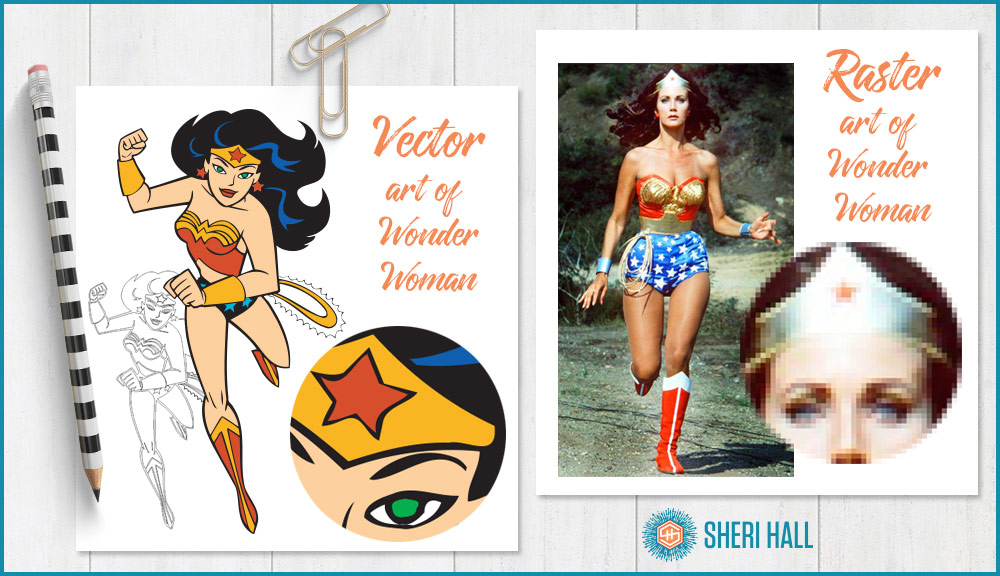
As mentioned above, even if you’re creating your art as a vector (like your logo), when you export it for web use or social media graphics, it’s going to get rasterized to a jpeg or png. It will no longer be a vector file. Not so with print design; the vector files get incorporated into the final art or printed piece and retain their vectorness.
Difference between print and web design #3: Different color spaces … HEX, RGB, CMYK, PMS, WTH?!
Holy cats, if you haven’t already figured this out, color is complicated! You might have already found this out the hard way if you designed something on screen and tried to print it on your desktop printer, or gave the file to a printer to print. Did it turn out like you expected based on what you saw on your screen? Probably not.
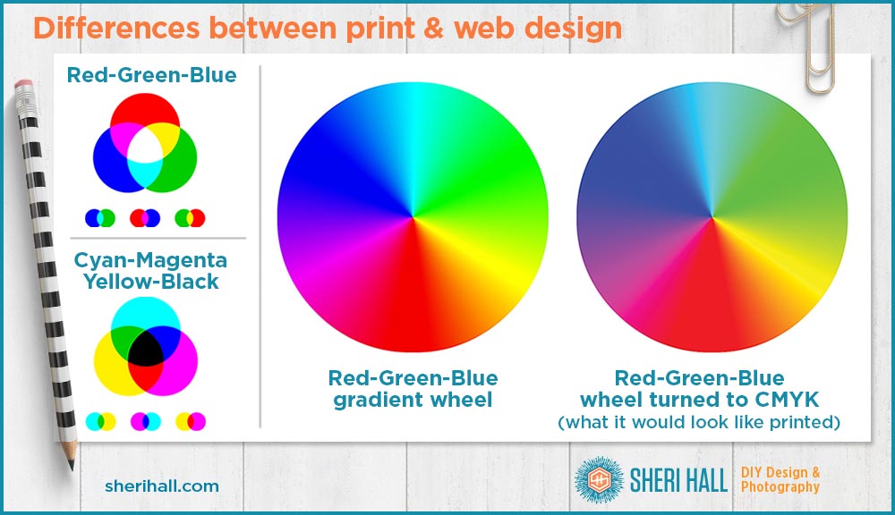
Keep in mind that looking at a screen is looking at a light source (RGB). Looking at a piece of paper is not. (CMYK)
When creating color with light, all colors mixed together make white (RGB); in paint/ink on paper, it makes mud. (CMYK)
The point is, when going from screen to paper, expect the results to be less bright, less brilliant and less saturated and you should be fine (see example above, green is especially hard to translate).
Defining colors for screen use
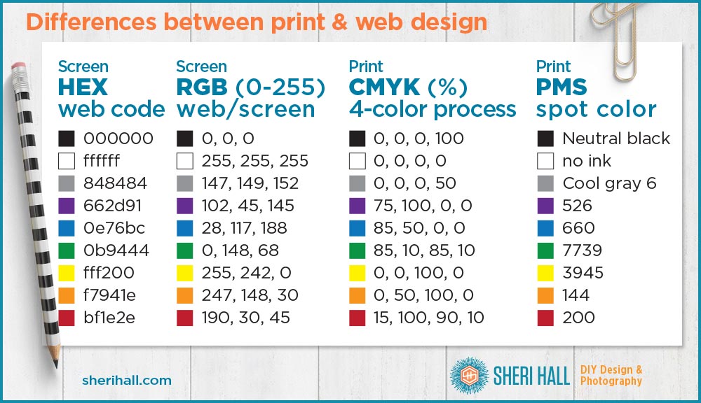
Now, back to these letters … RGB stands for red-green-blue which is a common way for color to be described for screen use. Each color (red, green, blue) has a number from 0 to 255. The example below shows the RGB numbers of some sample colors. At 255 for each, the color is white, at 0 for each, the color is black.
Hex is a common way for web designers to describe colors in code for text and blocks of color. The codes are all 6 characters long; some may be letters (0-9 and a-f).
Defining colors for print use
CMYK stands for cyan-magenta-yellow-black. These are the 4 colors of ink that go on a printing press (also called 4-color process) and what all other colors are created from. If you look closely at a printed piece, you’ll see tiny dots of each color that make up all the photos, graphics and copy in your piece.
CMYK settings are based on simple percentages for each of the 4 colors, 0-100% for each one. In CMYK color space, when you have 0 for each color, you have white; when you have 100% for each, you have a black mix (opposite of RGB).
If you’re doing specialty printing you may be using PMS (Pantone Matching System) colors; in PMS the ink is the actual color you choose and is not printed from other colors. This allows for metallics, neons and my favorite PMS 321 (aqua, of course).
All major design applications have access to color books of PMS colors so you can spec them within the app. Just make sure you have a physical PMS book to make sure you’re choosing the color you want. Remember what I said earlier about color looking different on screen than on paper?!? It’s true with PMS as well!
Difference between print and web design #4: Typography standards are higher for print
Print designers seem to take more care with typography than web/screen designers. I think part of this goes back to print designers being more old-school and learning about type in a more traditional way.
Type for web design
In the early days of the web it was common to limit typefaces to what you could be sure everyone had access to on their computers, which was not very much: Arial, Times New Roman, Georgia, Tahoma and Verdana come to mind, ugh. None of these are common in high end graphic design, so web design (especially early web design) was not very polished.
Another problem was that designers didn’t have as much control over what the end user would see as they do in print. How do I know if the viewer is seeing my beautiful page in daylight, or at night, on a Mac, or a PC, a cheap display, an expensive display, which browser, a wide window, or a narrow window that will make it reflow? So many variables, it made us want to throw up up our hands and just do what works best for most people, and not lose sleep over it. I think this naturally led to web designers not taking control over typography when they move to print design.
Type for print design
In print design, the designer can see the project from blank screen through final files or PDF, paper proof and a press check. This is the best way to make sure the final piece is exactly what you envision. No such luxury in web design, though things have improved over the years.
I’m going to guess the lack of attention to detail web/screen video designers exhibit is a result of lack of control and knowledge over typography. I’ve seen atrocities in web and video typography that print designers would not accept.
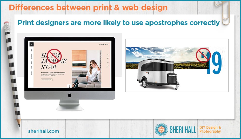
For example, double hyphens used as em dashes ( — vs. —), single open quotes used as an apostrophe (Airstream ad shown above), dumb/straight quotes used instead of smart/curly quotes (see graphic above from jasminestar.com). I’m afraid that screen designers don’t know what they don’t know so when they move into print design, they don’t know the right way to handle these things. The design and client suffer for it. Unfortunately, the client probably doesn’t even know their designer is doin’ it wrong.
If it were me, I would fix these because even though it’s displaying on a screen, it’s easy to use the proper punctuation.
To see more examples on how to use an apostrophe the wrong way, check out my post: The most misused key on your keyboard.
Difference between print and web design #5: Print allows more control, but there’s more room for error and mistakes are harder to fix
I think the changeable and transient nature of screen design means people take less care in designing it for it. If you can easily change something next week if you decide you don’t like it, you may not put as much time or thought into it this week, for better or worse.
Also, changing digital art is usually quicker and easier (i.e. less expensive) than changing a print job that’s been printed.
When you go to press on a print job, you have to make sure everything is correct. If you have one mistake on your piece and print 1000 of them, yikes, that’s 1000 mistakes and the printer is not going to reprint your job for free. You can live with it until the next printing or pay to have it reprinted.
You don’t want to be in that position, so it’s best to get sign-off from your client before it goes to press and to work closely with your printer to make sure you give them the files the way they want them. You, your client and your printer need to proof very carefully at every stage to ensure a successful project.
There are plenty of specific design considerations that vary from web to print, but I wanted to outline these high-level things to prevent you from suffering any gotchas if you choose to dive into (or get thrown into) some print design projects.
It’s not any harder than web design, but learning typography, showing attention to detail, double-checking and proofing everything will serve you well. If that’s not your strong suit, be sure to have a partner who can lend you a second set of eyes along the way.