If you’ve been stressing out about your logo design because you think you need a killer icon and the perfect casual script, check yoself before you wreck yoself! None of that is necessary for a good logo or a successful business. Go text logo!!
Folks, I have some startling news for you: you don’t need that killer icon or trendy script. You can design an awesome logo using nothing but typography!
One key to designing a text logo is consistency of use. Another is to vary something so you’re not just setting your words a typeface and calling it done.
Text logo design
Even if you’re only using letters, there’s still a lot of variations to play with. Consider playing with:
- The weight of your letters — light and airy, medium weight or bold and heavy?
- The case of your letters — all caps, all lower case or some combination. What about small caps?
- The letterspacing or tracking of your letters — are they far apart for an airy look or close together for a strong, sturdy look?
- Color — are all the letters the same color, or varied by word?
Logo trends for text logo design #1:
Bold sans serif fonts in all capital letters

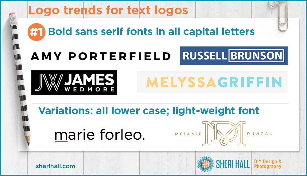
The first trend we’re looking at is the use of bold, sans serif typefaces in all capital letters. The examples we’ll look at here include: Amy Porterfield (online course creator), James Wedmore (YouTube guru and online business course creator), Melyssa Griffin (Pinterest guru and online educator), Russell Brunson (author and Click Funnels inventor), Marie Forleo (B-School course creator and author) and Melanie Duncan (e-commerce business owner, Pinterest guru, online educator).
- These fonts are clean, simple and easy-to-read. For short chunks of copy (like a name or company name) setting type in all capital letters is fine. For large bodies of text, it would get tiring to read.
- Brands belonging to men are usually bold, whereas the ladies’ logos are a mix of bold and medium weight fonts.
- Playing with the letterspacing/tracking (horizontal distance between letters) is one way to customize a text logo. Melanie Duncan’s logo has the most letterspacing, followed by Amy Porterfield and Marie Forleo. Spacing the letters out gives the mark an airy feel which could be considered more feminine and appeal to a feminine target audience.
- Since most of the men are using bold fonts, keeping the letters close together helps create a sturdy look.
- The variations shown here are Marie Forleo who sets her logo type in all lower case letters; the other variation is Melanie Duncan who uses a medium weight font, but it is in all caps and spaced out. Notice that no one uses upper and lower case!
Fonts to explore to achieve this look (see examples at bottom):
- Gotham Black
- Brandon Grotesque Black
- Myriad Bold
- Gentleman Black
- Gotham Medium
- Futura Medium
Logo trends for text logo design #2:
Bold condensed sans serif fonts in all capital letters

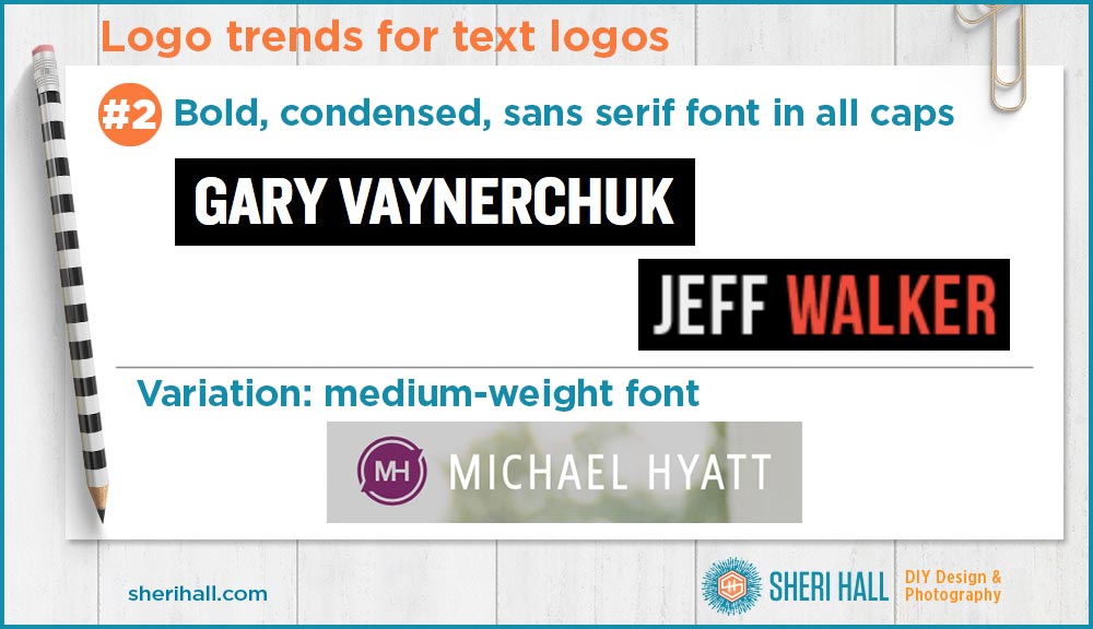
The second trend we’re looking at is the use of bold, condensed, sans serif typefaces. Our three examples are Jeff Walker (author and online business course creator), Gary Vaynerchuk (entrepreneur, speaker and author) and Michael Hyatt (speaker, author and online educator).
- Gary’s logo is the heaviest weight type, followed by Jeff’s and Micheal’s whose font is a regular weight.
- All three logos are in all caps (as in trend #1 and #3!)
- The letterspacing on Gary’s and Jeff’s is very tight. The boldness of the letters combined with the tight letterspacing both help make these very strong, heavy logos. Gary’s particularly looks to cater to a young, savvy audience.
- The slightly lighter weight of Michael’s font and adding a little space between the letters makes his a little airier. This would cater to a more mature, established audience.
- Notice that all these brands represent men, though they may not be limited to marketing to men.
Fonts to explore to achieve this look (see examples at bottom):
Notice several type family names have “gothic” in them
- Trade Gothic Heavy Condensed
- Franklin Gothic Condensed
- Univers Bold Condensed
- Block Gothic Bold Extra Condensed
Logo trends for text logo design #3:
Ladies only! Modern serif fonts in all caps for feminine brands

The third trend we’re looking at is the use of modern (didone) serif typefaces. I covered this category of serifs in my blog post called The Wonderful World of Serifs. Here’s the skinny on modern serifs (used to be called Didone):
- First emerged in the late 1700s(! – do the math – over 200 years old)
- Characterized by hairline serifs
- Vertical orientation of the weight axes (vertical strokes are thick and horizontals are thin)
- Strong contrast between thick and lines (because of the hairline serifs)
- Some strokes end in ball terminals, rather than a serif (lower case y)
- Examples: Bodoni, Didot, Monotype Modern, Modern No. 20
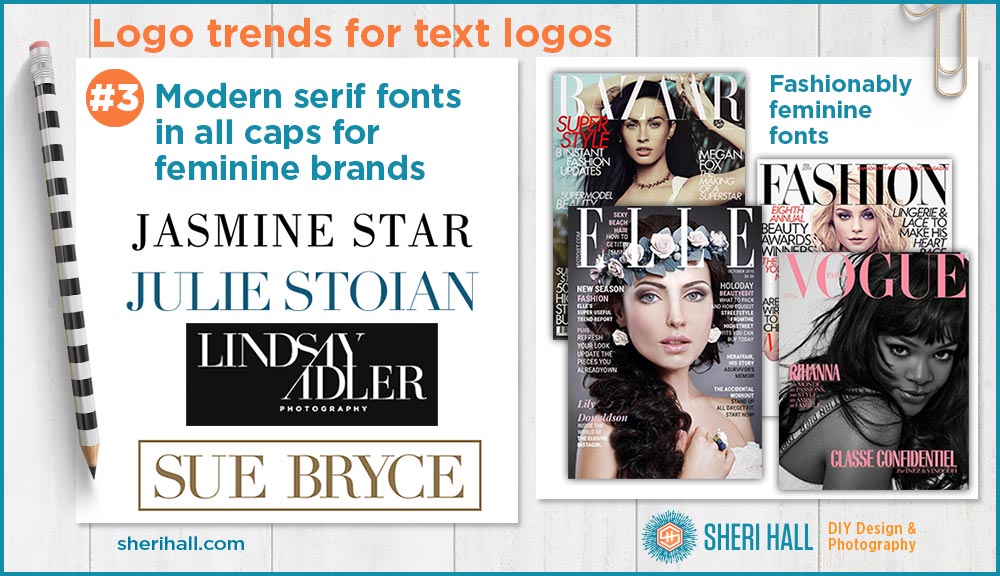
For this trend, let’s look at Jasmine Star (wedding photographer, Instagram guru and online educator), Julie Stoian (online business marketing maven), Lindsay Adler (high-end fashion photographer and educator) and Sue Bryce (modern glamour photographer and educator).
- These typefaces are very popular in fashion mags: Vogue, Elle, Bazaar. And thus appeal to a feminine audience.
- As with the previous two trends, these brands are set in all capital letters.
- Jasmine’s font appears a little condensed while the others are wider.
- These fonts are classy and classic, but not stuffy. They have plenty of curve and airiness to them. The serifs help keep letters from getting super tight like they do in bold condensed sans serifs (trend #2).
Fonts to explore to achieve this look (see examples at bottom):
- Bodoni
- Didot
- Encorpada Classic
- Modern No. 20
Logo trends for text logo design: Font recommendations

I’m not a betting person, but I’m curious to see how long this trend lasts — the hardly legible, casual scripts and handwritten fonts, ugh. Did you notice I didn’t include it in my trends? Did you notice I don’t use a casual script for my logo?
No, because I’ve been designing logos for 25+ years and I look back at a few of my early projects that were based on trendy fonts from the 1990s(!!) — ouch! I wish I had stuck with the classics. Please learn from my occasional mistakes. You’re much better off with a solid 200-year-old typeface than a trendy one from the last 5 years. I want to steer you toward a professional, appropriate logo that you can use without worry for years to come.


