
Do you want a lightning-fast way to look hip and retro with your graphics and branding?
🕺 It’s better than putting on some bell-bottoms and pointy collars
💥 It’s better than putting on your finest ’80s party costume
🍬 And it’s better than blowing big fat bubbles with Hubba Bubba
🧚♀️ It’s using inline fonts!
I’ve rounded up quite the high-end, low cost, chic set of fonts for you today!
And I am happy to do it — anything for you my trusty, font-thirsty peeps!
c
As you might have guessed, I’m quite a font fiend! If you want to know where I get the good stuff, click the button below.
First, what is an inline font?
I didn’t find a definition because the internet wanted to tell me about inline styles in CSS (cascading style sheets) for web design purposes. That’s not what I’m talking about here!
When you look at a few inline fonts, you’ll observe they have negative space running through them — a line running inside of the main character shape. Other similar styles or terms that I will lump in here are open face, recut and hand-tooled.
My own definition of inline fonts: an inline font is a type of display or fancy font that has a cut-out or negative space as part of the character. Bam, there ya go!
When looking at these inline fonts, you’ll notice that some of the inlines are contained by the rest of the character for an engraved look (like Castellar). And some of the inlines run all the way through the character and out the other end (like Lovelo). In my mind the engraved fonts are appropriate for classical uses, and the uncontained ones are for trendy, retro uses.
Inline fonts aren’t their own exclusive font category; there are inline versions of “regular” non-display fonts. For example, Bodoni is a serif type family, and Bodoni Classic Inline is an inline version of Bodoni. Not all fonts have inline versions and not all inline fonts have “regular” non-inline versions. Clear as mud, huh?
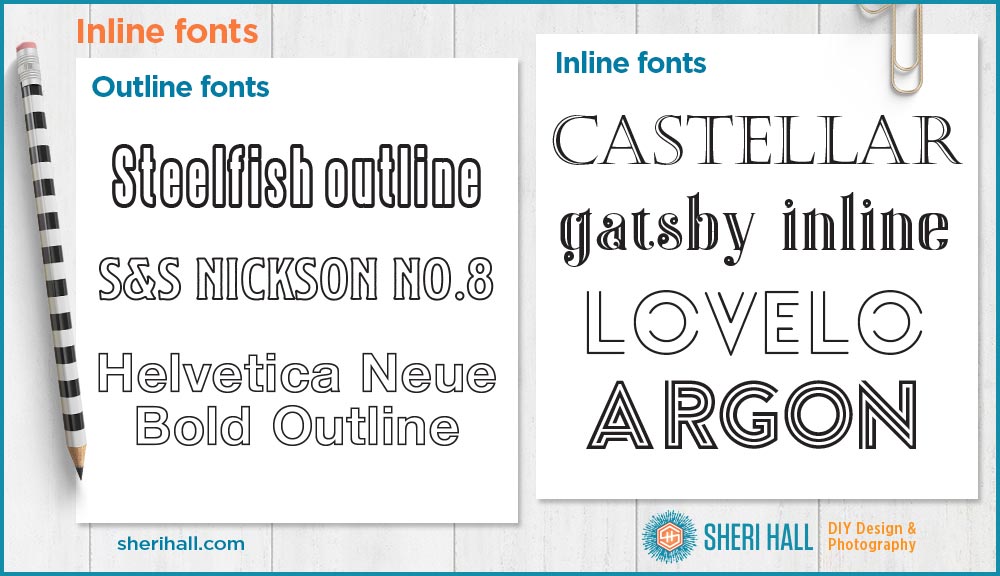
Inline fonts vs. outline fonts
How are outline fonts different? Outline fonts have a consistent width line around the shape of the character, like outlining a circle would result in a slightly larger circle. The width of the outline is narrower than the width of the character stroke. With inline fonts, the inline shape follows the curves of the character, but is not just a slightly smaller version of it.
Inline font tips
There are some universal commonalities in inlines: they are all display fonts! You’ll also notice that many of them are caps only (capital letters). For those, I removed the lower-case example line (on the graphics below) in order to make the type larger for higher quality.
Inline fonts should be used sparingly and for decorative purposes. Use them for logos, headlines, posters, advertising, packaging and book covers. Don’t set body copy in an inline font or you will drive your viewer mad! Try to stay at 24 points minimum for print use and larger for web use. If you set an inline font too small, the negative space becomes a mess and hard to discern, which really kills the point of an inline font.
I’ve broken my inline fonts list into 3 parts:
- #1 is a set of classic “old-school” typefaces and by old, I mean I became familiar with them in college — let’s say late 1980s to early 1990s. These are not free web fonts, though you may be able to find some sketchy versions for free
- #2 is a set of (mostly) free web fonts that I specifically went looking for. This list is not exhaustive as I found several I didn’t really care for (so why show them to you!) and a few were similar to others I had found. I’m giving you the links to get the goods! Some of them are for personal use only and some are demo versions, because, ha, there’s usually a catch if something is free. Do your due diligence on this stuff, please.
- #3 I will link you to lists I followed to track some of this stuff down! I am full-service, yo.
Let’s look at some inline fonts!

Old school inline fonts:
- Castellar ($35) – https://www.myfonts.com/fonts/adobe/castellar/
- Bodoni Classic Inline ($49) – https://www.myfonts.com/fonts/wiescherdesign/bodoni-classic-inline/
- Caslon Open Face ($35) – https://www.fonts.com/font/monotype/caslon-open-face/regular
- Mona Lisa Recut ($35) – https://www.fonts.com/font/itc/itc-mona-lisa/recut
Contemporary, yet retro, inline fonts

- Argon (free) – https://fontmeme.com/fonts/argon-font/
- Blanch inline (free) – https://www.dafontfree.net/freefonts-blanch-f63699.htm
- Fnord Engraved ($23) – https://www.myfonts.com/fonts/paulo-goode/fnord/engraved/
- Fnord Inline ($23) – https://www.myfonts.com/fonts/paulo-goode/fnord/inline/

- Gatsby inline (free) – https://fontmeme.com/fonts/gatsby-inline-font/
- Gist light (free, slanted version, not shown) – https://www.1001freefonts.com/gist-light.font
- Gist rough (free) – https://www.fontsquirrel.com/fonts/gist-rough
- Intro inline (free) – http://www.fontfabric.com/intro-free-font/
- Lovelo (free) – https://www.fontfabric.com/lovelo-font/

- Metropolis 1920 (free) – https://freetypography.com/2012/05/01/free-font-metropolis-1920/
- Mexcellent Regular (free) – https://www.myfonts.com/fonts/typodermic/mexcellent/regular/#index
- Mexcellent 3D (free) – https://www.myfonts.com/fonts/typodermic/mexcellent/3d/
- Monoton (free) – https://www.fontsquirrel.com/fonts/monoton
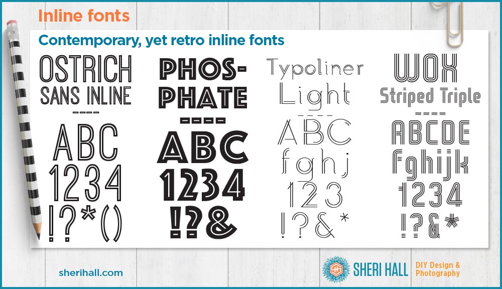
- Ostrich Sans Inline (free) – https://www.fontsquirrel.com/fonts/ostrich-sans-inline
- Phosphate ($60) – https://www.myfonts.com/fonts/redrooster/phosphate-pro/
- Typoliner (free) – https://www.fontsquirrel.com/fonts/typoliner
- WOX triple striped (free) – https://www.dafont.com/wox-striped.font
Resources for inline fonts
- 10 best free inline fonts – https://www.designcrawl.com/best-free-inline-fonts/
- 35+ fresh inline typefaces – https://www.webdesignerdepot.com/2014/02/35-fresh-inline-typefaces/
- Creative Market inline typefaces (I would not consider all these inline, and now that you have a good handle on what inline fonts are, you’ll see what I mean) – https://creativemarket.com/tags/inline-font
- My own blog post on where to get ALL THE FONTS, not just inline fonts
Do you have a favorite inline font? Have you used one recently in your design work? Do you think you might soon? Let me hear from ya!
Sheri Hall
Entrepreneur, graphic designer, photographer, cookie-baker

👀 Facebook – DIY Graphic Design + Photography https://www.facebook.com/sherihalldiydesign
📷 Instagram – boxy fun with graphic design + margaritas + costumes + life adventures
https://www.instagram.com/sherihall/
📌 Pinterest – pinning logos, typography and cats!
https://www.pinterest.com/sherihalltx/
Email sheri @ sherihall dot com
“Those who say it can’t be done should get out of the way of those doing it …”
P.S. If you enjoyed this post on inline fonts, share and comment please =)