
A look at the 4 subcategories of sans serif fonts and some basic advice on choosing a sans serif typeface for your graphic design project
Note: The following advice on sans serif fonts is mainly relevant to “print” design including actual printed-on-paper pieces, PDFs of flyers and brochures that look like they should be printed, and social media graphics because the text has been turned into an image and does not display as editable type on a screen.
Let’s start by defining some basic typeface classifications and then take a deep dive into the wonderful world of sans serifs!
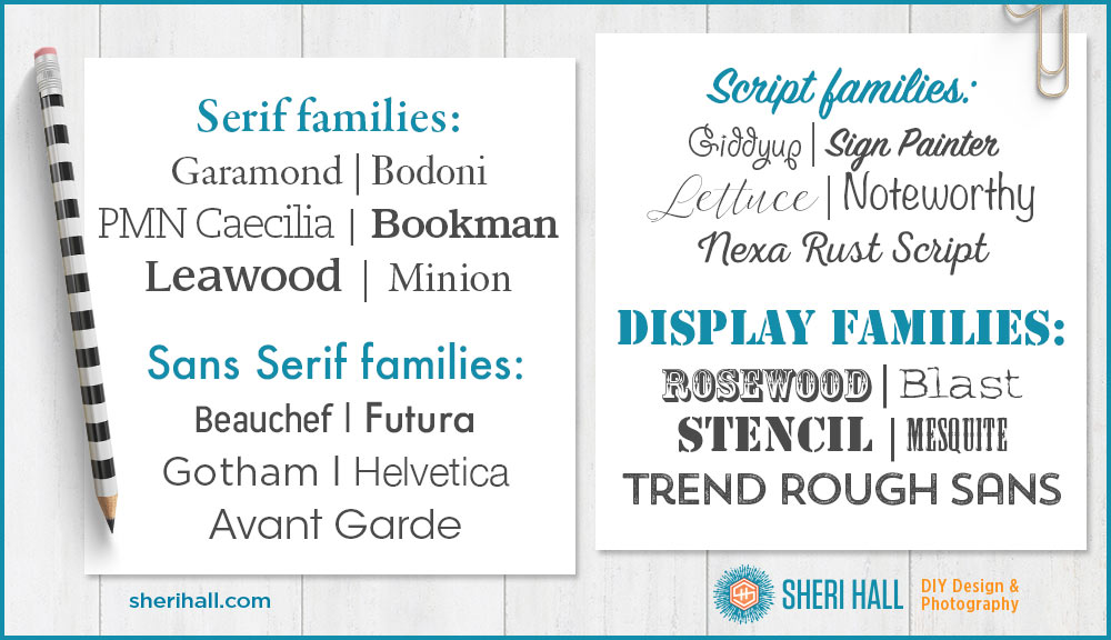
Major font (typeface) categories
- Serif – A serif is the small line at the end of the stroke in a letter or symbol; thus serif fonts have these small flourishes at the ends of strokes. Here’s my article covering the types of serif fonts, my picks, and when to use them.
- Sans serif – Sans is French for without, thus sans serif fonts are without serifs; they are much simpler because there are no flourishes at the ends of strokes
- Script (handwriting) – Handwriting or cursive typefaces; some are very fancy and work great on formal invitations while some are approximations of chicken scratch. Whimsical, flowy, casual scripts are very trendy right now; if you choose one, make sure all the characters you need are easily legible (super important for logo design because you want people to be able to read your company name, right?)
- Display (novelty, decorative) – the last major category is a catchall that includes everything that doesn’t fall easily into the first three categories, and is used in a very limited capacity because they are not comfortable to read in large volumes. You may set a logo in a display face, but you wouldn’t set a brochure or book in a display face.
Types of sans serif fonts
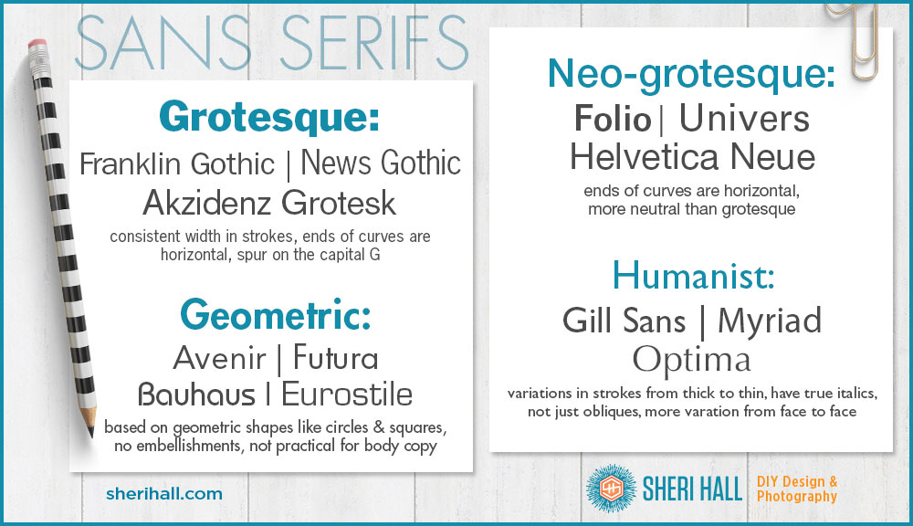
These are the 4 different subcategories within the sans serif world, followed by examples:
Grotesque
- Came in a range of widths from condensed to normal to extended
- Strokes don’t have much variation in width
- Capital letters don’t have much variation in width
- The ends of the curves are usually horizontal (look at the letters C and S)
- Many have a spur on the capital G and a curled leg on the capital R
- Height of the capital letters and ascender letters are the same to create a consistent line along the top of the copy
- Descenders are often short to allow for tighter linespacing (leading)
- Most don’t have a true italic, but a simple oblique (basically a slanted version of the original)
Geometric
- As the name indicates, geometric faces are based on geometric shapes, near perfect circles and squares
- Check out the letter “o” and the lower-case “a” for the circles
- No embellishments
- Of these four sans-serif categories, geometric faces tend to be least practical for body text (they are used more for headlines and short text blocks)
Neo-grotesque/Realist
Humanist
- Many have true italics (not just oblique versions)
- There is more variation from face to face in humanist sans-serifs
- Many humanist faces have variations in their strokes from thick to thin
- Humanist faces are suitable for display and body text
- One of the earliest and most popular examples is Gill Sans by Eric Gill from 1928 (just a year after Futura!)
- Humanist faces expanded in the 1980s and 1990s as a reaction to the popularity of Helvetica and Univers and a need for legible typefaces on low-resolution computer screens
- Designs from this era intended for print use include: FF Meta, Myriad, Charlotte Sans
- Designs from this era intends for computer use include: Microsoft’s Trebuchet, Verdana, Calibri, Tahoma
My short list for go-to sans serif fonts (type families):
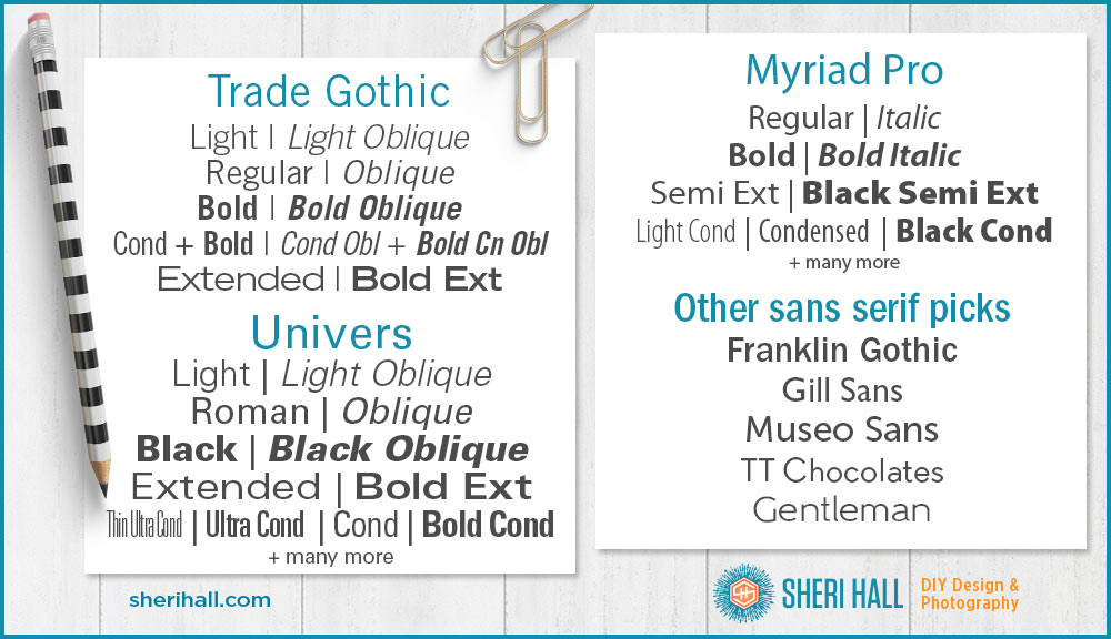
- Trade Gothic – Designed in 1948, includes three weights and three widths, more irregular than the Neo-grotesque families that followed it (Helvetica and Univers) and thus has more character
- Franklin Gothic – a large family used in many ads and newspaper headlines, it has been popular since the 1940s, although it was originally released in 1902 (limited versions; others came later). It was named in honor of prolific American printer, Ben Franklin.
- Helvetica – a Neo-grotesque design released in 1957 by Swiss designers. It’s a huge family with many weights, widths and sizes. Designers Miedinger and Hoffmann tried to create a neutral typeface with clarity that could be used on signage. Its original name was Neue Haas Grotesk. Helvetica the documentary was released in 2007 to coincide with the 50th anniversary of the typeface’s release. Watch this trailer to see the typeface “in action.”
- Univers – Designed by Adrian Frutiger in 1954 and released 1957, it is a neo-grotesque face and comes in many weights and widths. Frutiger studied at an arts and crafts school in Zurich and created Univers as an alternative to the geometric designs he disliked. He described it as having a “visual sensitivity between thick and thin” strokes, avoiding perfect geometry.
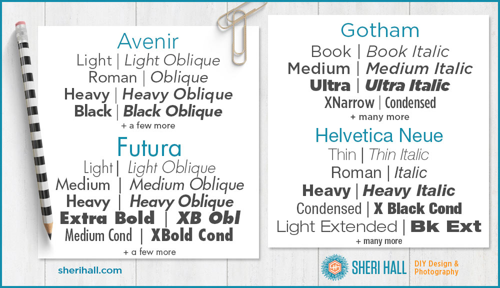
- Avenir – Avenir is the French word for future. It was also designed by Adrian Frutiger in 1988. It is classified as geometric but Frutiger intended it to be a more organic interpretation than pure geometric and suitable for extended text (notice the 2-story “a” and curl at the bottom of the “t.” It’s not a very big family but I use it often.
- Futura – A geometric face designed by Paul Renner and released in 1927. He began sketching it in 1924. This is a good reminder that typography and type design are true arts and take time. He rejected the grotesque designs in favor of simple geometric shapes and strokes of even weight. I used Futura for the title graphic of this article.
- Gotham – This is the only one of this batch released this millennium, in the year 2000. It was originally commissioned by GQ magazine which was looking for a geometric sans-serif that would look “masculine, new and fresh.” Gotham was designed by Tobias Frere-Jones; his inspiration came from walking through Manhattan with a camera shooting lettering on old buildings and signs. It’s a huge flexible family with many weights and condensed versions.
- Myriad – a humanist typeface designed in 1992 by Robert Slimbach and Carol Twombly of Adobe. It’s best known as Apple’s corporate face from 2002 to present; it replaced Apple Garamond, a popular serif typeface. Myriad is a large family that includes a set of condensed fonts that are very readable and great for tight spaces.
Did you notice Arial is not on this list? You’ll be doing awesome if you can avoid using it from here on. Here’s a great article from 2001 called, “The Scourge of Arial.”
And here’s what they look like:
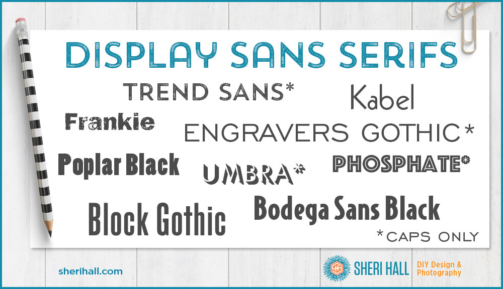
Fun Display Serif Fonts
You wouldn’t use any of these to typeset body copy in, but they might be good for headlines, logos and other limited uses. Some of them are capital letters only.
When to use a sans serif font
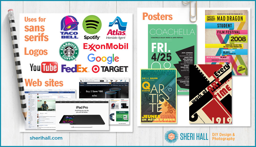
- Web site headlines and body copy – Since sans serif fonts are simpler, they tend to be easier to read on screens. Some good choices from Google web fonts include: Lato, Source Sans Pro, Roboto and Open Sans. Here are a few more.
- Logo design – Because sans serifs are so bold and simple, they tend to be great for logos. They can also be simple and clean which makes them good for eco-friendly logos and technology-related logos.
- Headlines and posters – Posters are usually seen from a distance, and sans serifs make a great, clean, easy-to-read option.
Observing fonts in the wild
Can you recognize Helvetica and Futura when you see them in the wild? Both are popular logo choices. Can you pick out humanist faces on printed material (magazines, bulk mail, brochures, packaging) you see when you’re out and about? Practice font identification skills by looking at the world around you. Design is everywhere.
Comment below with your favorite sans serif type face. What do you like about it and what do you use it for?