I’ve had to take art appreciation classes throughout my academic career and studied painting, architecture and sculpture, but never graphic design and typography as its own class. If there was a typography appreciation class, I’d probably take it. In the meantime, I’ll appreciate character shapes and fine typography on my own and share it with you!
Then we’ll take it a step further and look at how to take a letter and some printer’s ornaments and vector frames to create your own logo.
Typography and logo design
One of the design projects where choosing a typeface is super critical is logo design. Choosing the right face can support a brand nicely while the choosing the wrong one can be disastrous — hard to read, inappropriate, set expectations of low value, turn prospects off, etc.
One of the first things I do when I sit down with Adobe Illustrator to translate my pencil sketches to vector art is look at typefaces and typography. I find playing with type a great way to make a logo unique and on brand. I pick a prominent letter or two (initials) in the client’s company name and typeset it in a bunch of different fonts to see what the possibilities are.
After I have a few fonts that I think fit the client’s brand and attitude, I play with the shapes of the letter(s) and see how they might create a unique mark or monogram. For me it’s a lot like putting together a puzzle, but there’s no photo on a box to refer to. Look at the overall shape of the letter; is it round, angular, boxy, symmetrical, asymmetrical? How might the shape of your letter integrate with a printer’s ornament or geometric shape? (See my logo hacking ideas at the bottom of this post.)
Typography appreciation
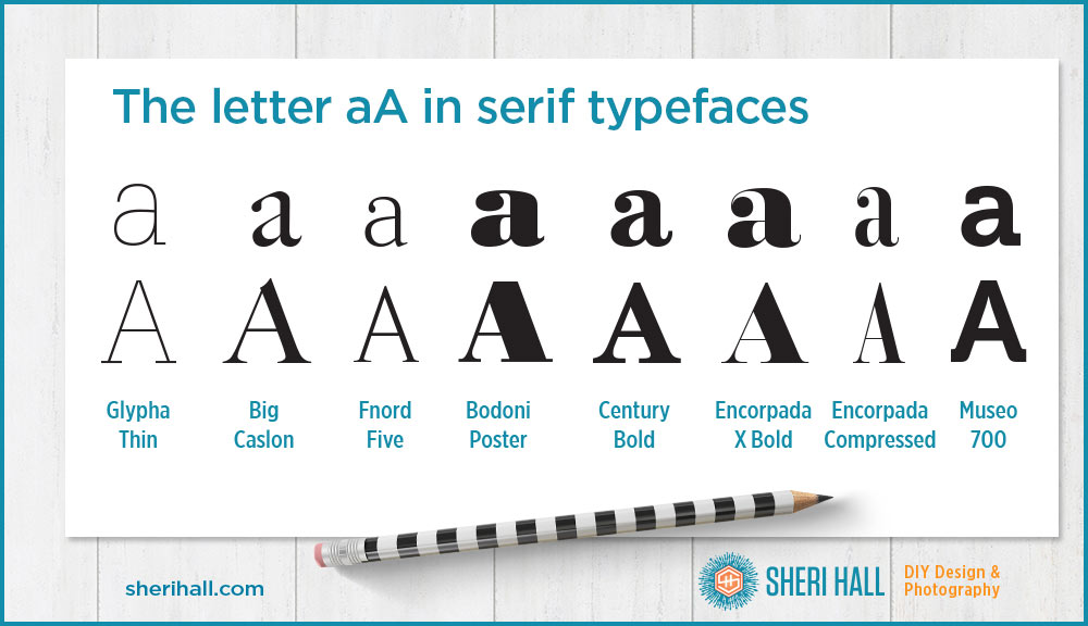
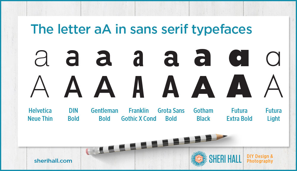
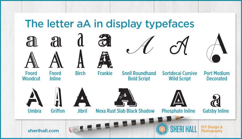
First we’ll take a look at the letter A typeset in several different faces. An uppercase A is fairly predictable because it’s symmetrical or close to it. The script capital A is an exception to this as it usually has more weight on the front end.
The lowercase a has more variety than the capital since it comes in one and two-story shapes. The single-story examples tend to be sans serif and in the minority. I like the two-story a, especially the ones set in modern serif faces; they tend to have nice ball terminals (the ball at the end of the top stroke). Check out this article for more info on the anatomy of type.
Second, we’ll move on to a few different example marks I created from the letter A and some inexpensive vector art from Mighty Deals.
Here is the letter A set in a variety of serif typefaces:
Here’s the letter A set in several sans serif typefaces:
Here are a bunch of A characters set in script and display faces:
Logo hacking with the letter A
If you think designing your own logo or personal mark is out of reach, look at the examples below. It doesn’t need to be complicated; a nice, professional typeface combined with a printer’s ornament or a nice vector badge/frame can go along way. And remember, when it comes to logos, you only need one awesome design!
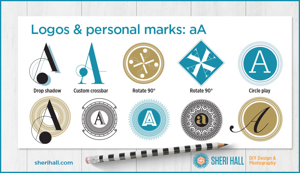
Here are my logo hacks for the letter A:
- Add a drop shadow to type; it’s a no-brainer and easy to do. It adds a little pop, but you have to be careful that the shadow doesn’t overpower what’s in front of it.
- Turn the letter A into a vector shape and manually remove the crossbar allowing one to add a printer’s ornament in its place. This is now a unique A since it doesn’t exist as part of a typeface.
- Take a capital A and rotate it 90° around the tip of the A. This could be done with a lowercase a as well, but it doesn’t have a built-in point to easily rotate around so it would take some experimentation with different typefaces to see which works best. Put the resulting mark into a frame to make it a cohesive element.
- Choose some interesting circular forms to put the A into. I added some of the solid inner circles and didn’t always restrain the A to the inside circle. Once you know the rules, it’s time to learn how to break them. There’s no guidebook on this. With practice and training your eye to what good design is, you’ll feel when something works or doesn’t, or when it almost does but needs some polish. Be patient and play with it. You only need one good one!
Before you start any logo design project, download my Logo Design Questionnaire (free PDF) and share it with your client, your logo designer, or fill it out yourself. Click the orange button below to download:
Create your own logo
Your personal or company name probably doesn’t start with an A. What does it start with? What are your initials? Can you fit one letter into an interesting frame or go for extra credit and arrange your initials into a monogram? If your letters are symmetrical or close to it, can you overlap them into your own unique mark? Remember, forget that you’re working with letters and think of them as shapes that you want to fit into a puzzle. Don’t limit yourself to your initial characters. Add in some simple printer’s ornaments for more flair.
Comment below with your favorite A, favorite printer’s ornament font, or favorite logo hacking technique show above. Could you create your own?

