For better or worse package design affects the perceived value of a product. Seeing the price tag also affects the perceived value, and it’s comforting to a consumer when a low price and inexpensive packaging match up; likewise, an expensive product should match up to upscale packaging.
When the elements of package design are out of whack, it causes confusion and people can doubt the value of what is being sold. If you want to charge a high price for your product, course, or service, your design must visually support the price you are charging.
My sources estimate National Dark Chocolate Day was February 1, 2017. Here we are seven months later with a great opportunity to learn about graphic design by looking at high-end package design. As in my reposado tequila post, I’ll critique some packaging and discuss how design can establish value (either high or low) for your products or services.
I’ve always been fascinated by how changing some fonts, colors and layouts can change the perceived value of a product in the viewer’s head. Two products may be identical but if you design a more upscale packaging, you can establish a higher price for one over the other (it’s a little magical).
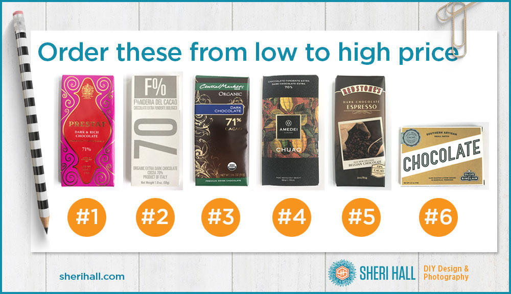
I’ll critique six packages in no particular order and then let you guess the relative price order from low to high. Then I’ll reveal the prices and you can see how you did identifying packaging for the low, medium and high end for a particular product (dark chocolate).
I went to Central Market to choose my specimens, but Whole Foods and World Market are also worth places to visit when chocolate hunting.
OK, let’s get started! All products are plain dark chocolate unless otherwise noted; they range from 67% to 72% dark. The weights range from 1.8oz to 3.16oz. I will evaluate the price per ounce separately. Your mission is to order the products’ retail prices from low to high.
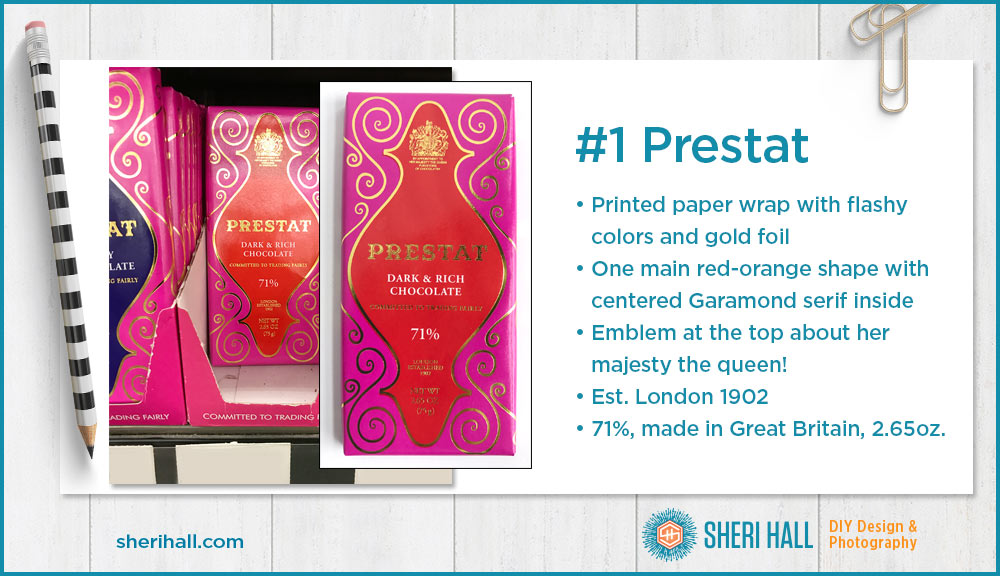
#1 Prestat Dark & Rich Chocolate
71%, 2.65 oz.
Layout – The layout is symmetrical with an emblem at the top and one main red-orange shape that all the type sits in. Outside of that, it’s solid pink with gold foil swirly shapes flanking the main vertical shape.
Package – The package is double-wrapped in paper; the inner piece is silver foil and the outer piece is glossy and printed.
Type – The logo type is serif with a subtle inline to set it off a bit. Since the logo is in gold foil and very reflective, the inline is hard to see. The rest of the type is a conservative old-style serif typeface, all in capital letters (my guess is Garamond).
Art – There is a small emblem at the top that looks like a royal seal with a unicorn on the right side. Underneath that it says, “By appointment to her majesty the queen purveyors of chocolates.”
Color – There are limited colors here: the red-orange and a bright pink plus the gold foil. Some of the text is reversed out in white, but that’s the paper color, not an ink color.
Extras – A few features on the package are
- Committed to trading fairly
- London established 1902
- This chocolate is made in Great Britain
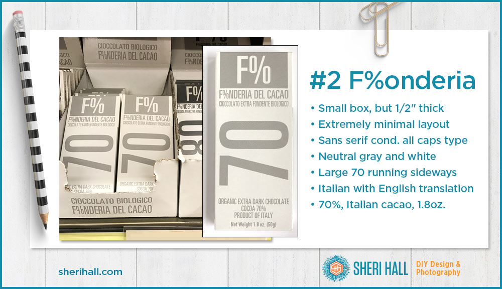
#2 F%onderia (Fonderia) Extra Dark Chocolate
70%, 1.8 oz.
Layout – Super simple, one color layout with the chocolate % number set on its side as the main graphic on the package. The F% is the secondary graphic at the top; I assume that’s their logo.
Package – This is a full box that is 1/2″ thick. It’s shorter and narrower than the other packages, but the petite feel in the hand is nice. It’s also the second lightest-weight of the bunch.
Type – This package is all type, set in almost all caps in one condensed sans serif typeface. The exception is the weight at the bottom. The font and sides are all light to medium gray and white.
Art – Here’s a great example of making art out of type. There are no graphic ornaments on this package. However, the designer has used a rectangle to reverse the logo out of, and has made the 70 as large as possible and turned it sideways for emphasis. When all these packages are lined up in a row in numerical order, it makes a nice statement on the shelf.
Color – Not much else to say here; it’s gray and white, as minimal as it gets while still communicating a message.
Extras – A few features on the package are
- On the sides of the package, it says Fair and Organic Cocoa
- One side of the box is in English and the other is in Italian. That’s a nice touch.
- This chocolate is made in Italy
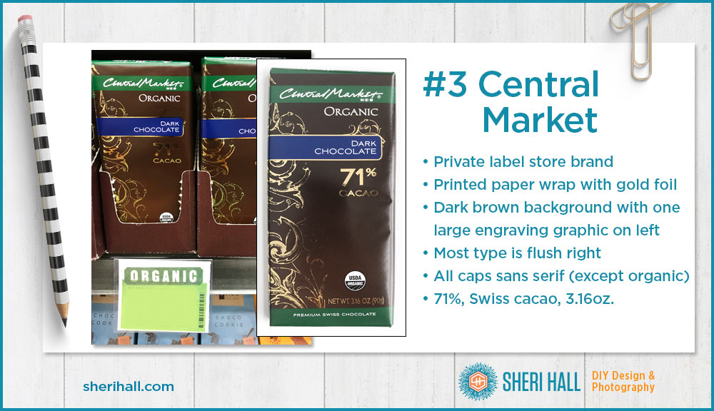
#3 Central Market Organic Dark Chocolate
71%, 3.16 oz.
Layout – This is a flush right layout as far as the type goes. There is a gold foil engraved spiral floral motif on the far left that bleeds off the left side of the package. The Central Market logo is reversed out of dark green at the top (nice branding). Organic is prominent at the top. The bar flavor is reversed out of a blue bar bleeding off to the left. 71% is large and in gold foil under the words “Dark Chocolate.” The green bar at the bottom brings back in the CM brand and tells us the chocolate is Swiss.
Package – This bar is double-wrapped in paper; the inner piece is gold foil.
Type – The logotype is Central Market’s script; the word Organic is in small caps in a serif typeface. The rest of the front is an all caps sans serif face, similar to Engraver’s Gothic. I like that they have reduced the size of the % character so the number 71 stands out more. It’s the largest type on the package.
Art – There’s the logo at the top, the USDA Organic seal at the bottom and the engraving in gold foil on the left. Other than that, this design is accomplished with shapes and reversed out type to organize the info.
Color – It’s dark chocolate so dark brown seems appropriate if predictable. The gold foil plays well with that, and the dark green and blue fit well. All combine to pop the info in white off of the background.
Extras – A few features on the package are
- USDA Organic seal
- Premium Swiss Chocolate reversed out at the bottom
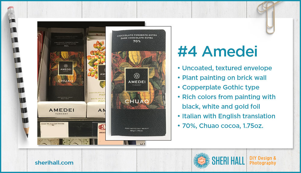
#4 Amedei Dark Chocolate Extra
70%, 1.75 oz.
Layout – This is a simple symmetrical layout with a plant background painted on a brick wall. Centered in front of that is the Amedei logo reversed out of black and outlined with a gold foil rule. Under that is says, “Chuao” the Venezuelan area the cacao is from. Above and below the painting are simple black bands with type reversed out.
Package – This package is a sort of envelope with a small flap on the far right that tucks into a slit on the back to keep it closed. The paper is a cover stock that is uncoated and lightly textured.
Type – All type on the front of the package is in Copperplate Gothic, a traditional popular typeface with tiny serifs. It only comes in capital letters. If you can’t identify Copperplate Gothic in all its forms, work on that. It’s a popular staple in the typeface universe, especially the versions that are bit extended.
Art – The main art is the plant painting. The colors are very rich and warm. The brick texture adds a nice, rustic feel to the textured paper. The painting is set off by the simple black square with reversed logo.
Color – Most of the colors come from the painting. The black, white and gold are just there to support and not interfere with them. Overall it’s a very rich, upscale look.
Extras – A few features on the package are
- The envelope aspect of this package makes it unique
- The text on the front is in English and Italian
- The cacao is from Venezuela
- Most of the type on the back is in Italian. The romance copy about Chuao and the legend of the Mayan cocoa being where the food of the gods grows is translated into English.

#5 Redstone’s Dark Chocolate Espresso (no plain dark available)
72%, 3 oz.
Layout – This layout is near symmetrical, and adds a little visual interest with a tilted photo of the beans and the little 72% cacao mark at the bottom right. The background is subtle and rich with brown tones. The logo is arched across the top; the flavor is just under it and the coffee bean photo with cacao origin info sits under that.
Package – The bar is double-wrapped; the outer piece is printed in 4-color and the inner piece is silver foil.
Type – The logo type is not very upscale or appealing to me. The flavor is set in a sans serif with a printer’s ornament centered underneath to give it a little something fancy.
Art – The background color change is subtle and a good complement to chocolate. The photo is nice, but nothing special. It could easily be royalty-free off of iStock.com. It has an odd crop to it. I like the arched shape of the 72% cacao mark at the bottom. It makes it easy to find the % number.
Color – Everything on this package is neutral. Even the red in the logo is muted. I like the solid dark brown at the top; it sets the arch of the logo off nicely with the cream on brown contrast.
Extras – A few features on the package are
- This is not apparent by the packaging, but this product was tagged with a “local flavor” mark on the store shelf. The back of the package says it was made for Redstone Foods in Carrollton, Texas, but it doesn’t say where it was actually made.
- The cacao is from Belgium
- Made for a Carrollton company
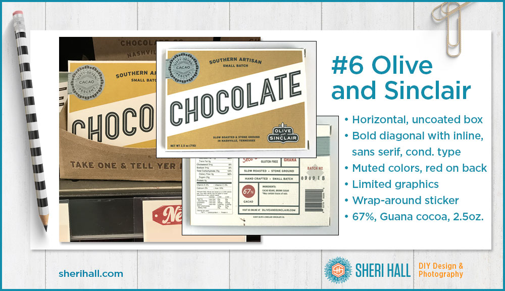
#6 Olive and Sinclair Dark Chocolate
67%, 2.5 oz.
Layout – This is unusual —a horizontal design! Most chocolate bar packaging is vertical because it lets the store put more bars on the shelf thus making it more cost effective. A horizontal package means a lot of wasted space between the top of the package and the bottom of the the shelf above it. The layout is not symmetrical, but it’s very well balanced. It has a strong diagonal band with the word “Chocolate” in it. There is a 67% seal at the top left and the logo is at the bottom right. The rest of the important text is centered above and below the band.
I took a photo of the back of this one because I liked it so much. The info is organized in a boxy layout with a little red for emphasis.
Package – This package is a box that is about 3/8″ thick and is made of textured, uncoated cover stock.
Type – The arrangement of the type is fairly conservative. The slanted “Chocolate” across the center is unexpected. I like the condensed sans serif inline typeface a lot. All the text on this package is capital sans serif but it has variety in weight and width. The type and color give this box an upscale retro feel.
Art – Here’s another nice example of typography as art. The seal at the top left has a nice graphic weight to it and the logo at the bottom has a little leaf icon (olive?), but other than that, there is no art. Color, shape and type can go a long way! I will point out that the 67% seal is actually a sticker that folds around the left side of the box.
Color – The colors are very muted and there aren’t many of them. The box is a cream paper and the ink colors are gold, black and red, with the red printing only on the back. The label is a separate piece and printed in 2-color (black and muted blue). The art and the colors give this package a clean, retro feel.
Extras – A few features on the package are
- As noted, the sticker is a nice touch
- Small batch is noted on the front and the batch number is stamped on the back
- Made in Nashville, Tennessee
- The cacao is from Ghana
- The only 2 ingredients are cacao beans and brown sugar
How design affects perceived value
- Prestat – This package is very flashy for a chocolate package, which makes it a bit of a wildcard price-wise. There’s nothing special about the typography. The only things that give it street cred are the emblem at the top mentioning the queen and the the fact that is was established in London in 1902. The bar is on the small side so I’d put it in the middle range.
- Fonderia – This package is too minimal to be cheap. It’s also a small, but unusually thick box. The shelf presence of the whole line shows some design skills. It’s Italian. The weight is on the small side though. I’m going to put this price on the high side.
- Central Market – Since this is private labeled, it’s likely on the low end price-wise. That’s not to say it’s not good chocolate, but whoever made it (not CM), doesn’t have their brand on it and thus can’t charge what they normally would. On the plus side, it’s organic and premium Swiss chocolate. Also the weight is on the high side of these samples. I’d say lower price, but better value.
- Amedei – I had never seen this package before this project so it was an unknown. The fact that it’s an envelope package, Italian and small make me think it might be at least medium, maybe high. The gold foil box around the logo is nice, but several of the packages have gold foil so that wouldn’t make me think it’s expensive. However, gold foil on uncoated paper is unusual and something I like.
- Redstone’s – Nothing about this package is saying it should be pricy. The only thing that sets it apart for me is the “local flavor” tag on the shelf and that’s not even mentioned on the front of the package. There’s nothing special about the printing techniques or package and there’s no romance copy. It’s all just the facts. I’d go with a low price.
- Olive and Sinclair – I love this package; it’s my favorite of the bunch because it’s the one that aligns most with my vintage design sensibilities. I like the paper stock, the texture, the little label that runs around the left side. I like the inline, condensed sans serif typeface across the middle. The minimal design but with nice touches makes me think it’s at least mid-range, maybe high end. The fact that it says “small batch” and is numbered on the back would make me think high end.
Don’t scroll down until you’re ready for the answers …
.
.
.
The price is right!
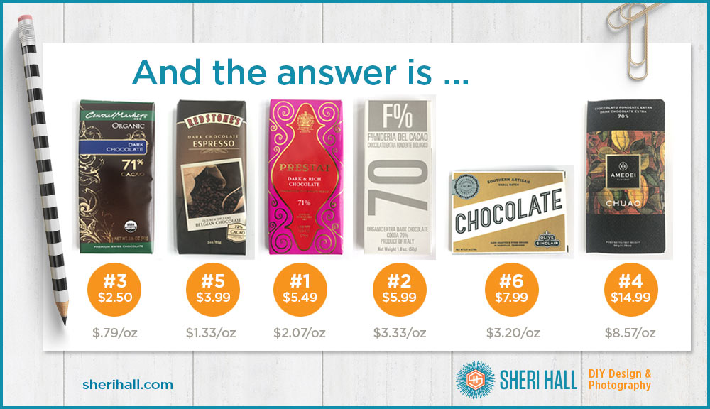
How did you do? I added the price per ounce on each so you could get an idea of that metric. They were only one off the actual price order. What surprised me was that Amedei was so expensive, especially when you compare them on a cost per ounce basis. It’s more than double the next one down.
Another thing I find interesting to look at is the artwork embossed on the chocolate bar itself, but since this is a shelf exercise, I did not include that. I will leave that to you to investigate on your own!
I will also let you taste lower price and higher price bars to see which you prefer. After tasting these, I’d say the Central Market bar was a nice surprise — very creamy. The Olive and Sinclair was rich and chewy. The Amedei had a little sharp taste at the end. The white Amedei cost $18.99, even more than the dark!
How did you do on ordering these packages from low to high? Were there any surprises? Aside from the order of things, do any price points surprise you? Comment below with your answers.
Part of what makes package design so fin is the typography. Where do you get all these awesome fonts? Here:
Design in the real world
The next time you want to design something high end (it doesn’t have to be packaging), go to a good grocery store and walk up and down the aisles and take a quick photo of what appeals to you. It could be an unexpected layout, a cool way to handle logo placement, a typeface, a color combination or a printing technique. Chocolate companies have a lot of money to spend on packaging so go learn from them.
I got the most expensive one. Didn’t care for the packaging on the next two (shows what I know!). Never would’ve picked CM as the lowest price.
This is fun!
4, 6, 1, 2, 5, 3. And I strongly dislike the look of 4, but I also don’t like fall colours. Thanksgiving layouts bring me down, so that I did not like this chocolate’s packaging is clearly a Katy issue.