For better or worse package design affects the perceived value of a product. Seeing the price tag also affects the perceived value, and it’s comforting to a consumer when a low price and inexpensive packaging match up; likewise, an expensive product should match up to upscale packaging.
When these elements are out of whack, it causes confusion and people can doubt the value of what is being sold. If you want to charge a high price for your product, course, or service, your design must visually support the price you are charging.
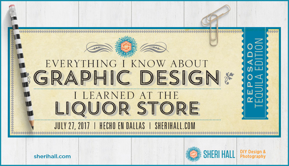
In honor of National Tequila Day on July 24th, I’m going to devote this post to critiquing tequila packaging and discussing how design affects perceived value (either high or low) for your products and services. I took a field trip to the new Total Wine & More in west Plano, Texas to photograph these samples.
I’ve always been fascinated by how changing some fonts, colors and layouts can change the perceived value of a product in the viewer’s head. Two products may be identical but if you design a more upscale packaging, you can establish a higher price for one over the other (it’s a little magical).
I’ll critique the seven bottles in no particular order and then let you guess the relative price order from low to high. Next I’ll reveal the prices and you can see how you did identifying packaging for the low, medium and high end for a particular product.
OK, let’s get started! All products are 750ml bottles of reposado unless otherwise noted. In the world of tequila, the least expensive product is silver, the mid-range is reposado and the high end is añejo (aged).
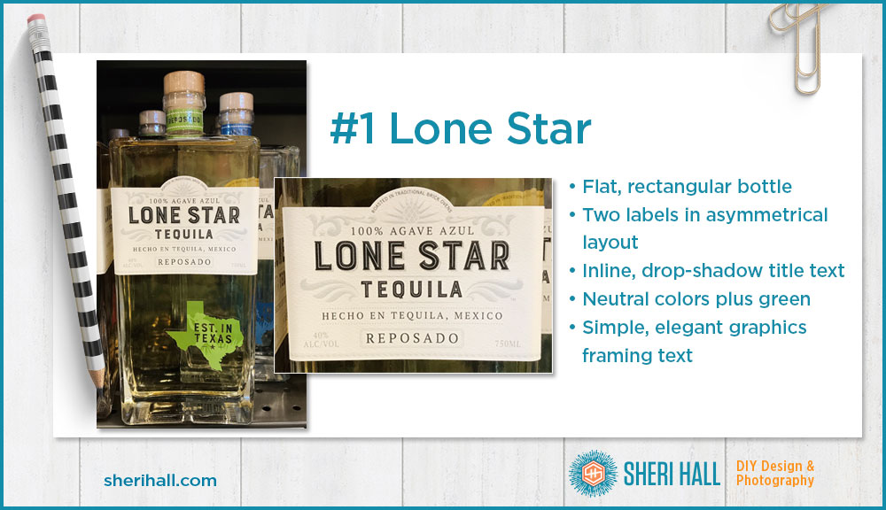
#1 Lone Star package design
Bottle – The bottle is a simple, flat rectangle with no embossing
Layout – I like the two-label layout a lot: the main one is a simple rectangle with a short arch on top and a symmetrical layout, and the second one is in the shape of Texas. When a label is cut to a custom shape like this it’s called a die-cut because the label stock has to be cut by a die (like a sharp cookie cutter) to the exact shape. As technology has improved over the years, jobs that used to require die cutting may now be cut by lasers.
I like the extra high position of the main label. The layout of the two labels is well balanced though not symmetrical.
Type – All type is centered making for a symmetrical layout. I really like the font combo here.
- The brand name and product in an inline (thin reversed out character over the main one) font with a subtle hatch drop shadow
- The secondary text is in a clean all caps serif face
- The condensed sans serif is in all caps and reversed out of the Texas label
Color – The green from the Texas label is repeated in the faux green ribbon around the neck of the bottle. That’s a nice touch. The main label is very neutral but not boring.
Art – There are some simple, subtle graphic ornaments and agave icons; they help from the text without getting in the way.
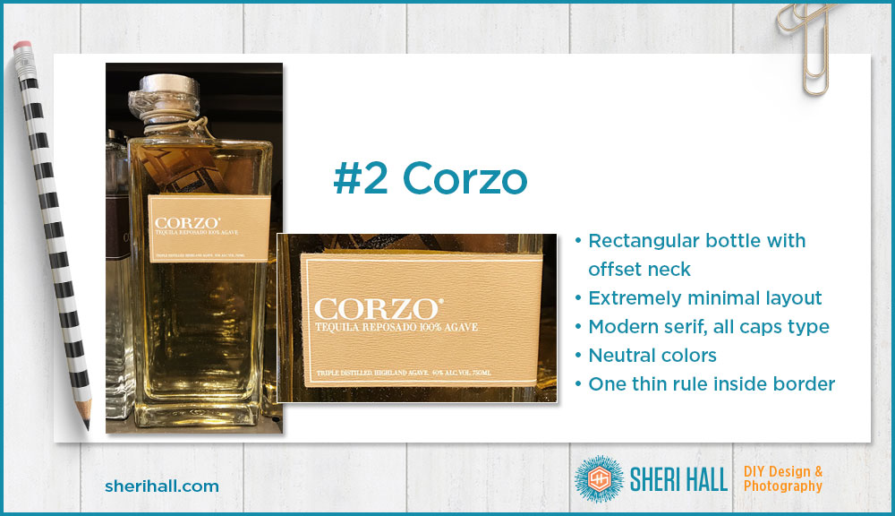
#2 Corzo package design
Bottle – Here we have another simple rectangular bottle with no embossing, but the neck is set way off to the left side.
Layout – What drew me to this bottle was the extreme simplicity. The label is super clean and offset to the right side of the bottle. The label is well above center which adds a little elegance.
Type – The brand name is an extended modern serif font set in all caps (popular in the fashion world); the secondary text is also in all caps, but condensed. All text is flush left.
Color – Sticking with the simple theme, the label is camel-colored with a slight texture and all type is reversed out to white.
Art – There are no ornaments or icons on this label; there is on simple rule slightly inside the edge of the label.
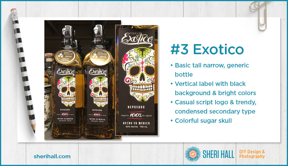
#3 Exotico package design
Bottle – It’s a basic tall and thin bottle with rounded corners and a square base, nothing unique.
Layout – The label is a vertical rectangle with a black background and centered text. It’s a nice touch to have the sugar skull bleeding off the right side. This adds visual interest and allows the skull to be larger than if it were contained. It’s an awkward crop at the edge of the eye socket; I would move it 1/8” one way or the other to get it off that edge.
Type – The logo type is a casual script with great contrast between thick and thin. The secondary text is a stylish (maybe trendy?) condensed face in upper and lowercase.
Art – The bright colors on the white sugar skull contrast nicely against the black background. The two pink wavy shapes set off the 100% agave text with a little pop.
Color – The colors are bright and fresh; given the imagery, colors and typefaces this product appears to be aimed at a youngish female market.
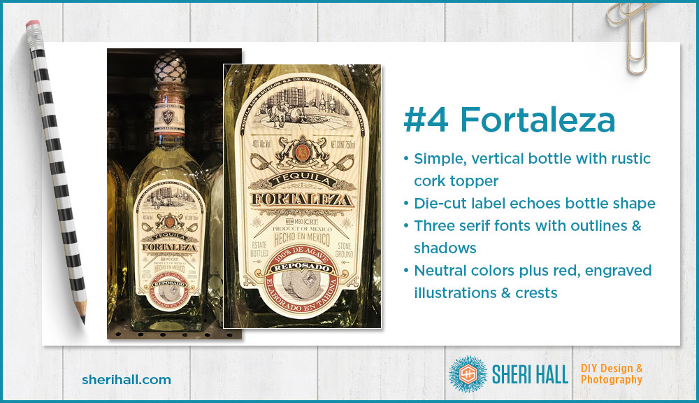
#4 Fortaleza package design
Bottle – This is a simple bottle with a smooth transition from neck to body. The cork topper looks a bit homemade and adds a unique flair.
Layout – This label is die-cut and follows the curves of the bottle nicely. All art is symmetrical giving it a formal look. The type, illustrations and embellishments lend an old-world feel.
Type – These’s a lot going on here — at least three serif fonts all working well together because they have enough contrast. The brand name (Fortaleza) and Reposado are set in a modern serif; tequila is in a display all caps serif. The sans serifs all look like Universe Light Condensed set in all caps. I really like the Hecho En Mexico type arching over the bottom seal.
Art – There’s a lot going on here too. The engraving style of illustration and the official-looking seals give the feeling that this brand has been around a long time.
Color – Most of the color is neutral. There are pops of red in the seals, but it’s still quite muted. The tone-on-tone rays in the background add a subtle texture.
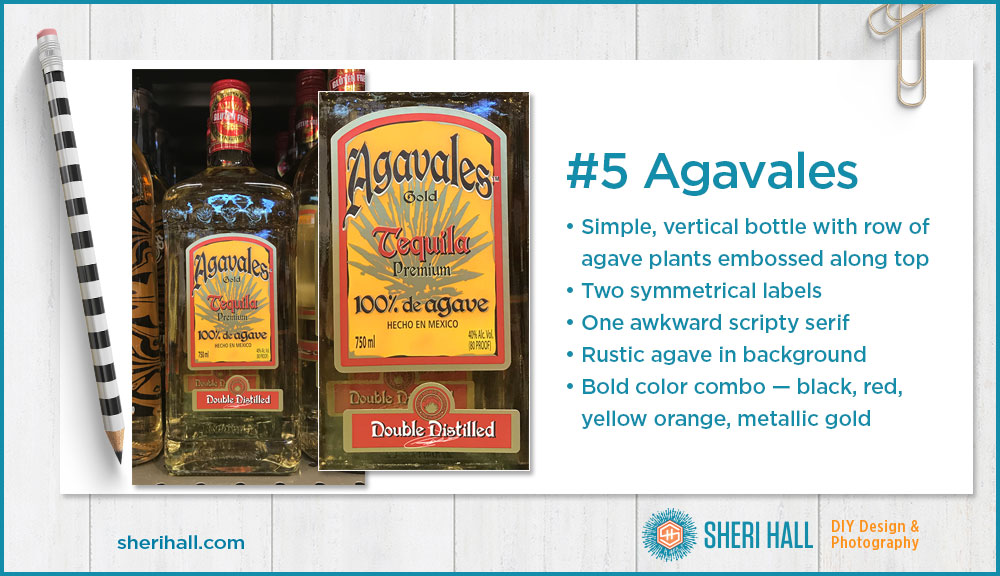
#5 Agavales package design
Bottle – The bottle is a basic round corner square with a border of little agave plant icons embossed around the top.
Layout – This one has two labels plus the neck wrap. The main label is a vertical rectangle with an arch at the top. The text is centered and all art is symmetrical. There’s nothing that stands out on the main label. The smaller one at the bottom is a little more interesting to me because it has a seal and signature. The seal is fairly small and hard to read.
Type – There is one main typeface for this label — an awkward scripty serif. I have never liked this font, whatever it is. The secondary type is a simple sans serif in all caps. The various drop shadows do an adequate job of popping the text off the background.
Art – Other than the seal at he bottom, the only art is a rustic agave plant in gold centered behind the type. The design also includes rough edges of black and gold inside the label border. I think it’s an attempt to complement the rustic plant art, but it looks sloppy to me.
Color – The colors are black, red, yellow orange and metallic gold. It has a bold look, but not necessarily in a good way. I find the gold and yellow orange combo to be odd and it gives it a cheap look.
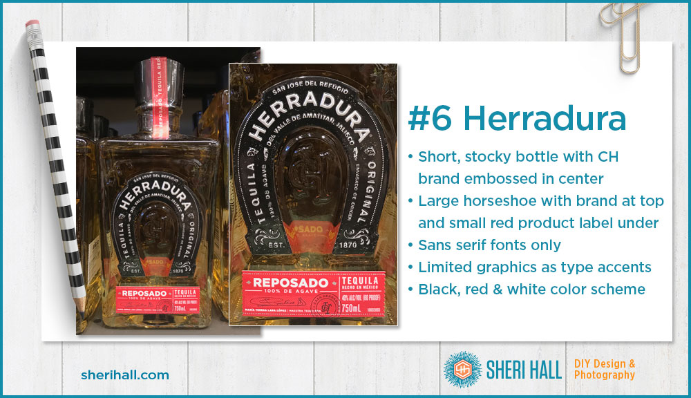
#6 Herradura package design
Bottle – This bottle is shorter and thicker than the other boxy ones. It has some subtle embossing and a horseshoe shape with the arched Herradura logo.
Layout – Herradura uses the top 75% of the bottle to establish the brand, product category tequila, that is was established in 1870 (gives credibility) and where it’s made. The red label at the bottom has the specific product info. I love this little red label! This design style is right up my alley — the layout, how the info is separated into boxes, the typefaces, the serrated stamp edge on the sides, the signature and round black Casa Herradura stamp bleeding off the bottom edge. The color red, typeface and dotted line border are repeated vertically over the bottle cap — nice!
Type – This one is a bit unusual in that it has no serif or display fonts. It is all sans serif, but it still manages to have a very established, classic look and feel. There is a bit of variation in the sans serif fonts. The main type family looks like Gotham and it’s complemented by a condensed face on the bottom label.
Art – There is not much in the way of graphics here. The design is limited to type on a curve, the horseshoe shape and the signature and stamp at the bottom for Casa Herradura. There are some nice little ornaments separating the type on the horseshoe.
Color – The colors are red, black and white — that’s a simple, bold color combo and it works great. Compare it to the Agavales label which also uses yellow orange and metallic gold. Both labels also have arched type, but the Herradura looks much more upscale to me.
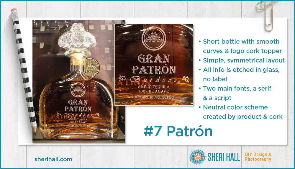
#7 Gran Patron Burdeos package design
Note: This one is an añejo, not reposado like the other bottles.
Bottle – This is a simple bottle that’s similar to other Patron bottles but has a smooth texture and slightly different shorter shape. It has a nice curve from the neck to the body. The cork topper is the wow factor here as it reflects the logo bee.
Layout – The layout is simple, centered and symmetrical. There is no label since the art is etched in the glass.
Type – There are only two fonts (three if you include the ml line). The logo type is fairly familiar and repeated on the product description. The secondary typeface is a script.
Art – The art is simple with the bee-in-a-circle logo being the main emphasis and the two little plant icons flanking the product name Burdeos.
Color – Since the art is etched in the glass, the color is subtle and created by the product itself. It has a very neutral look with the warm tones of the cork and tequila.
How design affects perceived value
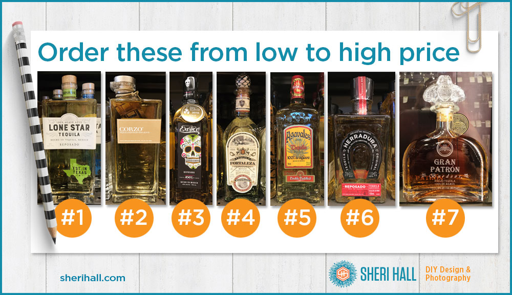
What do you think? Here are the seven bottles in the order I discussed them. Can you put them in price order from low to high? Write down your guess, then scroll down to see the answer. Here are my general thoughts on low, medium and high-end perceived value based on design:
- Lone Star – The boxy bottle, high label placement, clean design and understated color scheme make me think this is at least a mid-range brand.
- Corzo – The offset neck (custom bottle), boxy bottle, super simple layout and neutral color scheme make me think this is on the high end of mid-range.
- Exotico – The plain bottle and colorful artwork make me think this is aimed at a younger, or entry-level market so it’s probably on the low end.
- Fortaleza – It’s a little busy (OK, a lot busy), but the color scheme is muted and they are adding value with the stone ground feature, the crest, the swords and the rustic cork topper. I’d guess this is mid-range at least.
- Agavales – I have always disliked this package; the only reason I would buy it is that it’s 100% agave (if I were making pitchers of margaritas and didn’t want to go broke). The type, the colors, the illustration style all point to the low end for me.
- Herradura – The simple elegance, color scheme, brand stamp and type-heavy design make me think this is at least mid-range.
- It’s hard to ignore the Patron name. But let’s try! The fact that there is no label and the info is etched into the glass, the cork topper is custom made from the logo and the info is minimal makes me think this could be pricy (and it’s in a glass cabinet). Also the fact that it’s an añejo is going to kick it up above the others. But how far above?
Don’t scroll down until you’re ready for the answers …
.
.
.
The price is right!
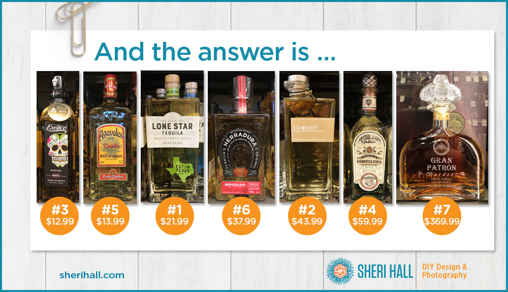
How did you do on ordering these bottles from high to low? Were there any surprises? Aside from the order of things, do any price points surprise you? Comment below with your answers.
What surprised me was that Lone Star was priced fairly low for its design aesthetic. I was surprised the Fortaleza was at the high end (not stupid, silly high end, just regular high end) given that several products slightly less expensive than it use such minimal design, but it has a very complicated label. It’s pretty and establishes credibility for a high price point, but it’s busy busy.
In researching this article I learned that Patron has only been around since 1989, yet it commands a pretty hefty price. When a company doesn’t have actual age behind it (Herradura, 1870) but wants to look established to command a higher price, how do they accomplish this? Through the magic of graphic design!
If you did a blind taste test of these would they fall in the same order? I will leave that for you to test!
Design in the real world
The next time you want to design something high end (it doesn’t have to be packaging), go to a good liquor store and walk up and down the aisles and take a quick photo of what appeals to you. It could be an unexpected layout, a cool way to handle logo placement, a typeface, a color combination or a printing technique. Liquor companies have a lot of money to spend on packaging so go learn from them.
I really like the practical approach to learning/appreciating design — and it really hits home the importance of GOOD design in order to establish product value in the potential buyer’s mind. When is the taste test?? 😉
Thank you! This is why I think design is so powerful; most people ignore the fact that good design can allow you to charge a higher price for your product, so why not invest little bit in it? It can also be the difference between being proud to answer the question, “What’s your website?” or embarrassed. I do have a bit of a tequila collection at the moment. I bought the Exotico, Lone Star and Blue (not covered in the post); I have a full bottle of Camarena too. According to FB, my cousin is buying me the Patron for Christmas, so I’ll be sure to invite you over to test that! Haha, not holding my breath.