A look at the 4 subcategories of serif fonts and some basic advice on choosing a serif typeface for your graphic design project
Note: The following advice on serif fonts is mainly relevant to “print” design including actual printed-on-paper pieces, PDFs of flyers and brochures that look like they should be printed, and social media graphics because the text has been turned into an image and does not display as editable type on a screen.
best serif fonts and typefaces
Let’s start by defining some basic font classifications and then take a deep dive into the wonderful world of serifs!
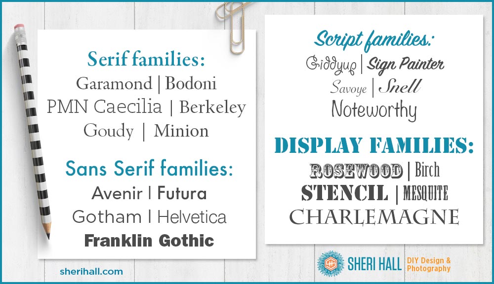
Major font (typeface) categories
- Serif – A serif is the small line at the end of the stroke in a letter or symbol; thus serif fonts have these small flourishes at the ends of strokes
- Sans serif – Sans is French for without, thus sans serif fonts are without serifs; they are much simpler because there are no flourishes at the ends of strokes
- Script (handwriting) – Handwriting or cursive typefaces; some are very fancy and work great on formal invitations while some are approximations of chicken scratch. Whimsical, flowy, casual scripts are very trendy right now; if you choose one, make sure all the characters you need are easily legible (super important for logo design because you want people to be able to read your company name, right?)
- Display (novelty, decorative) – the last major category is a catchall that includes everything that doesn’t fall easily into the first three categories, and is used in a very limited capacity because they are not comfortable to read in large volumes. You may set a logo in a display face, but you wouldn’t set a brochure or book in a display face.
Types of serif fonts
These are the 4 different subcategories within the serif world, followed by examples:
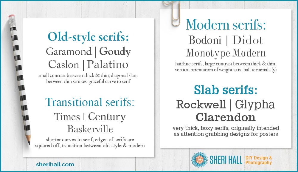
Old-style serifs (also called roman)
- They are characterized by a lack of strong contrast between thick and thin lines (though they easily have more contrast than sans serif faces)
- There is usually a diagonal slant between the thinner parts of the characters; look at the letter o and draw an imaginary line from the thickest part of the stroke on top to the thickest part on the bottom — is it vertical or diagonal? Vertical means modern and diagonal means old-style or traditional
- Their serifs are connected to the stroke with a graceful curve
- They date back to 1465 — they are the oldest and most common of the serif faces
- Examples: Caslon, Garamond, Palatino, Goudy
Transitional serifs (between old-style and modern)
- The curved angle that connects the stroke to the serif is called a bracket; the brackets of transitional serifs are shorter curves
- The edges of the serifs are squared off, giving these faces a more modern feel than old-style faces
- It is the transition between old-style and modern
- Examples: Baskerville, Times, Century Old Style
Modern serifs (used to be called Didone)
- First emerged in the late 1700s
- Characterized by hairline serifs
- Vertical orientation of the weight axes (vertical strokes are thick and horizontals are thin)
- Strong contrast between thick and lines (because of the hairline serifs)
- Some strokes end in ball terminals, rather than a serif (lower case y)
- Examples: Bodoni, Didot, Monotype Modern, Modern No. 20
Slab serifs
- Date back to 1800
- Originally intended as intention-grabbing designs for posters
- They have very thick, boxy serifs rather than the curved dainty serifs you find in old-style faces
- Examples: Rockwell, Clarendon, Lubalin, Memphis, Serifa
My short list for go-to serif fonts (type families):
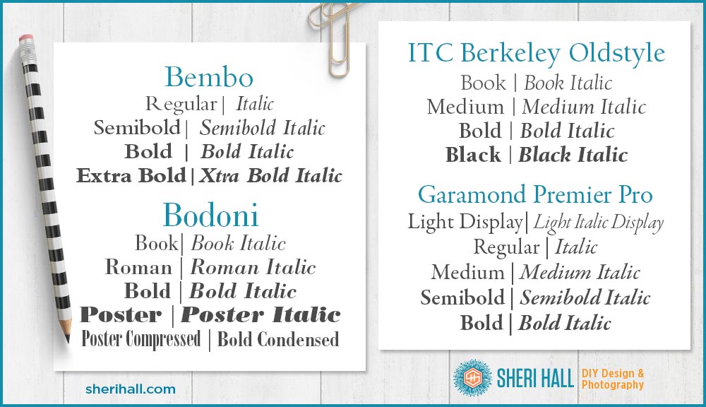
- Bembo – an old-style roman face, attractive and legible book typeface; the version you’ll find today is from 1929 based on the original designed in 1496
- Berkeley – an old-style, classic face from 1956 that has a little flair to it; I’ve always liked the slant on the lower case e and the tiny nibs that come off some of the characters as they give the face an elegant feel
- Bodoni – first designed in the late 1700s, this is a large family ranging from book weights to extra bold, poster, and compressed; it’s a modern face as it has significant contrast between the thick and thin strokes; great for headings, display and upscale magazine use, but less useful for large amounts of body text
- Garamond – very large family with light to extra bold weights and a whole set of condensed versions; it’s another old-style (a face from the 1500s qualifies as old, right?); there are several flavors of Garamond; Apple used to use a condensed version of ITC Garamond for its logo, Adobe Garamond is an elegant but short version
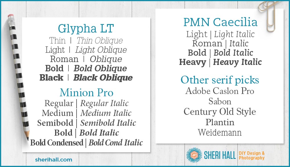
- Glypha – a slab serif face designed in 1977, very legible and practical
- Minion Pro – the youngster of the bunch designed in 1990 for Adobe; it’s classical, old-style and designed for body copy; it has very attractive numerals and small caps suitable for formal invitations if you don’t want to use a script
- PMN Caecilia – another young one, a slab serif face from 1990 that’s more humanist (rounded) and less geometric; easy reading and probably the most readable slab serif for body copy; the magazine Real Simple uses this typeface extensively
- Other good serif choices: Caslon, Sabon, Century Old Style, Plantin, Weidemann
And here’s what they look like:
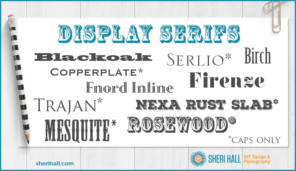
Fun Display Serif Fonts
You wouldn’t use any of these to typeset body copy in, but they might be good for headlines, logos and other limited uses. Some of them are capital letters only.
When to use a serif font
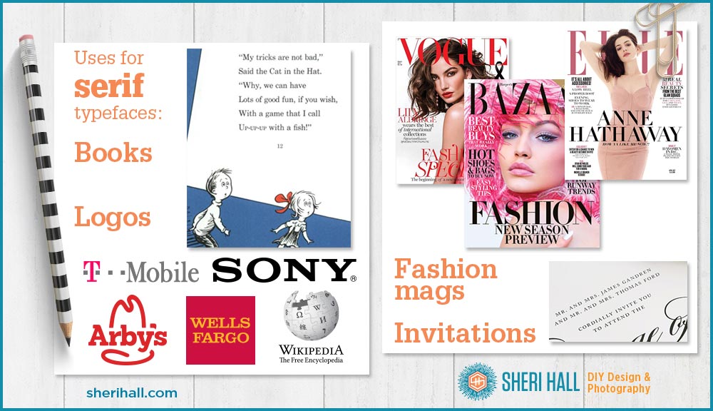
- Body copy – Serifs are old and most of us learned to read books printed in serif faces (The Cat in the Hat), so common uses of serif typefaces are body copy (that’s the little text used for paragraphs) in brochures, annual reports and books. This is usually old-style or transitional, but slab serifs would work if you want a more clean, contemporary look. Modern serifs are rare for body copy unless it’s a short piece.
- Logo design – Serifs are good for logo design when a company wants to look established, professional and reliable. Old-style faces would be more traditional-looking than slab and modern faces. Modern faces would be more stylish.
- Fashion magazines & other fashion related art – Elle and Vogue use modern serifs
- Formal Invitations – if you don’t want to use a script, consider a serif face in old-style small caps, or a modern face like Bodoni
Observing fonts in the wild
The next time you see some printed material (package design at the grocery store, bulk mail, magazines, flyers, brochures) look at the fonts they’ve chosen and see what you think. Did they use display fonts for the headings and something more legible for body copy? If they used serif fonts, can you identify which sub-category they fall in? Practice font identification skills by looking at the world around you. Design is everywhere!
Feel free to comment below and ask any questions you have about designing with serif fonts for print design.
Which is your favorite kind of serif?
I’m def a SANS serif kind of girl! I love clean, simple, modern fonts.
I will be covering sans serif in a future article, for sure! I can’t believe Futura is 90 years old this year. Maybe I’ll through a 100th birthday party for it in 2027. It’s one of my favorite sans serifs because it’s so versatile and stylish.
I had not seen Wiedemann before. I like fonts where the lowercase e slants that way. Tall and thin. Hint of art deco. I also love displays when I teach kids. They’ll use a display font as paragraph text. It’s revolting, but since they’re just playing … I guess it’s like how my stepson would eat Vegemite and peanut butter sammies. Anything goes at a certain age.
Haha! Yes, kids and typography is fun to watch. I’ve seen some garish layouts in Cavalcades and Evergreens, from well after we left of course. When desktop publishing put so much power in the hands of people with little to no skill and experience, it made for some interesting results. But that’s how people start learning so it does serve a purpose. (And it’s not limited to kids.)
It’s so hard for me to see differences when I am in the creative process! This was interesting.
Thanks! Yes, when you’re in the weeds it’s hard to know what the end product will look like. That’s why I usually design something and let it sit overnight, then come back the next day for revisions. It’s a little clearer by that point how I can improve it.
I should have added this in the article, but I’ll just add it here: don’t get too caught up in the old-style vs. transitional serif differences. They are both generally used for the same purpose: body copy for books and brochures. Concentrate more on being able to pick out the modern and slab serifs compared to the other two.