Today I’m counting down my top 5 Olympic athlete uniforms, plus one honorable mention and one eccentric outlier. Betcha can guess who.
Great news! Graphic design is not limited to paper and screens; it’s all around us — fabric, coffee mugs, tee shirts, mouse pads, phone cases, rugs, etc. Let’s take a look at some winter Olympic uniforms from a design standpoint and see how they measure up.
When I chose my favorite 5 Olympic uniforms, I did not consider the figure skating costumes. They are beautiful, but not really a designed uniform. I chose my favorites based on these criteria:
- Distinctive – I can easily tell this country’s contestants from the other ones when they are mingled together
- Memorable – When I associate a particular country with its uniform, will I remember it a few days later?
- Well-branded – The uniform is consistent with the visual brand of the country, from a symbol to a color scheme to cultural graphic icons
- WOW factor – When I see an athlete on TV and I think he/she’s wearing a cool uniform and I have to find out who they represent
- Overall cool looking graphics – because I’m a designer!
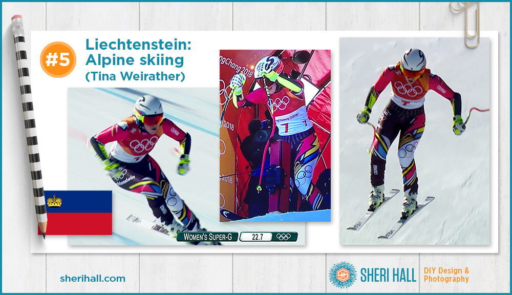
#5 Olympic athlete uniforms – Liechtenstein: Women’s alpine skiing (Tina Weirather)
The race bib covers up the top of the uniform so I chose this one based on the bottom half. The Liechtenstein flag is red and blue with a gold and black crown. The colors of the pants reflect this well. I didn’t know what country the skier was from when I saw this uniform fly down the mountain, but I knew I had to find out. It was so unusual!
What I like about this design:
- Asymmetrical
- Overall diagonal striping on the legs
- Bold primary colors pop out of the black background
- Diagonal stripes vary by color and width for extra interest
- The red lightning flash on her left thigh that’s bordered by a yellow one
- The Olympic rings running diagonally on a large white stripe across her left knee
- The Olympic rings and her country’s name stretching diagonally across her right hip, both reversed out of black (the rings are on a field of white on her left leg)
- It feels like what Mondrian would have painted if he worked diagonally
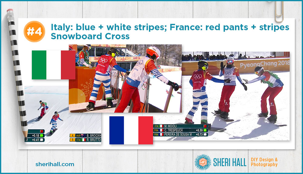
#4 Olympic athlete uniforms – TIE Italy (blue and white striped pants) and France (red pants and blue and white striped sleeves): Women’s snowboard cross
Again, the race bib covers up most of the top of the uniform so I chose these based on the boldness of the pants. These uniforms carry over to the men’s snowboard cross as well; it was easy to identify Italy and France no matter what bib color the racer was wearing.
What I like about this design:
Italy:
- The thick horizontal blue and white stripes (I’ve seen plenty of vertical stripes and thin stripes, but these pants turn that expectation on its head).
- The single red stripe at the left ankle and green stripe at right ankle (in researching this post, I ran across some other Italian uniforms that are red, green, blue and white striped, just as wide as these stripes!)
- Solid blue sleeves pick up the blue of the pants; simple and clean
- It’s super easy to identify the Italian boarders as they fly down the mountain in this crazy race event
France:
- Solid red pants, so simple but so unique
- Blue and white horizontally striped sleeves (I associate that with casual French fashion)
- The color scheme matches the blue, white and red of the French flag
- It’s super easy to identify the French boarders as they fly down the mountain in this crazy race event.
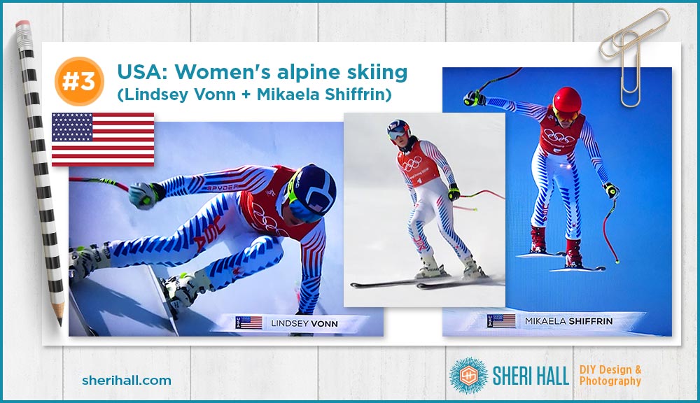
#3 Olympic athlete uniforms – USA: Women’s alpine skiing (Lindsey Vonn + Mikaela Shiffrin)
At first glance these two uniforms look the same, but they are not. The outer leg stripes go up higher on one than the other. The USA runs vertically on both right legs but not in the same place. They’re pretty similar so I’ve grouped them here at #3.
What I like about this design:
- The clean white background
- The repetitive series of blue triangles that run down the outer leg, reminiscent of stripes, but not
- A shorter series of triangles run vertically on the inside of the leg to just above the knee
- The vertical USA in red that runs vertically on the right leg
- The angular stripe elements on the sleeves
- The shapes on the arm generally follow the muscle structure: shoulder, upper arm, forearm
- The gradation from red to blue on the arms
- No stars, but a whole lot of stripes, the red, white and blue represents the USA well
- This uniform looks great flying down the mountain: the striping really says speed to me, maybe even a little like a super hero
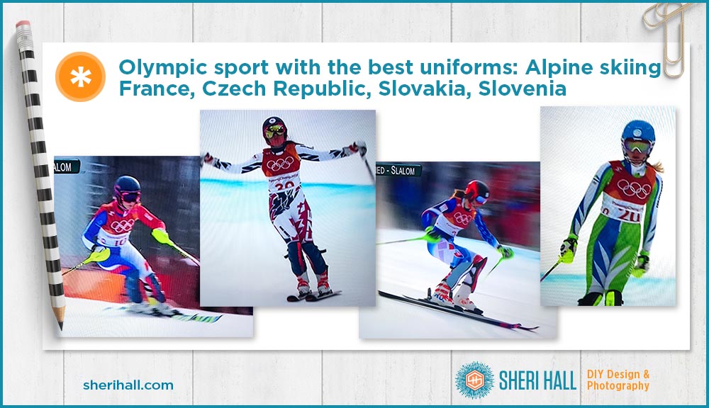
I found the alpine skiing uniforms in general to be the most interesting graphically, not just in the USA. Here are some others I liked.
#2 Olympic athlete uniforms – Canada: Men’s and women’s curling
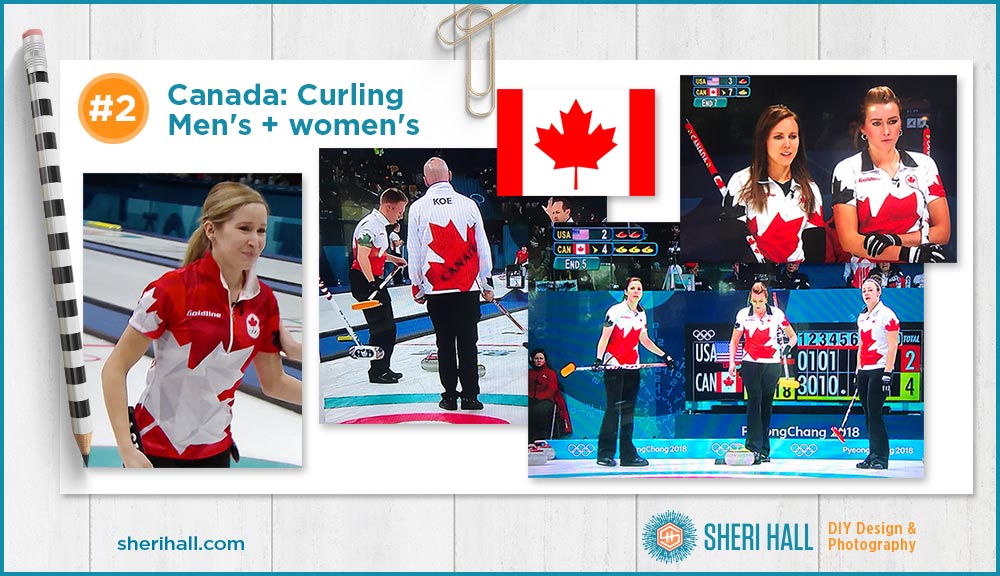
Canada does the best job of combining bold design and supporting the Canadian brand visually in its curling uniforms. The Canadian brand is all about the maple leaf and the red and white (and black here) color scheme.
What I like about this design:
- The huge maple leaf at an angle on the front and back of the shirts and jackets; unmistakably Canada
- The red, white and black is a very bold color scheme and has lots of good opportunities for contrast in the design
- On the back of the shirt Canada runs in all capital letters along a diagonal over the leaf; this is easy to see on the overhead camera angle that is common in curling TV shots
- The opposing colors of maple leaves on the sleeves; on the red shirt the leaves are black and white, while on the white shirts the leaves are red and black
- Not all the colors are solid; the white leaf has facets of light gray and the red leaf has facets of dark red; it’s subtle, but adds nice dimension
- The pants stay black while the shirts vary from red to white (and black, not pictured). The shirt collars contrast with the shirt colors
#1 Olympic athlete uniforms – Norway: Men’s curling
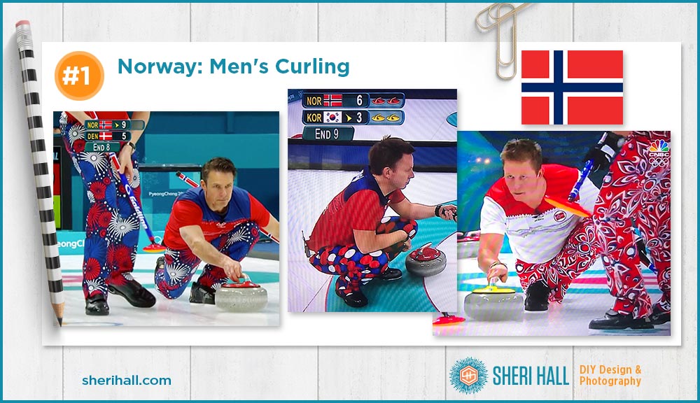
The “uniform” so popular it has its own Facebook page: The Norwegian men’s curling pants! This one scores high on unique and memorable for sure. It’s not as successful in national branding as Canada, but the red, white and blue color scheme is consistent with the Norwegian flag. Other than the pink and red hearts on Valentine’s Day, all of their pants have been red, white and blue – I’m giving this an A for consistency.
What I like about this concept:
- This is not one design, but it’s a family of bold designs that all share a red, white and blue color scheme
- The team wears different pants for each match, so they have a lot of opportunity to keep their audience guessing what they’ll wear next — an Olympic soap opera
- I like the fireworks pattern shown here; the bursts are different sizes layered over each other, all in red, white, and blue on a black background; very dynamic and festive
- The dot pattern on the middle photo is nice because it’s over-sized and it’s a grid rather than polka dot diagonal; it also looks like an irregular pattern which makes it more interesting to me
- The floral pattern is different because it’s on a red background (the other two are on black); the pointy petal shape is fun and there are bursts of flower parts all over
Olympic Athlete Uniforms Honorable Mention: Mexico alpine skiing
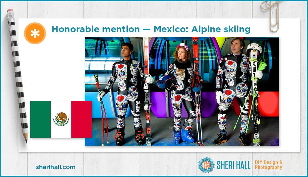
This uniform is inspired by Dia de los Muertos. It was designed by a German prince who is a six-time Olympian on the team. Read the story here.
I did not see this uniform in a race, but wow, it’s pretty awesome. I like the pop of colorful skulls in varying sizes floating around on a black background. MEX runs in white up the left thigh.
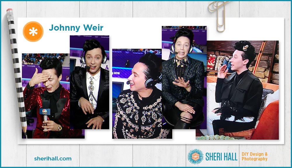
A class by himself: Johnny Weir
Not a uniform, but who can ignore the outfits worn by figure skating commentator Johnny Weir?!? He and his cohort Tara Lipinski took 22 suitcases to South Korea — filled with clothes, shoes and accessories.
Johnny said he prefers black and white outfits, but he lets Tara take the lead on what their daily wardrobe theme will be and then he chooses something to go with her idea. She likes more color, so they’ve worn a nice mix of bold colors and black and white, and metallics.
What really sets Johnny apart? His accessories! They are big and bold, usually around his neck, but more than necklaces. He also wears a slew of rings and his hair is carefully sculpted with the occasional unnatural hair color or adornment running through it.
WOW!
Have you been watching the Olympics? Do you pay attention to the athletes’ uniforms? Do you have any favorites? Did any of them surprise you?
What’s your favorite Johnny Weir outfit??? Tell me in the comments below …

