
My favorite dingbat fonts, how you access them and what cool things you can do with them
Here’s the scoop; in typography, a dingbat (formally known as a printer’s ornament) is a decorative element character. Dingbats can be combined to create box frames with fancy corner elements or used singly as decorative bullets or spacers. The term continues to be used in the computer industry to describe fonts that have symbols, shapes, banner elements, whole decorative words (examples below), simple illustrations and more.
My short list for dingbat fonts and ornaments
1. Adobe Caslon Pro – This one is a little sneaky because it’s a regular character typeface, but it has some dingbat characters hidden within. You’ll need the otf font format because it allows for the extra character spots necessary to include the ornaments.
2. Bodoni Ornaments – Bodoni is a large type family; this is an individual typeface of ornaments.

3. Ed’s Market Design Elements – Part of the larger Ed’s Market type family, this is a typeface of shapes and banner elements that make great elements for signage. In the example below, note the three banner pieces; you can type those individually and choose different tails. It’s a build-your-own banner feature. How cool is that!?!
4. Trend Rough Dingbats – This is part of the larger Trend Rough type family. Just like Ed’s Market, it has a build-your-own banner feature. Type the different parts in as separate characters and they will combine to make one unit. It also has several dingbat icons.

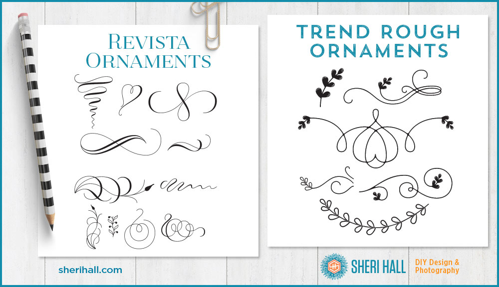
5. Revista Ornaments – Revista is a fashionable modern serif family and has a face that’s full of scripty ornaments.
6. Trend Rough Ornaments – This is part of the larger Trend Rough type family. It has a bunch of scripty flourishes with little leaves at the end. This would work well on a whimsical, feminine or eco-friendly logo.
7. Trend Rough Words – This is part of the larger Trend Rough type family. It has pre-configured words integrated with script elements and banners.
8. Revista Dingbats Two – Revista is a fashionable modern serif family and has a face that has a handful of retro line drawings. It includes plants, light bulbs, and arrows.

How to tell which key stroke produces which dingbat
OK, this is important stuff — pay attention! Since your keyboard is not printed with dingbat characters, you need to use the glyphs palette to show you which dingbats you have available. In Adobe Illustrator, choose the dingbat font you want to use in the font character palette, then open the glyphs palette (under the type menu at the top of the screen), click the T text tool in the toolbox, click on your document and double click the character in the glyphs palette that you want to type. Boom — dingbat!

When to use a dingbat font
Dingbat fonts are so much fun! You can use them for:
- Logos
- Headline accents
- Banners and shape background for call-outs on signs, ads, flyers
- Large ghosted background elements in page layout
- Dividers between lines of copy on social media graphics
- Decorative corners
- Decorative borders (repeat one simple ornament to make your own)
- Accent graphics (point an arrow at an important word in your art)
Observing dingbat fonts in the wild
Be on the lookout for dingbat fonts in magazine ads, flyers, direct mail, invitations and social media graphics. Can you identify what might be from a dingbat font? Sometimes it’s a plain old vector illustration, but then again, it might be a dingbat font.
The next time you want a simple way to jazz up your layout or add emphasis to part of your message, try a dingbat font!
What’s your favorite dingbat font? What do you like about it? How do you use it? Hit the comments section below!
(Extra credit: how many individual dingbat characters did I use to create the title graphic for this post? Duplicated, flipped or rotated characters don’t count; just the individual ones count.)
I had no idea! I thought of them as early clipart from when I got my first computer.
Most people still think of them that way. I guess it’s good for those of us who know there’s so much more to dingbat fonts. It’s another awesome tool in the toolbox.