Hi! I’m Sheri
I’m a graphic designer and photographer, passionate about empowering busy entrepreneurs to confidently create their own logos, graphics and photography.Tl:dr 4 years of art school and 24 years as creative director at my own design firm; a lot of reading and studying print design, typography & web design and how to make messaging look good and communicate.
I was born in Dallas, lived in Southern California during my childhood years and returned to Dallas for high school, where I attended Greenhill School—and somehow became valedictorian of my class! What year? Let’s say the ’80s. I went on to The University of North Texas where I majored in Advertising Art (retro term for what they now call Communication Design) and minored in Marketing.
As owner & creative director of my boutique firm Soleil Design for 24 years, I have designed gigabytes & gigabytes of logos, brochures, annual reports, packaging, posters, billboards, tee shirts and more.
In the mid ’90s I was perfectly positioned (and lucky perhaps?) to apply my killer design skills to the exciting “new” world of web design. Although I love the unique aspects of both print and web design, if you made me pick one, I’d have to give a slight edge to print.
During my schooling and being on the leading (not bleeding) edge of desktop publishing, I developed a great love and respect for typography. Typography is my favorite part of design. It’s a rare skill — choosing and combining a bunch of seemingly disparate typefaces and letters into a beautiful, cohesive layout that communicates a message. Will you ever see me use Arial or Brush Script in my design? Ewww, no!
One of my favorite parts of running my design business has been teaching summer interns about what I do and how I do it — everything from the design process, the research, identifying typefaces, dealing with color, designing for print vs. web — there’s a lot to this design stuff, but I have always believed that if a sharp high-school student can learn it, so can an ambitious entrepreneur!
I love graphic design and I have come to love photography (that story will have to wait ’til another time). Folks, this stuff is not simple, but it’s not hard either.
Those who already have a visual sense will pick it up faster than others, but anyone can learn the rules of design and typography. The more you look at good, high-quality design, the more you will learn what good design is. And lucky for you, design is all around you, good design and bad design. I’m not gonna lie though, most of it is crap, but you can help change the tide by learning and creating good design!
Open your mailbox and look at your bulk mail, postcards & brochures; scroll through your Facebook feed and look at the text graphics that show up. Are some of them harder to read than others? That’s because they are not well designed!
Look at billboards; are they simple and convey the brand and the message quickly, or do you almost have a wreck trying to figure out what they’re saying? Look at signage in the world around you. Look at packaging on the grocery store shelves. Design is all around you! Use it; learn from it. What looks elegant? What looks cheap? What looks expensive? What looks playful? What makes you want to buy it?
Pro tip: One of the best places to go for design inspiration is a liquor store! No kidding. That industry spends big bucks to communicate and compete on the shelf. Walk up and down the wine row(s) and look at the typography, the use of color, the die cuts (any non-rectangular label), the layout, the illustration. Dissect what you see. Some wine labels can use a couple typefaces, a black background, a dramatic layout, and some elegant swashes and look amazing!
The liquor bottles can teach you a lot about typography, layout and how to use design to establish value. How does a $50 bottle of tequila look different from a $20 bottle? Assess the layout, the use of color, typography and illustration.
The other fun place to go look at design is the fancy chocolate bar section of the grocery store (I am not talking Hershey’s here). The higher end grocery stores have a much better selection than the mass market stores. When you pick up an $8 chocolate bar, you’ll see how design can establish value. Does it taste better than a $2.50 Trader Joe’s bar? Maybe not, but the design and copy (and overall brand) may convince you that it does. I love Trader Joe’s chocolate, by the way, and I love those $8 chocolate bars with packaging printed in one color on craft board. Design is fascinating stuff! I hope you grow to appreciate its power as much as I do!
So now, you know my priorities: good graphic design and a tie for second place between wine, margaritas and chocolate!
At the top of this page I labelled myself a photographer as well. I concentrate mostly on design, and I use my photography to support my design and to give myself a creative, related outlet that isn’t specifically design. My photography is very design based; I am drawn to shoot images that show texture, pattern, typography, architecture, and asymmetry.
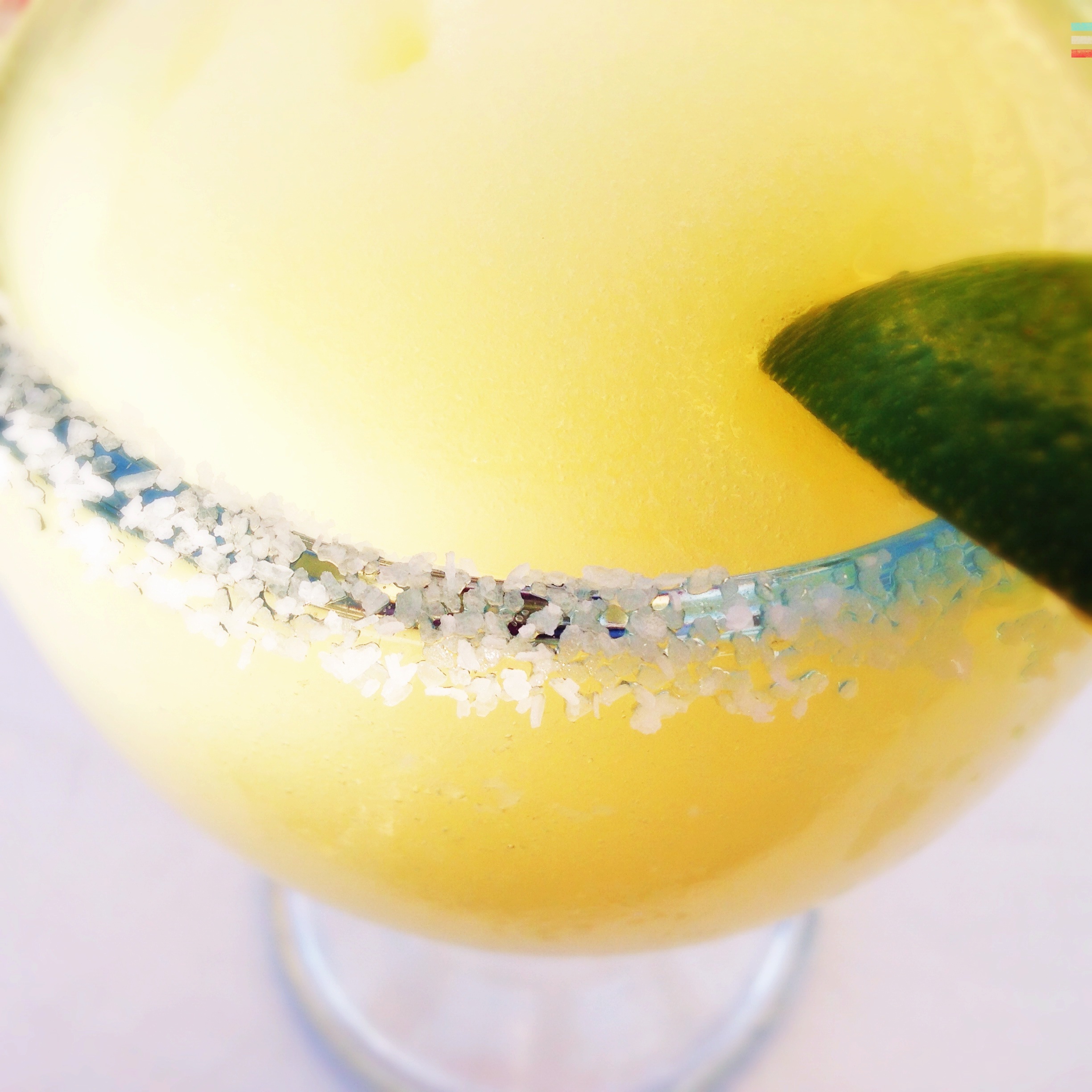
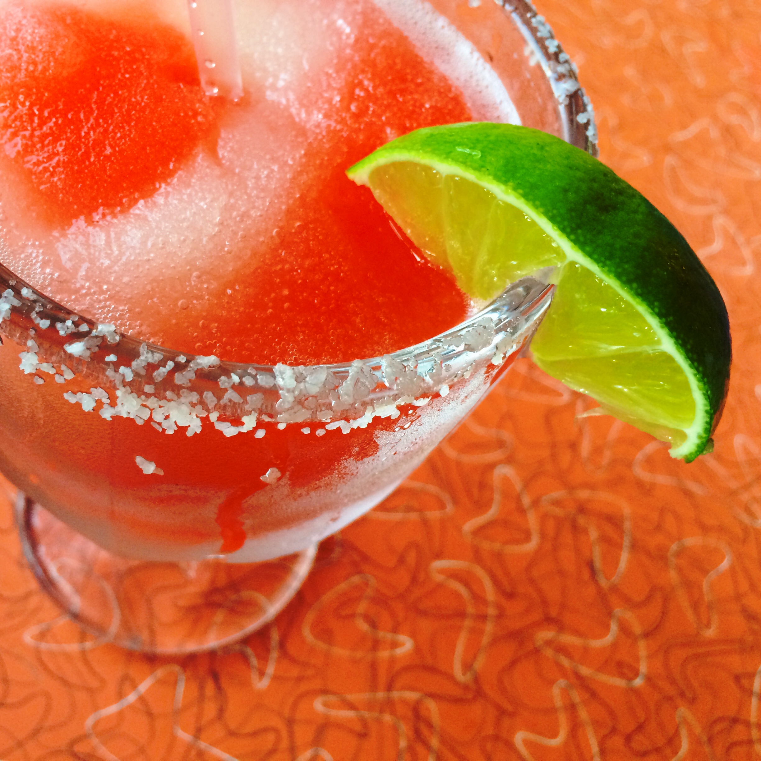
One of my favorite photography subjects is the frozen margarita with salt on the rim. Hey, you read that part about me living in Dallas, right? Dallas is birthplace of the frozen margarita, not the rocks margarita, the frozen margarita. If you’ve ever spent the summer in Dallas, you probably understand. I shoot margaritas with my iPhone and usually my Olloclip lens if it’s a close-up. Below are a few of my faves.
And back to why do I do this? Selfishly, I would like to teach people about better graphic design because it will make this world a better-looking place, and that is a world I would like to live in. And it will give entrepreneurs confidence that they can design their own professional logos, graphics and communications. Like I said, it’s not that hard. Come along and see …
These are a few of my favorite things:
Fuzzy kitties, snow skiing—fast, photogenic margaritas, iPhone photography, Apple technology, writing with dull pencils, grilled fish tacos on the patio, baking cookies & creative entertaining
Today, everything I do is geared toward helping busy entrepreneurs confidently create a professional, visual style for their brand.
I’ll teach you the design process, specifically how to design your own logo and graphics, how to set type properly (yep, that’s a thing), Photoshop and Illustrator basics, and simple photography skills you can use with your iPhone.
And if you get too overwhelmed to tackle this stuff on your own, or you realize you’re better off outsourcing it to a qualified professional, I can handle it all for you. I will send you a complete package of finished files for you to use going forward.
I believe that a solid, professional image is crucial in business today, but like I said above, it’s not simple, but it’s not hard. You can learn to do this stuff, I promise. If you want to stop being confused and start learning how, go ahead and sign up for my free updates.
Thanks for visiting! I look forward to helping you improve your image so you can rock your business!
Cheers,

Sheri Hall | sherihall.com | sheri at sherihall dot com


