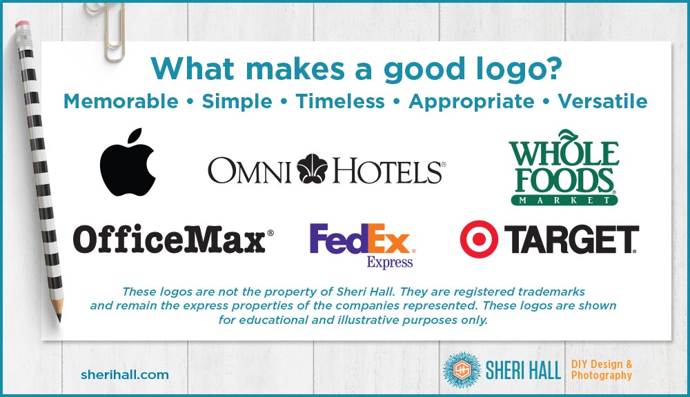
What makes a good logo? The answer is a little different for everyone, but most agree on these five characteristics.
1. A good logo is memorable
A logo should be distinct or unique in some way. This is usually accomplished by setting the letters of your company name
in a specific typeface
with s p e c i f i c l e t t e r s p a c i n g
in a specific color
accompanied by some kind of mark or icon.
Are the letters close together or far apart? Are the words side by side or stacked (on top of each other) … or staggered, or vertical? Consider if you want ALL CAPS, all lowercase or Initial Caps.
There are plenty of text-only logos in the world, but I recommend adding an icon as it makes your logo more distinctive and memorable.
2. A good logo is simple
Let that one sink in—please! I’ve had so many clients who wanted their logo to represent everything their company is and does. That is not the goal here! Let your brochure and web site tell people about your company. Your logo should identify your company and support your brand … and be memorable (remember #1?).
3. A good logo is timeless
This one is relative. If you’re a bank, your logo should be more timeless than if you’re a clothing store for teenagers. Some products do better with a little trendy feel, while others require stability.
How do you show stability? Serif typefaces are a great place to start, and preferably ones that cost money. Using a 200-year-old typeface may look more stylish and timeless than a 20-year-old typeface (Hello Bodoni!).
Trendy faces (watercolor scripts and handwriting fonts, I’m looking at you!) and styles might look great today, but how will they look in 5–10 years?
If you want typeface or font suggestions for your logo design project, here are my recommendations:
- Serif typefaces
- Sans serif typefaces
- Script typefaces
- Display and novelty typefaces
- Dingbat fonts (these will give you nice options for icons and flourishes to add to your logo)
- Fonts to avoid if you want to be taken seriously (do not use these, please)
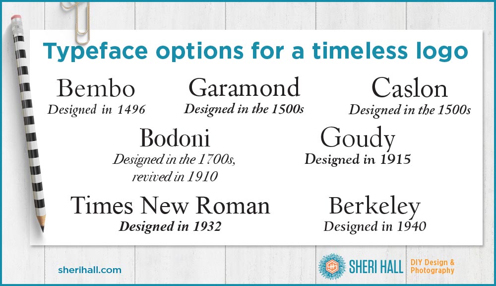
This example shows several timeless typefaces and what year they were designed, for a little extra street cred.

4. A good logo is appropriate
The overall style, colors, and typefaces in your logo should speak to the audience of the company/organization. Is your audience young (whimsical), or mature (elegant); male or female; single and loving it, or family first? What appeals to you personally might not be a good fit for your audience. Try to put yourself in their shoes.
5. A good logo is versatile
A good logo adapts to different colors, sizes, and media. How will it look on a business card, a web site, a tee shirt, a billboard? Here’s where the #2 simple characteristic comes in handy. Simple logos work well in small sizes because they don’t have too much detail to reproduce at 3/4″ size.
What if your logo needs to be printed 1.5″ wide in all black with 20 other logos on the back of a tee shirt? Can you translate your logo into one color and maintain your look and feel?


Great article – these are all 5 simple and fantastic reminders!!