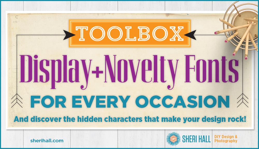
Well, here we are, at the end of our whirlwind tour of the typeface world. We’ve looked at serif, sans serif, script and dingbat fonts … and now we’re at display/novelty. This category is huge since it’s a catch-all for things that don’t easily fit into the other categories. Also, it’s a bit scary. I’ve looked at many a display face and thought, “What type of project was this intended for and what was the designer thinking??” I really want to know! Below are examples of 14 display faces. I have modern, casual, classic, rustic, vintage, elegant and trendy. I’ve pulled together a little of everything so if you want to build a toolbox of quality display fonts, these should have you covered for any occasion.
By the way …
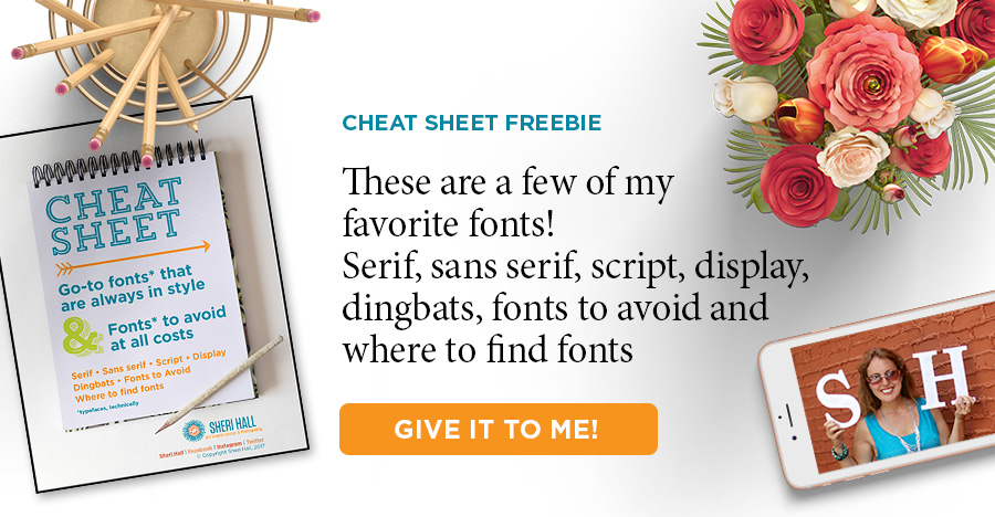
Do you get overwhelmed or underwhelmed when trying to pick the perfect font from your font menu? Put an end to that by downloading my designer-recommended list of go-to fonts that are always in style. Click that big orange button below to download it👇 👇 👇
My short list for best display fonts for every occasion:
Most of these fonts are fairly predictable meaning that when you type a character on your keyboard you get the one option for that key (typing a lower-case “a” gives you the one lower-case a in that face). However, some display typefaces have several options for a lower- and upper-case a, b, c. etc. At the end of this post I’ll show you where to find the extra characters so you can make your typesetting look professional.
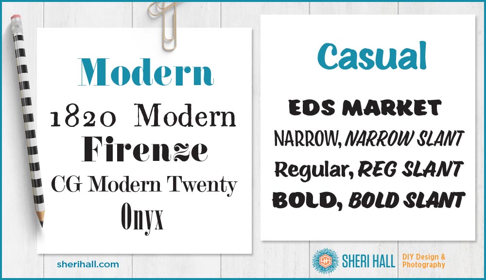
Modern display fonts
- 1820 Modern
- Firenze
- CG Modern Twenty
- Onyx
Casual display fonts
- Eds Market Narrow (caps) + Narrow Slant (caps)
- Eds Market Regular + Regular Slant (caps)
- Eds Market Bold (caps) + Bold Slant (caps)
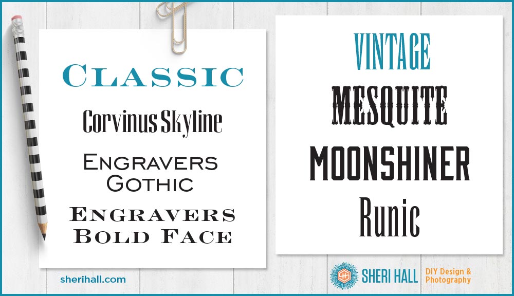
Classic display fonts
- Corvinus Skyline
- Engravers Gothic (caps only)
- Engravers Bold Face (caps only)
Vintage display fonts
- Mesquite (Western, caps only)
- Moonshiner (caps only)
- Runic (very condensed)
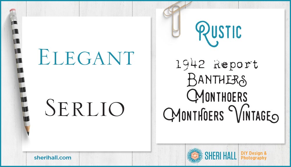
Elegant display fonts
- Serlio (caps only)
Rustic display fonts
- 1942 Report
- Banthers (caps only + special characters)
- Monthoers (caps only + special characters)
- Monthoers Vintage (caps only + special characters)
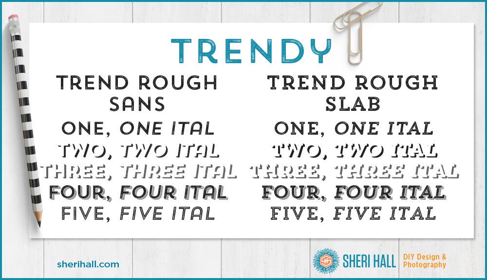
Trendy display fonts
- Trend Rough Sans (caps only, make your own drop shadows!)
- Trend Rough Slab (caps only, make your own drop shadows!)
How to find the super cool alternate characters
OK, this is important stuff — pay attention! Since your keyboard doesn’t have 500+ keys, you need to use the Glyphs palette to show you which characters you have available. In Illustrator, choose the font you want to use in the font character palette, then open the glyphs palette (under the type menu at the top of the screen), click the T text tool in the toolbox, click on your document and double click the character in the glyphs palette that you want to type. Boom — alt character! In InDesign, Go to the Type menu and scroll down to Glyphs to bring up the glyphs palette. It works the same way. Put your cursor where you want the character and double-click the character you want. 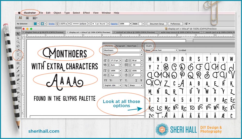
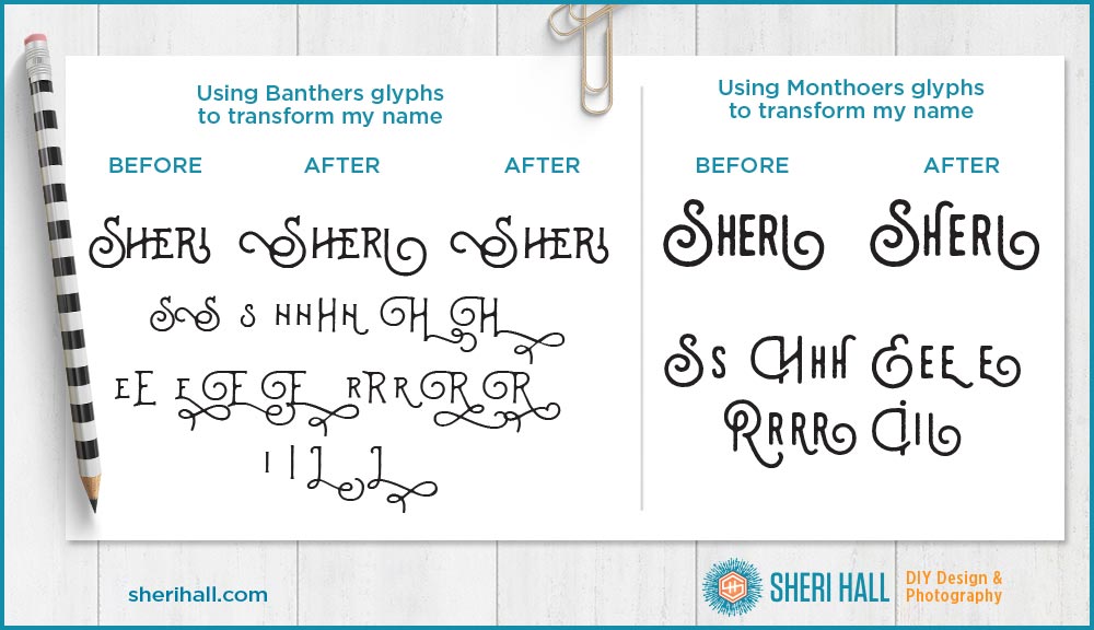
How I choose which characters to use when I have multiple choices for each
First off all, a high-quality typeface will probably choose characters for you based on what you’re typing. If it has ligatures included (letter combinations), it will insert those for you. If it has flourishes at the beginning and end of characters it will choose those for your first and last characters on your words. Pretty cool, huh!?!? If I am going to do a totally custom job, here’s what I do: First, I type in the characters I need for what I’m typing, let’s say “Sheri.” Next, I open the Glyphs palette and start a new text block where I type in all the options for the characters I need. What are all the S options? I type them in. Then I start a new text block with all the h options and so forth. Then I copy the character I like best from my optional text blocks into my original Sheri text block. I continue until it’s complete. If I need to change one out to fit better with the characters on either side of it, I do that. Display fonts don’t have nearly as many glyph options as script fonts, but they do have some that are meant for the beginning of a word, the middle of a word and the end of a word. Typically there’s a flourish at the beginning or end of the letter. You want to look at a flourish at the beginning on your first letter and at the end on your last letter. You can try some flourishes in the middle, but they will probably run into the other characters and look awkward. Proceed with caution on that.
This is not very practical for lots of text, but if you are typesetting a logo or a headline (maybe for a Facebook ad or Instagram quote art) and really want to make an impact, spend the time. You won’t regret it. And your text will be the envy of everyone who has the pleasure of reading it. I have several other display typefaces that I recommend. They are shown in the bonus PDF for this article: my cheat sheet of best go-to fonts, worst fonts (avoid at all costs), where to find fonts and how to identify fonts. Click that graphic below for access.
c
Do you have any favorite display typefaces? What are they?? Have you seen any that are complete train wrecks? Do tell!! I am always looking for some great new faces to add to my ever-expanding collection. And remember — he who dies with the most fonts wins!