The world of script fonts seems to exploding as fast as Bitcoin (at least as I write this in late 2017)! Most of the explosion is coming from the handwritten and calligraphic category. There are many other types of scripts out there. In this post, we’ll look at the trendy ones, the casual ones, the classic ones and the nouveau vintage ones (I think I just invented that term for a typeface that looks like it could be old, but it’s really not). If you’re interested in serif, sans serif and dingbat fonts, please see my similar posts on those. Here, I’ve pulled together a little of everything so if you’re trying to build a toolbox of script typefaces, these should cover 95% of the uses you have for scripts.
My short list for go-to script fonts:
Some of these fonts are fairly predictable meaning that when you type character on the keyboard you get the one option for that key (typing a lower-case “a” gives you the one lower-case a in that face. However, some script typefaces have several options for a lower-case a, b, c. etc. At the end of this post I’ll show you where to find them so you can make your script typesetting unique and professional.

Historical script fonts:
- Jane Austen
Traditional script fonts (like for wedding invitations):
- Shelley
- Bickham (also offers beginnings, endings, Swash Caps, ornaments)
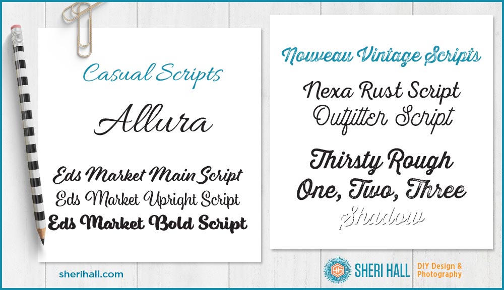
Casual script fonts
- Allura
- Eds Market (this family offers several scripts and other faces that are reminiscent of hand-painted signs)
Nouveau Vintage script fonts (my own term)
- Nexa Rust
- Outfitter Script
- Thirsty Rough

Trendy/Whimsical script fonts
- Lettuce
- Lovely Melissa (this one has many extra glyphs/characters)
- Natasya Regular (this one has many extra glyphs/characters)
Warning: I’ve been setting type for 25+ years and these trendy handwritten faces give me pause. Some of them are well-done and attractive, but many look like they were cranked out en masse so they all look very similar. Honestly, they can be very hard to read quickly, and if you’re trying to communicate, you want to do it quickly and clearly. If you’re thinking of designing a logo with one of these trendy scripts, be very careful (BVC). First of all, try to find one that is easy to read quickly. Second, spend some time exploring the alternate characters so that you can make your final project attractive AND legible. Keep reading for how to track down the alternate characters for maximum style and legibility.
How to find all those alternate characters
OK, this is important stuff — pay attention! Since your keyboard doesn’t have 500+ keys, you need to use the Glyphs palette to show you which characters you have available. In Illustrator, choose the script font you want to use in the font character palette, then open the glyphs palette (under the type menu at the top of the screen), click the T text tool in the toolbox, click on your document and double click the character in the glyphs palette that you want to type. Boom — alt character! In InDesign, go to the Type menu and scroll down to Glyphs to bring up the glyphs palette. It works the same way. Put your cursor where you want the character and double-click the character you want in the glyphs palette. 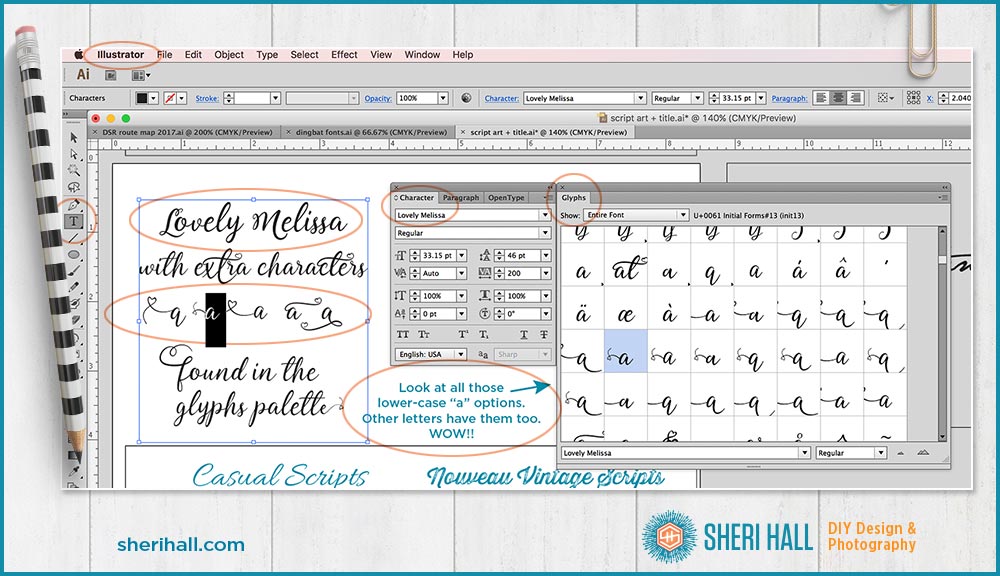
How I choose which characters to use when I have multiple choices for each
First off all, sometimes the typeface will choose characters for you based on what you’re typing. If it has ligatures included (letter combinations), it will insert those for you. Notice how Lettuce (in the trendy example above) uses two different t characters. I did not do anything special to accomplish that. The tt is a ligature in that face and it substituted that for two single t characters. Pretty cool, huh!?!?
If I am going to do a totally custom job, here’s what I do:
First, I type in the characters I need for what I’m typing — let’s say “Sheri.” Next, I open the glyphs palette and start a new text block where I type in all the options for the characters I need. What are all the capital S options? I type them in. Then I start a new text block with all the lower-case h options and so forth. Then I copy the character I like best from my optional text blocks into my original Sheri text block. I continue until it’s complete. If I need to change one out to fit better with the characters on either side of it, I do that.
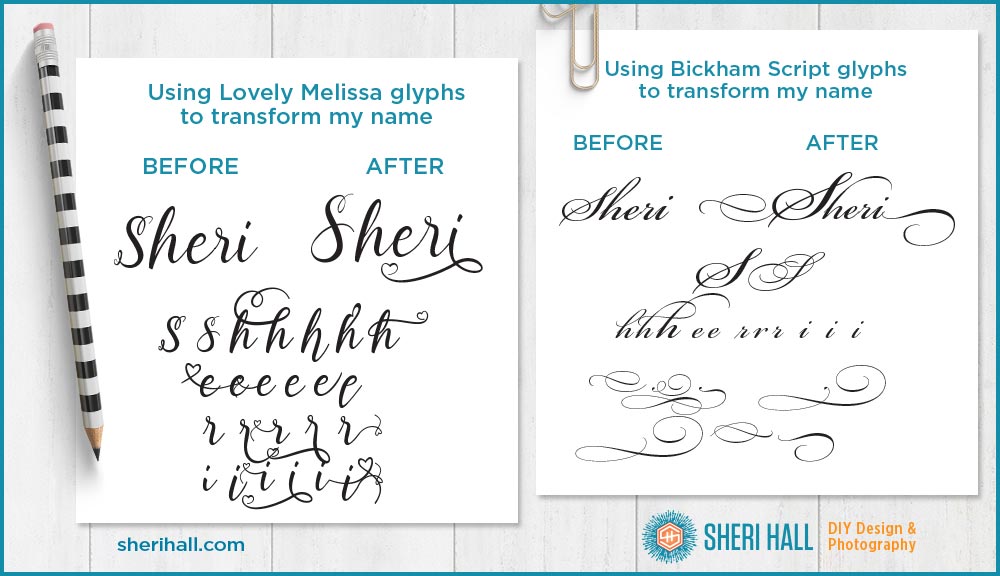
This process takes a while, but it makes a big difference in making your final art custom. This is not very practical for lots of text, but if you are typesetting a logo or a headline (maybe for a Facebook ad or Instagram quote art) and really want to make an impact, spend the time. You won’t regret it. And your text will be the envy of everyone who has the pleasure of reading it. Here’s how I use it making my title graphics for my own blog posts: 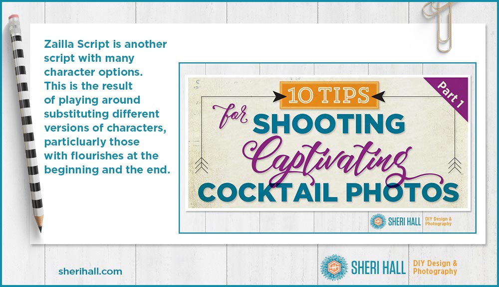
I have several other script fonts that I recommend. They are shown in the bonus PDF for this article: my cheat sheet of go-to fonts that are always in style, fonts to avoid at all costs, where to find fonts and how to identify fonts. Click that graphic below for access. 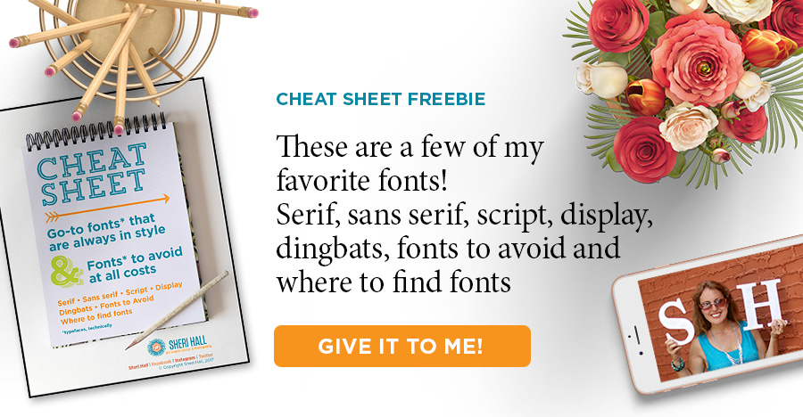
Do you have any favorite script typefaces? What are they?? I am always looking for some great new faces to add to my ever-expanding collection. And remember — he who dies with the most fonts wins! Comment below with any scripts you like, unless it’s Brush Script. I’ve seen enough of that to last me a lifetime 😉 .

