When discussing the various attributes of different typefaces, it’s handy to know some type terms and anatomy. This list is not exhaustive, but it’s a solid intro. There are some some really obscure type terms out there, like too trivial for Trivial Pursuit. I left them out because even I don’t use them. Learn these and you’ll be good to go!

Anatomy of type: Lines, ascenders, descenders, x-height
We’ll start with an overview of the various lines and measurements before we get into the nitty gritty anatomy.
- Baseline – the imaginary line that most letters sit on; descenders drop below the baseline; letters with bowls (see illustration toward the bottom) usually come slightly below the baseline to make them look visually like they are sitting on it. Notice that the bottom curve of the e and d dip slightly below the baseline whereas the x sits right on it.
- Mean line – the imaginary line that runs along the top of the x-height, or non ascenders
- Ascender – a lowercase letter that extends higher than the x-height; ascenders include b, d, f, h, k, l, t. Upper case letters are not considered ascenders.
- Ascender line – the invisible line that marks the top of where the ascenders reach
- Cap line – the invisible line that marks the upper edge of capital letters and some ascenders, depending on the typeface
- Descender – a lowercase letter that extends below the baseline; letters g, j, p, q, y all have descenders
- Descender line – the invisible line that marks the bottom of where the descenders fall
- X-height – the height of a typeface’s lowercase letters (not counting ascender and descender strokes) that rest on the baseline. X-height is an interesting feature of a typeface because a tall x-height can make you think the point size is larger than it really is (see illustration).
- Point size/body size – the height of the space between the top of the ascender and the bottom of the descender in a given font. Not all typefaces are created equal. One 12-point font may look much taller than another. Fancy scripts can look especially small for their point size. There are 72 points in an inch.

Anatomy of type: spacing left to right and up & down
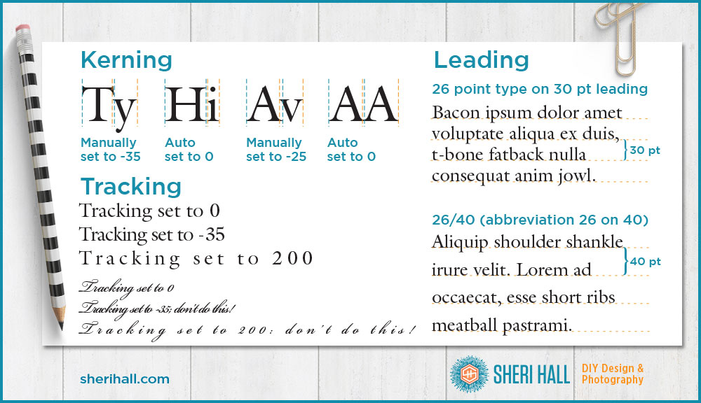
- Kerning – the horizontal space between two side-by-side letters, which you can adjust to add or subtract space.
Here’s a ninja pro tip: one of the best ways to tell a cheaply-made typeface is that the kerning is crappy. Can you imagine how long it would take for a type designer to manually set the kerning for every possible combination of characters in a given typeface? Yep, that’s why the cheap ones have crappy kerning — because they let the typeface design software do it for them. If you’re looking at body copy in a typeface and the spacing is not visually equivalent between letters, you may have a cheap font on your hands. If you’re using it for a logo or headline, you can hand-kern the letters to your liking. If you’re using it for body copy, try another font. - Tracking/letterspacing – the horizontal space between a range of letters (not just a pair); loose tracking means the letters are far apart; tight tracking means they are close together. Loose tracking can add some interest and emphasis to a section of type you want to set apart in your design; do not loosely track a script typeface where the letters are meant to connect. Keep tracking on cursive faces to 0 — no more, no less.
- Leading/linespacing – the vertical space between lines of text; it is measured baseline to baseline and should be larger than your point size
You may notice my dummy text in the example above has a meaty feel to it. If you’re looking for some fun dummy text try the Bacon Ipsum text generator at baconipsum.com.

Anatomy of type: letter parts
- Stem – the main stroke of a character, also known as a stroke
- Serif – the little stroke attached to the end of a character; also refers to the category of typefaces that have serifs
- Counter – the hole in the donut, as in an enclosed area of whitespace; several letters have counters and they are a, b, d, e , g, o, p q. Note: the lowercase e has a separate name for its counter: the eye
- Bowl – the curved part of the character that encloses a counter (the donut hole) of letters such as b, d, g, o, p, q; even though a c doesn’t have a counter, the curved stroke is still considered a bowl
- Aperture – similar to a counter, but has an opening instead of being fully closed; n, s, c, e all have apertures
- Loop – the bottom bowl of a lowercase g
- Bar/crossbar – the horizontal stroke that goes across the A, H and e characters; it connects one side to the other
- Ear – the decorative flourish that sometimes appears on the top right of a lowercase g
- Foot – on a serif typeface, it’s the part of the stem that rests on the baseline
- Terminal – the end of a stroke that doesn’t include a serif, but instead ends in a ball terminal or finial, as in the lowercase r
- Tail – the decorative stroke that may appear on a Q, K or R; descenders on g, j, p, q and y are also called tails
- Spur – the curly stroke coming off the bottom right of the lower case a
- Tittle/dot – small, usually round dot at the top of the i and j
- Ligature – two or more characters that are joined together as a single glyph. Note: The ampersand (&) developed from a ligature in which the handwritten Latin letters “e” and “t” were combined, as “et” was Latin for “and.”
Anatomy of type: the most unique character across the typeface universe
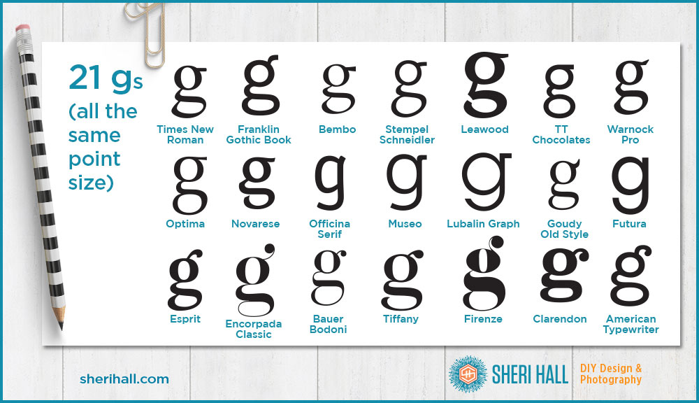
Here’s an interesting piece of trivia and something I have found very useful to know when identifying typefaces. What is the most unique character from face to face, as in the one with the most variation? If you are able to match this character form your sample text to a documented typeface, you likely have a match. Drum roll, please…
…the lower case g!

If you want to learn these terms on an interactive website, check out: supremo.tv/typeterms/. It’s very well done. Roll your cursor over the term you want to learn and click.
Comment below with your favorite type term or your favorite g, whether it’s in the graphic above or not. What do you like about it? I like that the ear on the Encorpada Classic g is backward from what you normally see.


Ear! Who knew? You did. I loved this post. Now I’m going to look for the lowercase g everywhere. I also had not considered all the effort that goes into a typeface due to the kerning. Thanks for sharing your brain.
It is sad that type design is so overlooked as an art. Type is half art, half utilitarian, but most people only see the utilitarian side. Do they think fonts just get spit out of some magic font machine? I don’t know, but I love a good lowercase g and capital Q! Thanks for reading!