I have some bad news and I have some good news. The bad news: there’s a lot of crappy typography out there in print and online. The good news: you can learn from it and avoid making these typography mistakes yourself!
I have a folder on my Mac called “Bad type good type” and it’s filled with mostly bad type, or rather examples of what not to do. I am a firm believer that if I can learn from the mistakes of others and avoid making the mistakes myself, then their work was not in vain and I appreciate the learning opportunity.
As usual, this advice applies mainly to “print” graphics, which means the designer has ultimate control over the type even if the graphic is destined for screen use.
Let’s look at a few of these typography mistakes. This list is not exhaustive, but these 10 are fairly common pitfalls.
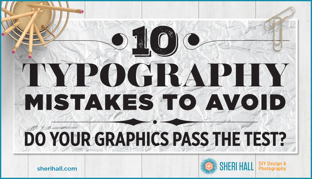
Typography mistake #1: Do not set a script font in all caps
Script type is a little harder to read naturally than serif and sans serif type. The capital characters often have swashes and extra volume and length to their strokes. When you set a bunch of capital letters in script, it just turns into a hard-to-read mess.
The particular example above has a couple other issues going on too so let’s discuss them while we’re at it.
First of all, don’t use Brush Script for any reason unless you are trying to mock some bygone era, and then think twice. It has made a few “worst fonts” lists because it’s overused, clichéd, ugly etc.
How to fix it? Pick something else, perhaps a bold sans serif like Futura Extra Bold.
Second, we have a contrast problem here. The yellow is not standing out from the background because the background is super busy.
How to fix it? Pick a less busy background, or put a 70% opacity white box behind the text to lighten it and choose a dark bold type. Or put a 60% opacity black box behind the type to darken it and use a bold light type. Or depending on the background you find, you might be able to use a drop shadow to separate the type from the background.
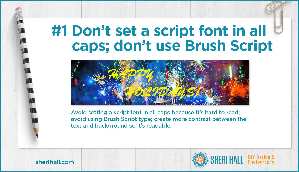
Typography mistake #2: Curly quotes and straight quotes (in the same graphic, no less)
Real quote marks should be curly; the opening quotes look like a pair of sixes (66); the closing quotes look like a pair of nines (99). I have no idea why the example above started out on track with curly (smart) quotes and ended with straight (dumb) quotes.
How to fix it? Proof carefully and use the ending curly quote character instead.
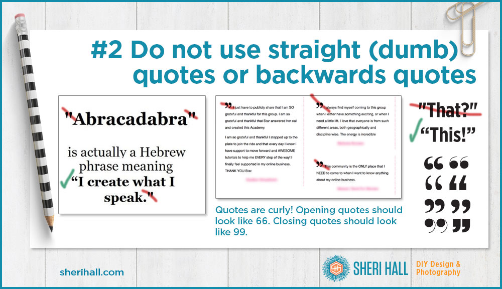
Typography mistake #3: Improper use of apostrophes
This one borders on grammar and punctuation, but when we’re discussing typography mistakes, these topics tend to bleed over into each other.
You’ll be a much better designer if you have a strong skills in grammar and punctuation. It comes in handy when you’re creating art and when you’re proofing art or copy from someone else. I have fixed plenty of “final” copy given to me by clients. They’re not even paying me to proofread or copy edit their text, but I do it anyway so the project comes out the best it can.
An apostrophe looks like a 9 and should be curved that way. It shouldn’t be curved like a 6 and it shouldn’t be straight up and down (that’s a foot mark, or prime, which I will cover in a different article). And it shouldn’t be completely missing!
The other common problem is when people leave out the apostrophe completely. Apostrophes have two uses:
- They show possession. For example, “Andy Warhol’s Marilyn is big, bold and colorful.” It is his painting so he gets the apostrophe “s” after his name.
- They take the place of a missing letter in a contraction. For example, in “Let’s get moving,” the apostrophe is taking the place of the “u” in us from “Let us get moving.”
How to fix it: say the phrase out loud and see if there’s a long version that you’ve contracted that needs an apostrophe, and add it!
Ninja pro designer tip: if your font does not come with an apostrophe (rare, but it has happened to me) and you’re only typesetting a few words, you can use the comma character and apply the baseline shift function in Illustrator, InDesign or Photoshop to push the comma up to where an apostrophe should go. Problem solved. She’s crafty — and she’s just my type!
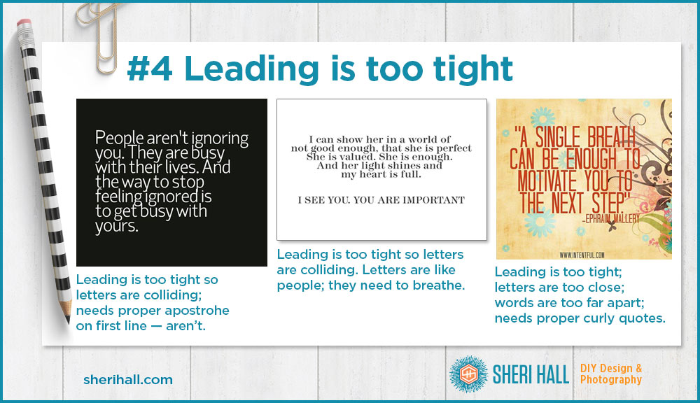
Typography mistake #4: Leading is too tight
The term for the vertical distance between lines of type is “leading,” pronounced ledding as the term comes from the strips of lead that typesetters used to separate lines of type to make plates for a printing press. It’s also called linespacing.
Leading is measured in points from baseline to baseline and you usually want your leading to be at least 10% greater than your font size. So if your font is 14 point, you want your leading to be at least 16 point.
This rule can be bent when you get into really large type; just make sure you have enough that your letters from one line don’t interfere with the letters above or below. If your leading is too tight, it makes your copy hard to read. All the lines run together.
How to fix it: add more leading until your lines of type are not interfering with each other.
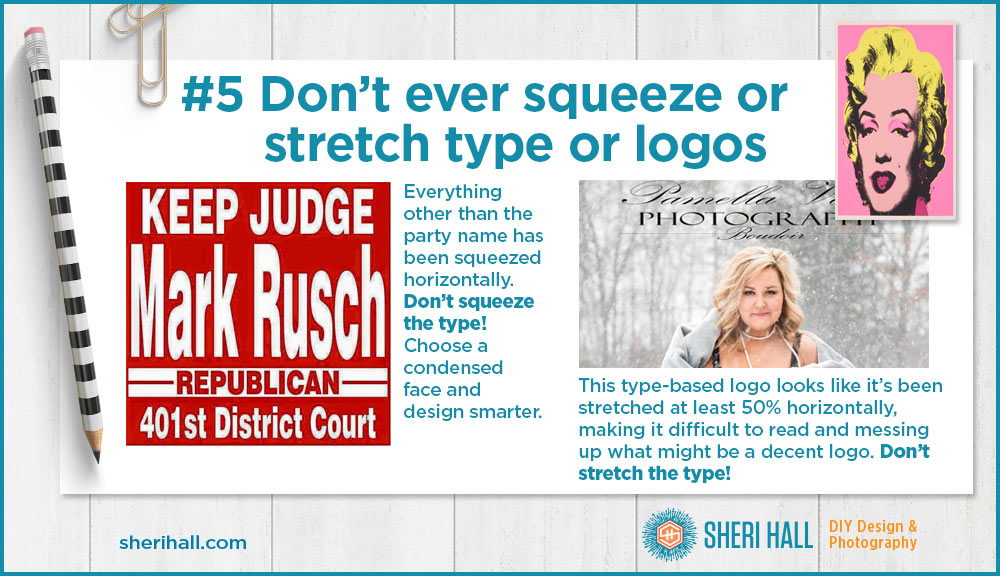
Typography mistake #5: Don’t ever squeeze or stretch type, logos or art
This one really slays me, like a dagger through my heart. Maybe that’s a little dramatic, but keep this in mind: every typeface was designed by a human being. Type is utilitarian, but it’s also someone’s creative piece of art.
You should never squish text to make it fit a space or stretch it out because you want to fill a larger space.
How to fix it: Resize type and logos proportionally, or choose a different typeface. If your type is too wide, choose a condensed face rather than squeeze it. If your type is not wide enough, try using a bolder version, or add some extra space between the letters (letterspacing), or choose an extended face, or keep the white space that narrower type creates. White space is a good thing!
What’s your favorite painting? Can you imagine it squeezed horizontally by 20%? Please don’t squeeze the art!
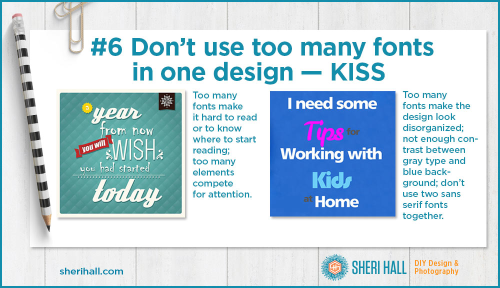
Typography mistake #6: Don’t use too many fonts in one design
Oh my! Too many fonts results in painful reading and confusion. Typography is not an easy skill to develop and it takes years of studying good design and trying it out for yourself. The KISS principle works well here: Keep It Simple, Sweetie!
The less experienced you are with typography, the simpler you should keep things so as not to go off the rails. That doesn’t mean your design has to be boring. If you choose a large type family to design with, you should have access to several light and bold versions plus italics at the very least. A really large family might have condensed and extended versions too. Helvetica Neue is a good example.
If you really want to use two typefaces, the general rule of thumb for combining fonts is to pick one serif family and one sans serif family; they will automatically have the contrast that your design will benefit from.
How to fix it: Nuke it from orbit and start over with one type family in one or two colors on a one-color background or one subtle texture.
There are many ways to add interest or emphasis to type without using multiple fonts. You can try making it larger, making it italic, making it bold, making it a different color, putting one word or phrase on its own line and adding a little white space above and below to set it apart.
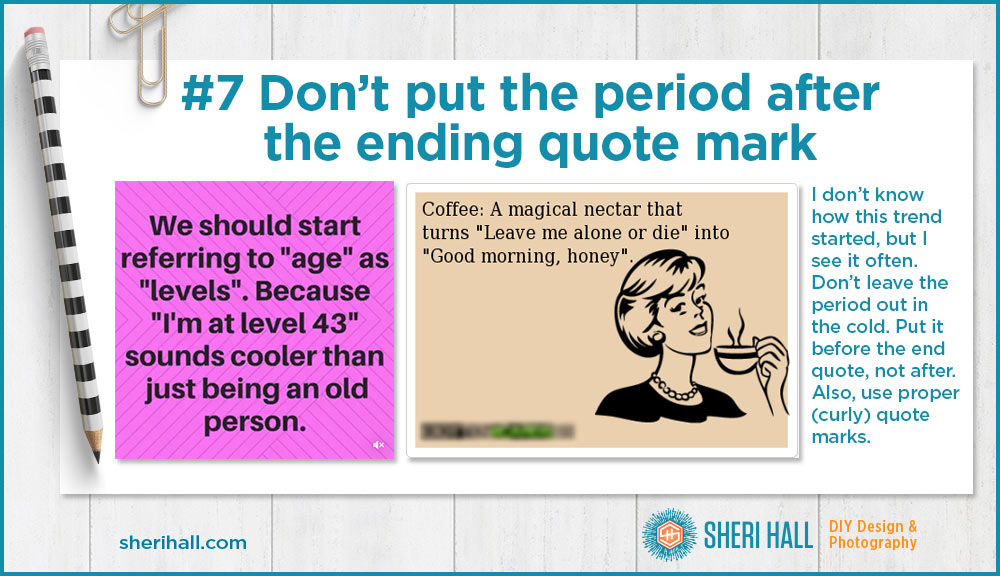
Typography mistake #7: Don’t put the period after the ending quote mark
Don’t leave the period hanging outside in the cold. Bring it inside the ending quote. It still symbolizes the end of the sentence and it’s not sitting out there in no man’s land.
How to fix it: Reverse the order of the end quote and period so it reads period end quote.
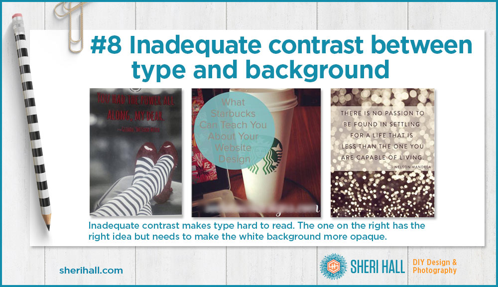
Typography mistake #8: Inadequate contrast between type and background
This is not strictly a typography issue, but it seems to rear its ugly head in designs involving type. If you’re going to set type over a background, make sure there is plenty of contrast between the two. The busier your background, the harder you’ll have to work to visually set that type apart.
How to fix it: There are many ways to do this: make it bigger; make it bolder; add a drop shadow (be careful with those); choose a simpler background (blur the background); add a partially opaque color box behind your text to give it more contrast to your chosen type color.
Ninja pro design tip: the best way to tell if you have enough contrast in your design is to squint at your screen or printed piece and see if you can still make out what it says. If you can, it’s probably easy to read for non-squinters. If it turns into a blurry mess, try some of the tips listed here to increase the contrast.
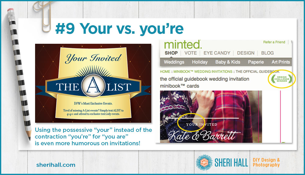
Typography mistake #9: Your vs. You’re (more of a grammar issue but still important!)
This one definitely falls into grammar, but it seems to trip folks up, so let’s discuss. “Your” shows possession and “you’re” is a contraction of “you are” where the apostrophe takes the place of the letter “a.”
How to fix it: Look at your use case; if it could be substituted with “you are,” then go with the contraction apostrophe option.
If it shows belonging and substituting “you are” does not make sense, then go with “your.”
In any event, proof you’re stuff!! See what I did there? That’s wrong. Proof your stuff!!

Typography mistake #10: Proof Everything
Speaking of proofing, this door at the Target I frequent cracks me up.
Typography mistakes in the real world
I copied most of these sample graphics from Facebook. The rest were email, web site and my own photo.
Now that you know a few typography mistakes to avoid, take the opportunity to look at design with a critical eye and think about what’s not working and how you would fix it. It’s a great exercise to go through especially on someone else’s graphic!
Leave comments or ask questions. Which one is your pet peeve, or do you have one not on this list?
Thank you for the type tips! I do have a question I am hoping you could answer. I have always put a double space after a period. When writing up my resume and handing it to a friend to proofread, she said that the double space is outdated and to get rid of them. What are your thoughts on this?
Definitely one space, unless you are using an actual typewriter or trying to mimic a typewriter. The two spaces was based on the days of monospace characters where every character was the same width, so the two spaces were necessary to visually separate sentences. Now that we have variable width characters, we don’t need to do that anymore.
Love reading these, and I hate to see them in real life. Thanks for sharing some good reminders.
You’re welcome. I keep a folder on both my laptop and desktop to use as examples, so I’m sure I’ll be revisiting this topic again in the future.
Interesting collection. I think #7 ( about the period outside the quotes) may be a British English rule.
Interesting. I remember learning in English class that when you have a ? at the end, you place it inside or outside the quote depending on whether the quote is the question or the overall statement is a question. I think it looks awkward so I try to avoid doing that. For example:
Did she say, “I want ice cream”? I would just say: Did she say she wants ice cream?
I think whether the punctuation goes in our outside the quotes is about if the quoted context needs the punctuation. I’d elaborate, but I need to get back to work. Have you referenced the New Yorker’s Comma Queen. She’s fierce and funny.
Thanks, I’ll check her out. Yes, you’re correct about the context if it’s a ? or ! but it still looks awkward to me and I try to rewrite it.
Full-stop inside or outside is definitely a US vs AUS/UK thing. As is the order of double and single quotation marks for nested quotations. I’ve kept many of my Australian habits for my own writing. Another is not using the full-stop in abbreviations if the last letter is also the last letter of the word it stands for: Dr not Dr. and Mr not Mr. I like that. The full-stop is a waste of ink.
I love your posts and find them very helpful.
That is interesting! When it comes to matters like these, consistency is key. If you start handling a situation one way in a written piece, you need to make it the same throughout that piece, or it’s definitely a mistake.
I HIGHLY DISLIKE Comic Sans. It should be banished along with Brush Script. Any teacher that even *thinks* of using it should go to detention.
Comic Sans is on my list of fonts to avoid at all costs. That list will warrant a blog post some day, for sure!
I love the art of fonts. Thanks for covering this.
My only suggestion in regard to proofing – try to find at least 1 or 2 other people to proof your work. They should be unbiased and have a fresh eye to see things you didn’t.
Also, in regard to apostrophes, what gives with putting them incorrectly in statements like this: I am very fond of the Smith’s; they are very nice people.
Ugh!
Great comments! Getting a second set of eyes for proofing is the goal, but it’s tough when you work alone.
There are way too many unnecessary apostrophes out there as people try to make things possessive when they should be plural. I think the default thought is to add one just in case.