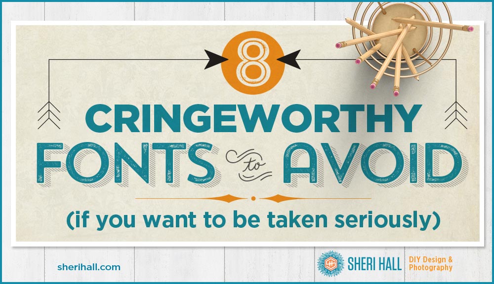
No one wants to be ugly, boring and dated; so why use fonts that are? This is my not-at-all exhaustive list of typefaces you should stop using right away. Some were too popular for their own good, severely overused and landed here, while others were cringeworthy from the get go. Either way, pay your respects and move on to something better.
On a side note: what was in the water in the mid 1990s? A string of winners there — Comic Sans, Curlz and Bradley Hand!

Fonts to avoid
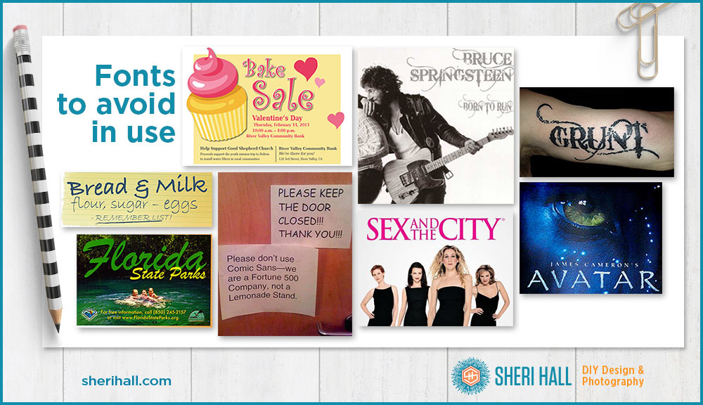
Brush Script (1942) – An early scripty handwriting face, it was used to convey messaging in a non-corporate way by corporations and government bodies. It spawned a bunch of other faux handwriting alternatives like Mistral and Reporter. Brush Script was still popular in the 1980s and 1990s, probably because everyone had access to it for their “desktop publishing” projects. If you’d use it today in any way other than sarcastically, your font fashionista card will be revoked. It’s a very over-used face. Find something better.
Arial (1982) – Arial used to be the default font in Windows applications so it got used, used and over-used. It was the go-to face for amateurs and thoughtless designers. Microsoft originally chose Arial to avoid licensing issues with the older, established and very popular Helvetica. No one who knows anything about typography would choose to use Arial for print work. Avoid! This will warrant its own post eventually, but for now, if you want to read the juicy bits, here they are: The Scourge of Arial.
Papyrus (1983) – Ugh, why is this even a typeface? It’s cheesy and cringe-worthy when I see it in the real world. People still use it for logos, posters and flyers. Unlike other faces in this list, it’s not bad because it’s overused; it’s bad because … it’s bad. Cheap & tacky — do not use. You want to see it in use? http://www.iheartpapyrus.com
Trajan (1989) – Such a beautiful, classic face, but alas, it has been tragically overused in movie posters and movie marketing materials. Sex and the City, The Last Samurai, Master and Commander, Titanic. It only comes in capitals so you wouldn’t use it for body copy anyway. It saddens me that a really elegant face I used to use is now on the do-not-use list. Sad Sheri.
Comic Sans (1994) – When it was new and fresh and not grossly misused, it wasn’t bad for its intended use. If it had stayed in the comic world in speech bubbles, it wouldn’t be so reviled. But here we are in 2017 and people have used it for announcements, invitations, notices and more. Cliché — do not use.
Curlz (1995) – Wasn’t this popular in Print Shop on the dot matrix printer in the 1990s? Or was that just in my house? It’s hard to read, Cheez Whiz level cheesy. I doubt it would even attract the ugly Christmas sweater crowd who wears those in a non-ironic fashion.
Bradley Hand (1996) — Eww. Handwriting fonts. Be careful with these. They are especially popular these days. They are trying to convey personality that other faces (like Arial and Helvetica) cannot. Unfortunately this one comes off as kitchy and inauthentic. Bradley Hand has been used in too many invitations and faux personal greetings to not land on this list.
Bleeding Cowboys (2007) – This had its 15 minutes of fame 10 years ago, and it’s over. Move on. Hard to read, jumped the shark. And what’s with that name? If you want to see it in use, these examples are pretty funny:
http://www.farcethemusic.com/2011/02/scourge-of-bleeding-cowboys.html
And here are these fonts in use (I did not include Arial because it’s everywhere):
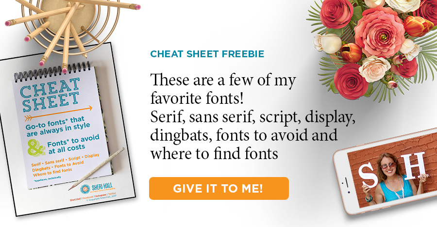
Do you get overwhelmed or underwhelmed when trying to pick the perfect font from your font menu? Put an end to that by downloading my designer-recommended list of go-to fonts that are always in style. Click that big orange button below to download it.👇 👇 👇
Your turn
What’s the one typeface you avoid using and why? Is it listed here? Comment below with the juicy details…
If you have friends or loved ones who use any of the fonts on this list, please share this with them. It’s never to late to boot the bad fonts from your life.
Disown me, if you must, but I love Comic Sans
I don’t know what font it is, but the signage at the little corner store area is awful. Manilla and black with some awful lettering.